CMSD - Horizon Kinetics Q2 2023 Commentary
2023-08-02 12:00:00 ET
Summary
- Horizon Kinetics LLC, founded in 1994, is an independently owned and operated investment adviser. With a long-term absolute return mindset, and based on first-hand research, our portfolios tend to be concentrated and avoid tracking or mimicking any benchmark or index.
- In 2015, the top 10 companies in the S&P 500 accounted for 17% of the index’s market value. Today the top seven are 28% of the index. Those top seven are all IT companies; in 2015, only two were.
- Because bubble valuations are so difficult to discuss while they’re happening, we show the “bubble look” through time, a picture-chart based way to recognize them at a glance—from the ‘80s Japan and Energy sector bubbles through to the present.
- We also discuss why indexes structurally can’t be inflation hedges, and how to find insurance-cost-free and opportunity-cost-free long-term inflation hedges with proven bona fides.
A Look in the Mirror, Eight Years On
Back in 2015, our first Under the Hood publication started a conversation about the content label on your S&P 500 or bond index fund: what you thought was in it versus, you know, the actual meat in the sausage. Was the allocation even close to what you presumed? Like buying an emerging markets ETF that, looking to the underlying securities, raised your developed markets exposure.
The impetus for the series was the arrival of the Asset Gathering phase of indexation, facilitated by the introduction of ETFs. By amassing so much AUM and ever-increasing inflows, it ceased to serve its original function of passive participation in markets. Indexation had begun, in direct contravention of its purpose, to directly change clearing prices and the very character of the markets it purported to free-ride upon. Its inflows had become the marginal bid—the trade that determined the last price—because each dollar of new money required a pre-programmed, valuation-indifferent purchase by the ETF.
Top 10 Holdings - S&P 500 Index (% Weights)
| 7/20/23 |
| Jun-15 |
| Apple Inc ( AAPL ) |
| 7.5 |
| Apple Inc |
| 4.0 |
| Microsoft Corp ( MSFT ) |
| 6.8 |
| Microsoft Corp |
| 2.0 |
| 3.5 |
| Exxon Mobil Corp ( XOM ) |
| 1.9 |
| Amazon.com Inc ( AMZN ) |
| 3.1 |
| Johnson & Johnson |
| 1.5 |
| Nvidia Corp ( NVDA ) |
| 3.0 |
| General Electric Co ( GE ) |
| 1.5 |
| Tesla Inc ( TSLA ) |
| 1.9 |
| Wells Fargo & Co. ( WFC ) |
| 1.4 |
| Meta Platforms ( META ) |
| 1.8 |
| JP Morgan Chase & Co ( JPM ) |
| 1.4 |
| Sub-total: IT companies* |
| 27.5 |
| Berkshire Hathaway Inc |
| 1.4 |
| 1.6 |
| Procter & Gamble Co ( PG ) |
| 1.2 |
| UnitedHealth Group ( UNH ) |
| 1.2 |
| Pfizer Inc ( PFE ) |
| 1.1 |
| Johnson & Johnson ( JNJ ) |
| 1.2 |
| Top 10 S&P 500 weights |
| 31.5 |
| Top 10 S&P 500 weights |
| 17.3 |
| Source: iShares, Morningstar. 2023 data as of July 20, 2023, using iShares Core S&P 500 ETF as a proxy for the Index. *Functional weightings, rather than S&P classifications. |
The great volumes of money inflows became a kind of limitation (a limitation with side effects). Indexation’s marginal bid became focused on a narrower and narrower subset of the public company universe, on those shares with the institutional-grade trading liquidity to absorb those flows. And, in a self- reinforcing cycle, that narrower subset of securities absorbed an ever-greater proportion of the ever-increasing inflows. This distorted valuations and index security and sector weights in ways that were de-linked from the kind of fundamental analysis and valuation sensitivity that active management had (in its imperfect ways) imposed. At least, those were some of the questions for debate at the time.
Eight years later, there is now an outcome, not just debate. Those trends have reshaped the profile of the S&P 500 itself. For instance:
- In 2015, only two of the top 10 S&P 500 companies were technology stocks. Today, the largest seven are “technology companies.” 1
- In June 2015, the top 10 accounted for 17.3% of the S&P 500 market value. As of July 20, 2023, just the seven IT companies—not all the technology companies in the index, just these seven—are 27.5% of the index.
- The top 10 are 31.5%.
The 2015 to 2016 period was just when the Technology Bubble began to find its legs:
New Sectoral Semantics
Now, a new set of factors is impacting the character of the major index constituents. One factor is the more extreme
concentration at the top of the index. Another is the law- of-large-numbers limitation on the growth prospects of these companies, which is now showing up in revenue and earnings figures. There are others; many others. They can all be addressed. The analytical exercise for the growth persistence question is to determine whether this slowdown is temporary or of a more permanent nature.
Market Capitalizations of the Seven Largest Technology Giants
A preceding table tallied the top seven companies in the S&P 500 as Information Technology, and as being 27.5% of the index. That is technically incorrect. Standard & Poor’s would put it at 17.2%, because it now categorizes four of those companies differently. Alphabet (Google) and Meta Platforms (Facebook) are classified as Communication; Amazon and Tesla are assigned to the Consumer Discretionary sector. Inarguably, though, Alphabet is an IT company.
Amazon is a somewhat subtle example. It’s true that Amazon Web Services, which is the cloud services division, produces only 17% of the company’s revenue. Yet AWS, which is unambiguously an IT business, produces 107% of the corporate operating profit. 2 Overall, Amazon’s traditional online retail business is not profitable. A counterargument in support of the retail business is that aggregate sales did expand by 8.15% in the past 12 months. Yet, retail would lack the funds for expansion if not for Web Services. Ergo, Web Services supports the business, not the online retail sales operations.
If Amazon were to be officially transferred to the IT sector, the S&P 500 IT weighting would rise to 31.2% from the current 28.1% 3 . Correspondingly, the weight of the Consumer Discretionary sector would dip to 7.5% from the current 10.5%. Similar evaluations can be made for Tesla (also Consumer Discretionary) and Meta Platforms and Alphabet (both Communication).
The S&P 500 sector weights are supposed to reflect the relative proportions of those sectors in the U.S. economy. It is difficult to accept the notion that consumer discretionary expenditures are only 7.5% (less, really) of the economy. History suggests that their average P/E ratio of 36x estimated forward earnings is excessive and a serious risk-to-the-prudent warning.
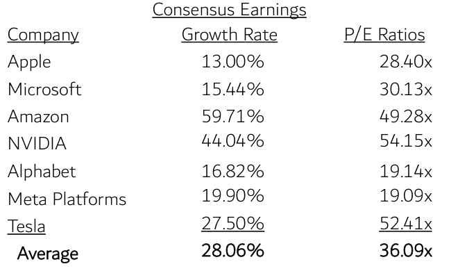
Nevertheless, Wall Street analysts forecast that these seven technology companies will grow far more rapidly than either the U.S. or the global economies. Their consensus earnings growth rate, as a simple average, is 28%. It is not in dispute that these companies have introduced, or are in the course of introducing, new technologies to the world. And their share prices do nothing but go up.
It’s an age-old conundrum: how to balance near-term reward, seemingly there for the grasping, against the weak and tentative voice of prudence while the risk is not in frank evidence? Is there a navigation map for the nettlesome this-time-is-different question? Time for a bar story.
Consensus Earnings Growth Rate of Seven Technology Giants (next business cycle)
| Company |
| Consensus Earnings Growth Rate |
| Apple |
| 13.00% |
| Microsoft |
| 15.44% |
| Amazon |
| 59.71% |
| NVIDIA |
| 44.04% |
| Alphabet |
| 16.82% |
| Meta Platforms |
| 19.90% |
| Tesla |
| 27.50% |
| Average |
| 28.06% |
| Source: Bloomberg as of June 2023. Estimated Compound Annual Growth Rate of Operating EPS over the company’s next full business cycle (typically 3-5 years) |
How to Talk About the Bubble in the Room, or A Complex Long-Term Data Set Walks into a Bar
Walk up to someone, a bartender, and make a simple statement about any topic—cultural, historical. (Not in what might be today’s politically charged bar scene. More a TV- or movie-generic-bar, like Cheers or the Cantina in Star Wars.) Maybe a statement about something objectively simpler, like the physical world instead of the social world. No exhortation or raised voice, just an assertion or conclusion about a topic. The catch is—there are two catches—that:
- it runs counter to what they know or have heard before; a novel idea, in essence; and
- you present your conclusion with no supporting data, history or interpretation; no context. 4
At best, you can seem extreme; at worst, bizarre.
Does that statement itself seem extreme? Oh, forgot to provide context. Say that 15 to 20 years ago, whether at your workplace or, if you had such a job, on the radio, you said the planet is warming to such a degree that there could be a global catastrophe within our lifetimes. Just like that. Now one can see why that would have seemed extreme at best, and bizarre at worst, because there were no mainstream voices saying that. As is well known, a former U.S. Vice President did say it publicly at the time, via a movie-theater-release documentary. Yet, even with the supporting data and interpretation, irrespective of how debatable they might or might not have been, a large contingent of the intended audience still considered the message, if not bizarre, at least extreme.
Why still extreme? In part because Vice President Gore’s proposed future hadn’t happened yet; there was ‘nothing to see.’ But, of course, there was nothing to see. Weather and climate might be the most massively mathematically complex and impenetrable systems there are. According to NASA’s Jet Propulsion Laboratory, a seven-day weather forecast is only about 80% accurate, and at the 10-day mark, only about 50% 5 . That’s with the benefit of today’s satellite and supercomputing technology, and only with respect to local conditions. And that’s just weather, not climate. For a human being’s sensory capabilities, climate change is imperceptibly slow, on a path measured in a handful of decades or generations, and overwhelmed, signal-wise, by the noise of local weather. Of course, there was nothing to ‘see’ with the individual senses and lived experience. There was no ‘show me’ answer, because sometimes one must surrender direct experience in favor of informed reason.
And the being informed part, for something like this, can’t be quick or without effortful attention. At the time of VP Gore’s 2006 showing of An Inconvenient Truth, the climate change argument wasn’t available in an easily viewable, lay-person- coherent way. There wasn’t a simplified 2-pager. What there was, before the widely acknowledged documentary, were a thousand disparate, independent studies by academic and governmental organizations examining different aspects of the global climate system 6 . Not that there wasn’t any centralized, organized source of such informational studies, but it wasn’t exactly public fare.
The Intergovernmental Panel on Climate Change ((IPCC)) had been producing consolidated reports of climate science findings for decades. Its 1995 report, probably released about the time of the documentary, was about 400 pages. The introductory Summary for Policymakers was 15 pages and included sections titled “Intertemporal Equity and Discounting” and “The Social Costs of Anthropogenic Climate Change.” Not every-day reading.
The 2007 report, its fourth, was so compendious, at over 2,800 pages, that it was broken up into four separate documents. One of the three primary sections was focused on the physical science, another on impacts and vulnerabilities, another on mitigation. The purpose of the fourth section—the Synthesis Report—was to summarize the significant findings. At 112 pages in length, it had its own 22-page Summary for Policymakers. Even this Summary of the Summary is of sufficiently technical language that it requires some concentration to follow closely. Reasonably fluent reading of either the 1995 or 2007 reports would have required recall of some basic statistical methods and physical science studies. Not many simple pie charts; plenty of more complex ones; lots and lots and lots of data.
There was no further organizing hand to translate and distill this important aggregation of study data into a more cohesive and accessibly conclusive whole. That’s a different type of document and requires a different set of skills. Author and New York Times journalist Thomas L. Friedman, whose specialty area is foreign affairs and mid-East geopolitics, recently wrote, “Whenever people ask me what I do for a living, I tell them that I’m a translator from English to English. I try to take complex subjects and make them understandable, first to myself and then to readers.”
Even had there been such a translator for the early IPCC report, its message would still likely have crashed against the Barrier: the future lived-experience impact of its assertions hadn’t, in non-technical terms, come to bite the audience in the derriere. The same happens in the financial markets.
Now let’s say you made an assertion, with no data or context, that a particular sector of the market—or maybe the entire market—was becoming a bubble, that it would end badly and within a relevant span of time. Here’s the rub. It is an absolute certainty that if there really is a bubble, the lived experience of your listener, whether an audience of one or 1,000, is of almost unalloyed success. And likely without any alarming markers of risk, like price volatility (at least not the bad downward kind). Moreover, your statement would in fact, statistically speaking, be extreme or fringe-like in relation to the great preponderance of opinions.
Going to the second step, let’s say you then provided the variety of data, current and historical, and the interpretive context to support your point. But that would not be persuasive unless the audience were willing to invest a not-inconsiderable amount of time to listen to, ponder, question and interpret that information. Even assuming the crystal clarity of the data’s message, it would remain an outlier among the sea of prognostications and fly in the face of lived experience. It could achieve the concurrence a handful, or of a very large handful, of individuals, but broad concurrence could not be had until the final result, a bubble collapse, came to bite.
How crystal clear, how obvious does it need to be? Pictures always help.
Do Bubbles Have a ‘Look’? Depends if You’re Charting Price or Charting Value (Good Luck With That)
Bubbles aren’t synonymous with the technology sector. I recall that in the early 1980s, the energy sector came to be about 30% of the S&P 500. Granted, at $40 a barrel in March 1981, oil had doubled in the prior two years, and almost quadrupled from seven years earlier. Imagine the drama. But any dispassionate analysis would have shown that to be unsustainable.
I also recall the Japan stock market inflating to somewhere like 35% or more of the combined value of the all the global stock markets in the mid- to late-1980s, and even exceeding the U.S. global index weight. Excluding the U.S., I vaguely recall that Japan had a global index weighting somewhere north of 50%.
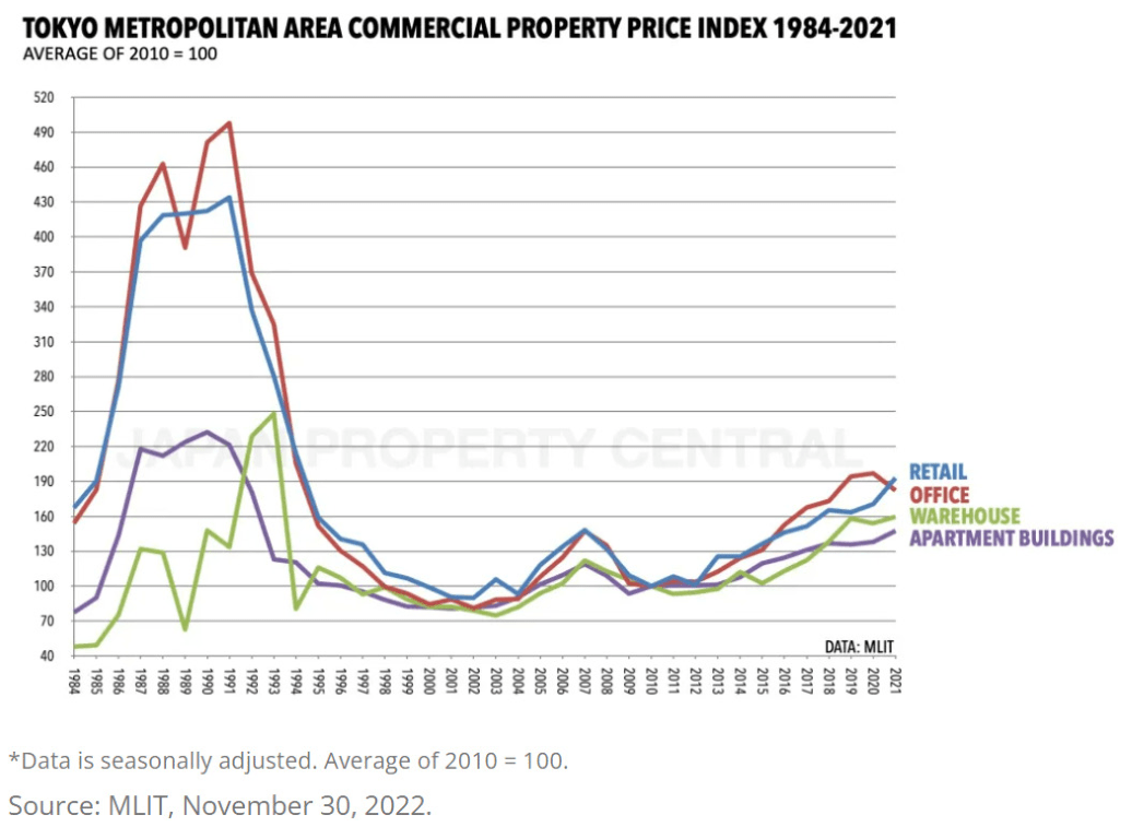
By 1989, when Japan was referred to as Japan Inc., prime commercial real estate in Tokyo’s Ginza district was priced at over ¥30 million per square meter. In U.S. terms, that’s $20,000 per square foot 7 . Needless to say, there followed a disastrous collapse. For reference, the most expensive U.S. commercial real estate is in California, and the most expensive such properties in California are in San Francisco, and the highest lease rates there are in the Presidio, at about $122/sq. ft., At today’s roughly 6% financing rate (cap rate, in real estate terminology), this would be a purchase price of about $2,000/sq. ft. That’s a tenth of the price in Tokyo 33 years ago.
Why use vague terms like “recall” and “somewhere like” about the 1980s energy sector and Japan weights instead of just laying out the data? Because a cursory internet search for those simplest of figures came up empty. I did once have some ‘80s-vintage Moody’s Manuals and Value Line binders, but they were lost in an office fire two decades ago. It required the assistance of one of our analysts, who has access to subscription- based database services, to provide the information.
To a suspicious mind, there’s something telling about that. Because anybody, any time, can get all the price data they want. You want monthly price data for stocks going back to 1920? You can get the results with dividends or without, you can get volatility data, you can get correlations between large company and small company stocks, between stocks and bonds and cash. Basically, you can get all the price-based data you want immediately and for free.
But valuation history? Not so easy. You can get today’s energy sector weighting in seconds. But if you want to know what proportion of the S&P 500 the Energy sector represented during its first big bubble—basic question, right?—you can’t. Why no availability? Here’s a theory.
Wall Street economics is built on trading activity and money movement, on what can happen today and tomorrow. Forty-year-old price histories are ok, because they feed into the risk and return statistics that support the asset allocation models, which engender portfolio adjustment and trading strategies. And those strategies are generally executed through index-based instruments, which themselves generate far greater trading activity than actively managed portfolios and individual stocks. Fundamental valuation doesn’t much factor into those models, and not at all into ETFs and indexes, which are definitionally valuation-blind. So, Wall Street doesn’t have much use for historical index valuation data. This all rhymes, in a way, with Oscar Wilde’s observation, abridged here, about those ‘who know the price of everything and the value of nothing.’
Historical sector weightings, though, can be very helpful for identifying bubbles and for determining how far they’ll fall. That’s because a sector weighting relative to its economic norm is a bit like a valuation multiple. It can identify excesses in ways that simple price data can’t. Recognizing bubbles is really important, because they are a normal occurrence and happen with regularity. Books have been devoted to compiling them. Yet, each new bubble beckons a brand-new crowd that resists every effort to tell them so.
Bubble ‘Look’ Example Set #1, Japan
Japan’s 1980s bubble period illustrates the difference between the standard price-based history of a sector and its index-weight history. They look different and convey very different information.
This chart shows the Nikkei 225 Index history that everyone sees. From 1983, in just six years, from a starting level of just under 10,000, it nearly quadrupled to 38,916 by 1989. From there, it didn’t bottom until 2009, 20 years later, after losing over 80%.
It has since appreciated from less than 10,000 to the 30,000 level. So, excluding the final uber-excessive year of the bubble, it has finally recovered its prior high, even though it took almost 35 years. But that chart tells the wrong story.
This next chart that tells a much different story. It’s not based on the price index of the Japanese market, but on its sector weight in the global stock market index.
Source: 1987-2007 from MSCI Barra Publication; afterwards based on the iShares MSCI ACWI ETF (ACWI) via FactSet.
You might note two deficits in this chart. Since sector weight-based information is so difficult to come by, the oldest data is not original-source data. The 1987 information is from a 2008 MSCI Barra publication that was itself making a 20- year comparison of emerging markets. Second, 1987 was already most of the way into the bubble, so the chart doesn’t show the pre-bubble normal weight of Japan in the world equity indexes. Kind of important to know, as will be shown shortly.
The earliest figure we have is 1987, when Japan was already almost 40% of the MSCI All Country World Index, and 58% of all countries excluding the U.S. We don’t have the 1989 peak figure, by which time the Nikkei 225 had almost doubled from the 1987 level. Unlike the preceding price chart, though, this Japan market weight statistic never even approached “recovery” and it never will. The Japan ACWI weight was down to 8.4% by 2002, and at year-end 2022 it was 5.6%.
An insight into the behaviors that portfolio managers can adopt under the pressure of being benchmarked to an index: Some international-strategy managers in the ‘80s would remark, as evidence of their risk-averse approach, their analysis that the Japan market was egregiously overvalued, and that they dared to be different, that they were underweight in Japan. That is, their portfolios might have been 40% in Japan instead of 58%. Restated, they were saying that they were being conservative for being 40% in a self-acknowledged bubble market!
The reason the post-collapse phase of a sector-weight bubble chart is so much more extreme, with a so much longer-lived aftermath, is that the standard approach is price-based, with the asset or country measured with reference only to itself. The sector weight approach has a valuation component relative to the market of its peers:
- In the standard price chart, a collapsed industry sector or an entire country’s stock market contains underlying earnings. Those earnings are reinvestable and can compound their value. There is good reason that the index in question might actually recover in 10 or 20 years.
- Japan’s global stock market weighting was never going ‘recover’ to that 30% position size again, because a sector weight doesn’t exist in a self-referential vacuum. All the other countries also have earnings or GDP, and they, too, are compounding. That %-weight line in the graph will never recover.
A different kind of normalized sector-weight benchmark would be relative to GDP. Any investor should at least ponder this basic, uncomplicated 50-year historical valuation chart of the U.S. stock market. In 2021, by ‘sector weight’ measure in relation to GDP, the U.S. was more than 25% overvalued relative to the prior highest level in U.S. history, the 1999/2000 Technology Bubble. Today, it matches that 2019 peak.
Source: 1975-2000 data from World Bank Open Data
Bubble Example Set #2, U.S. Energy Sector
It would have been very informa- tive for today’s investors to know the typical Energy sector weight in the S&P 500 prior to its bubble period. Price charts of oil or of individual energy companies are easily obtained, and they clearly show the familiar bubble shape we have been taught to expect:
Source: FactSet. Composite includes XOM, CVX and BP.
After falling more than 60%, it eventually recovered to its 1985 peak price 18 years later in 2004. Today, at $70, oil is 75% higher than the 1985 figure, which is only 2.6%/year. Energy companies, though, because they produce profits that can be reinvested and compound, are higher by many multiples—in this small index of three surviving major oil companies, by an annu- alized 8.0%.
Doesn’t look that bad.
But this simple price chart is misleading on two fronts for anyone weighing their allocation to the oil sector or considering the advisability of some risk hedge against oil, which is the most inflation-impactful commodity in the world. The first missing element is an inflation adjustment. GDP is presented in inflation-adjusted terms, which lowers the reported growth rate. A stock or stock market chart does not make that adjustment.
Source: https://www.worldbank.org/en/research/commodity-markets.
Adjusted for the CPI, not only hasn’t oil recovered from the 1980s bubble, it’s almost 50% lower. Just to recover to its inflation adjusted price of 40 years ago, oil would be priced at $140/barrel 8 . During this 40- year financialization of the economy, CPI increased at an annualized 2.9%. There is a lot of inherent inflation risk in oil. That’s without considering the fact that industry-wide capital expenditures, which are necessary to replace expended reserves, are less than one-half what they were a decade ago. There is no give in the supply/demand wheel.
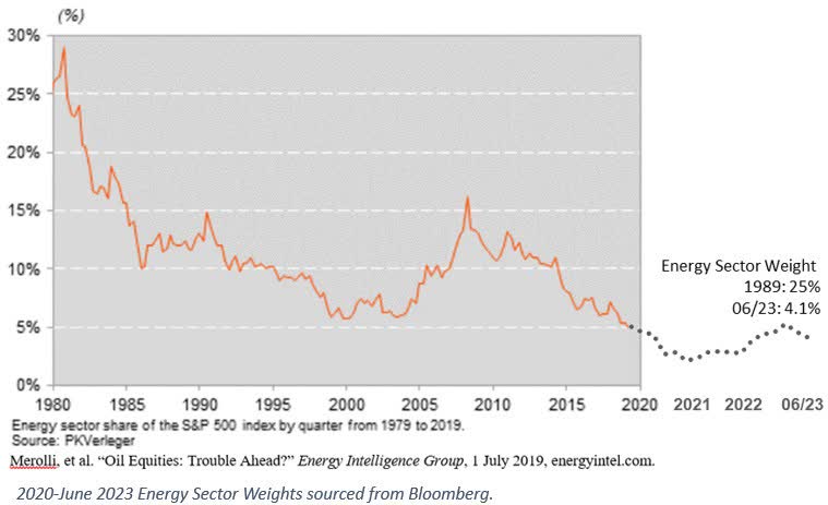
Finally, here is a historical sector-weighting-based chart of Energy in the S&P 500. Same as for Japan, we don’t have a picture of the preceding periods’ normal sector weighting, because this secondary-source data likewise only begins near the bubble peak.
Just as for the Japan sector-weight based chart, not only didn’t the Energy sector recover from its 1979 peak, but at 4.1% of the S&P 500, it is now only 15% of its weight 44 years ago. That’s because price is standalone, with reference only to itself; there’s no valuation component. Sector weight is with respect to all the other sectors and companies in the index. Therefore, its weight at any juncture bears some relation to its economic value, like revenues or earnings or book value relative to the same measures for the balance of the market.
The truer shape of a bubble is seen relative to an economically rational norm, not just the information-absent standard of its own price behavior.
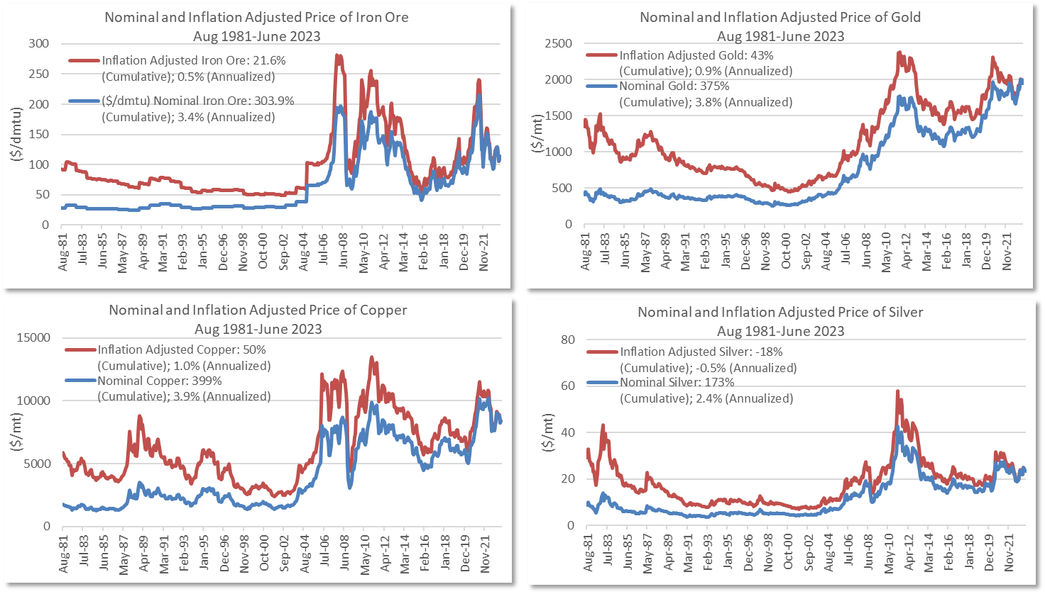
As to the 50% inflation-adjusted decline in price, oil has been anomalous that way. The charts below show the quoted and inflation-adjusted prices for iron ore, gold, copper, and silver.
Source: https://www.worldbank.org/en/research/commodity-markets.
Bubble Example Set #3, Financials
Source: Factset, Fed St Louis, ssga.com. 10-3Mo Spread based on the US Treasury Constant Maturity.
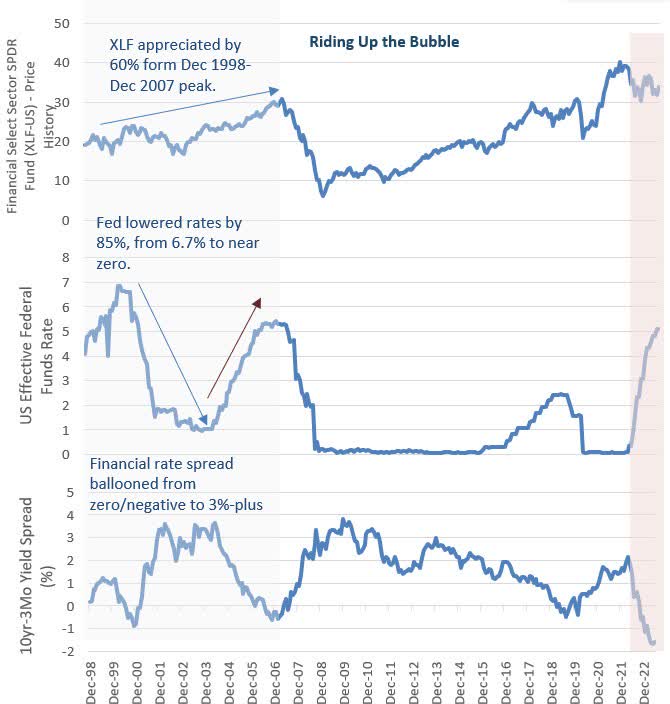
The same sector-weight bubble shape can be seen in a graph of the Financial sector before and after the Great Financial Crisis. Riding the Bubble Up: First, o enable comparison, the conventional price chart of the largest and first financial sector ETF shows the 60% appreciation of XLF from its Dec 1998 inception through its peak in May 2007. That was about twice the return of the S&P 500, which was suffering from the aftermath of the Technology Bubble collapse. And its eventual price-basis ‘recovery.’
The bubble was enabled by plentiful—too plentiful—money, as shown in the bottom graph of this three-chart set. The enabler was central bank monetary policy: the Fed Funds rate was brought down from a Dec. 1998 starting point of 4.7%, to 1% by 2004.
The middle graph provides a sense of the powerful earnings engine the Fed engineered for finance companies like banks and other lenders. It shows the interest rate spread between 3-month and 10-year Treasuries, which roughly indicates the difference between the interest a bank pays to depositors and the interest it earns on the longer-dated assets in which it invests those deposits. During this period, the spread rose from (0.9)% to as high as 3.6%.
Source: Factset, Fed St Louis, ssga.com. 10-3Mo Spread based on the US Treasury Constant Maturity.
Between year-end 1998 and mid-2006, the M2 measure of money supply increased 6.1%/year. Real GDP, excluding price inflation expanded at a 2.9% rate. Real GDP per capita expanded by 1.9% a year. Money, being too cheap and available, didn’t seem to be going into production so much as into financial assets—a policy-induced misallocation of capital, albeit with an initial short-term intent to allow banks to rebuild their balance sheets.
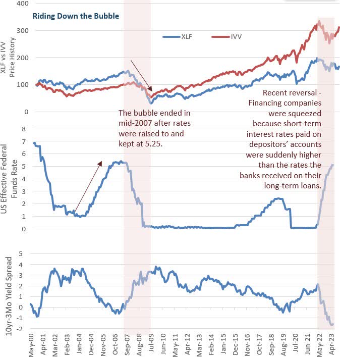
Riding the Bubble Down: The Financial bubble ended in mid-2007 after rates were raised to and kept at 5.25% from mid-2006 to mid-2007.
In a symmetrical reversal, financing companies like banks were squeezed because short-term interest rates paid on depositors’ accounts was suddenly higher than the rates the banks received on their long-term loans.
Much like is happening today.
Just as in the Japan and Energy examples, a valuation-based review, via the simplicity of the sector weight history, reveals a bubble’s truer shape.
Source: Bloomberg
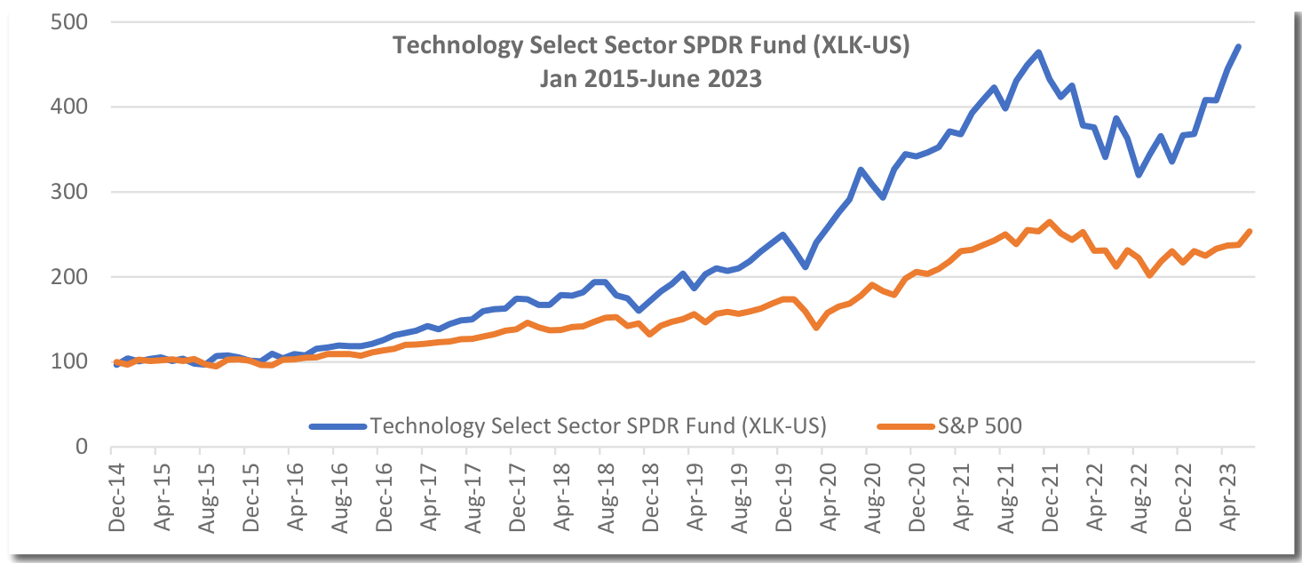
The Punchline: Bubble Example Set #4 – Information Technology
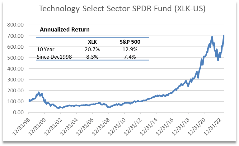
The IT sector is a bit more interesting; it differs from the rest. The oldest technology ETF is the Technology Select Sector SPDR Fund (XLK), which dates to December 1998. That provides only a year and quarter of history before the 1st technology bubble peak in March 2000. Even so, XLK almost precisely doubled in those 15 months. It took 15 years after the collapse to return to its inception price, and over 17 years to re-attain its prior peak. Since then, it’s almost tripled.
As an aside, that’s the unfortunately seductive aspect of anything that humans can buy that’s gone up and up and up for some period of years. XLK’s 10-year annualized return though June is 20.7% which is indeed extraordinary. Which is what induces the amnesia about the extraordinary losses that past bubbles ultimately created.
Over the 25 years since inception, including the doubling within its first year or so of existence, XLK’s annualized return has been only 8.6%. During almost the entirety of that generation-long span of time, through around 2018 or 2019, it did not do much better than the S&P 500, yet with a lot more volatility. By modern portfolio theory and practice standards, Technology—at least as represented in the indexes—has a sub-optimal risk/reward profile.
Source: Bloomberg
If you’re in IT now, which necessarily means if you’re in the S&P 500, and you’re doing great, you gotta ask yourself, ‘Is it the companies that are doing great, or is it the valuations? Are the preponderance of variables on my side or not?’ Or in Clint Eastwood movie action hero vernacular version of ‘How much risk do I take for a rewarding return versus how much extra risk for an extra rewarding return, “Do I feel lucky?”
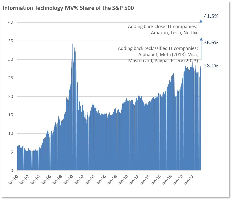
IT sector-weight history goes back to 1990. Up through 1993, it was 5% to 6% of the S&P 500. It reached its peak weight of 34.9% towards the end of March 2000 9 . By 2005, after the collapse, its S&P 500 weight eventually dropped to 15%. The officially stated weighting remained fairly constant for almost a decade, until 2014, when it began to rise again.
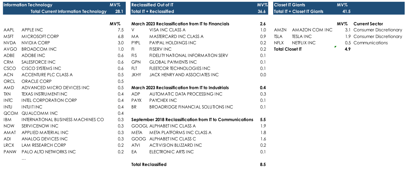
Today at 28%, the IT sector is back to its Dot.com bubble peak. This is an undercount, though: in 2018, Facebook and Alphabet were reclassified from Information Technology to Communications Services; in March 2023, Visa, MasterCard, PayPal and Fiserv, among others, were reallocated to Financials 10 . Had these not been removed, the possible reasons for which is another discussion, the official IT sector weight today would be 37%. This does not include, as reviewed earlier, Amazon and, up for debate, Tesla and Netflix.
| Source: iShares Core S&P 500 ETF ( IVV ) Holdings as of July 20, 2023. March 2023 Reclassification: https:// www.ssga.com/us/en/intermediary/etfs/insights/2023-gics-changes-companies-impacted-and-what-you-need-to-know September 2018 Reclassification: https:// www.morningstar.com/etfs/how-will-gics-sector-changes-affect-your-sector-etfs |
Now to the sector-weight history of the IT sector. Its reemergence from its long post-bubble collapse is unique. It truly has risen again, and to greater heights.
For those who don’t vividly recall, the prior Tech Bubble collapse was truly calamitous. Investors all, from individual to institutional clients, from their advisors to pension fund boards, were duly horrified. The talk, the fear, was about being able to retire, about pension funds being able to meet their obligations.
The SPDR Technology ETF dropped 80%, and even the S&P 500 dropped 46%.
IT Sector Growth – Early Warning Indicators
Returning to IT company valuations and growth rates, the slowest growth expectation is for the largest of them, Apple. It trades at 29x expected 2024 earnings. If a company of Apple’s size could persistently expand earnings at the projected 13% rate, it might be reasonable to buy the shares at a P/E of 29x. One needn’t be averse to paying 29 years’ worth of earnings if you had verifiable confidence in that growth longevity.
The question is whether it is reasonable to expect a $3.0 trillion market cap company with $390 billion in sales to expand at a 13% rate for the indefinite future.
IT Giants: Projected Growth Rates & Current Valuations
Source: Bloomberg as of June 2023. Estimated Compound Annual Growth Rate of Operating EPS over the company’s next full business cycle (typically 3-5 years)
If revenue is the base measure, then $400 billion annually is equivalent to $50 from every person on the planet every year. Of course:
- Even if Apple were a monopoly, only 63% of the global population have internet access 11 , so it can’t sell to every person.
- Apple could expand the size of the market, but, securing sales from the remaining third of the global population—the 2.8 billion people without internet access—is unlikely to be very profitable, even if network access could be achieved, unlikely as that is. The disposable incomes, if any, of this ‘untapped’ population, must be exceedingly low.
- The other means of expansion for smartphones sales— because Apple isn’t a monopoly— is to gain meaningful market share from the Android phone manufacturers. There is no evidence that this is happening. Apple’s global share is 30%. If the product line for internet access is broadened to include computers as well as phones, Apple’s iOS operating system has a 17% global share, to Android’s 43% and Windows’ 30% 12 .
If there’s no advantage of Apple’s iOS that enables it to naturally take market share from Android, then another growth avenue is to invest in expansion. Investment spending is an indicator of a company’s growth plans.
- In the past four years, Apple’s capital expenditures averaged only 85% of non-cash depreciation and amortization expense, which is a form of disinvestment, not investment. Capital expenditures as a percentage of revenue and of operating cash flow have also been in decline.
- In dollar terms, capital expenditures are unchanged from the 2013/2014 period. That’s another form of disinvestment, since the cost to maintain or replace plant and equipment is subject to inflationary effects, so that some portion of capital spending reflects price increases, not expansion.
- The revenue Apple generates per dollar of property, plant and equipment has been in decline, from $11.01 in 2014 to $9.99 last year. That suggests declining return on investment in physical capital.
- On the other hand, the company has relied heavily and successfully on outsourcing its manufacturing, so capital expenditures might be a misleading indicator of expansion spending. Research & development expense, which has not been externalized, has quadrupled since 2014.
Nevertheless, R&D plus capital expenditures have declined as a proportion of both revenues and operating cash flow. Combined, they amounted to 9.4% of revenues in 2022. Tired old Merck & Co., $270 billion market cap, price only 20% higher than in 2000, $60 billion of revenues, spent 23% of revenues on R&D last year.
Rearranging the figures a bit, the amount of revenue Apple generates per dollar of both R&D and capital spending has also declined, from $14.46 in 2014 to $11.95 in 2022. This is the opposite of what is seen in successful growth companies, which usually experience improved scale economies as revenues expand.
Apple’s minimalistic $37 billion of R&D and capital spending, that 9% of sales, is supposed to support 13% annual growth on a $400 billion revenue base, and incremental annual profit of about $10 billion. An incremental $10 billion would be a 27% marginal return on each year’s investment. That’s a pretty extraordinary fully taxed ROI.
Apple is just one example. Microsoft, though a somewhat different business with somewhat different elements, yields similar observations.
- Microsoft’s capital expenditures have been climbing rapidly, but it isn’t outsourcing production like Apple does. It is building data centers for the Cloud. Nevertheless, it has likewise been experiencing dis- economies of scale in the last several years, with declining revenue per dollar of R&D and capital expenditure.
- Yet, earnings expected for 2024, at $82 billion, would be a spectacular 100% marginal return on investment.
Another indication of what their managements believe about their growth prospects is bit more subtle.
- Both Apple’s and Microsoft’s depreciation expenses, as a proportion of their PP&E, are lower in the past few years. Those figures suggest a lengthening of the average estimated useful life of Apple’s PP&E, roughly, from about 3.3 years to 4.8 years; and for Microsoft from roughly 3.8 years to 5.9 years. In practice, as opposed to in financial statements, electronics and software product cycles generally have not been lengthening; they’ve been shortening.
As a point of comparison, CME Group’s electronics and software is no less important to its viability than are Apple’s or Microsoft’s. As the exchange’s only critical infrastructure, they form the platform that performs the trading, clearing and data provision functions. In fact, software accounts for over 40% of CME’s property, plant and equipment 13 . CME generally amortizes its capitalized computer software over two to four years. The implied estimated average life of its PP&E, at 3.4 years, hasn’t changed in the past few years.
Why would Apple and Microsoft, as two rapidly growing, leading companies in an industry dependent upon product enhancements and new product cycles alter their accounting conventions to lengthen the depreciation schedules of their assets? Toward what end? They’re not the only ones.
- Last year, Meta/Facebook and Alphabet/Google both revised the useful lives of their servers upward. This added nearly $1 billion of pre-tax profits for Meta and is expected to add $3.4 billion for Alphabet in 2023.
Microsoft followed suit, extending the useful life of its servers from four years to six, which would add an estimated $3.7 billion to operating income for this year. Absent the 5% increase to operating earnings from that accounting change, Microsoft’s operating income would be flat this year. Differing minds can debate the merits of extending the useful lives of such equipment. The accounting effect, though, is straightforward:
- By reducing the non-cash depreciation expense, stated earnings rise.
- The income tax burden, which is a cash expense, would increase, despite that economic earnings aren’t increased by that accounting change.
- Debatable is whether the enhanced stated earnings support a high or higher stock valuation, which does create a form of return, albeit not a direct economic return. (It’s not really that debatable.) This would be one of the many facets of the financialization of the economy in recent decades, which is a topic for another day.
The question to ponder for these IT companies, which are—or at least should be—capital-intensive businesses, is why they aren’t investing capital. Why would a company not do so in a business that has an astronomically high return on capital? If one accepts the working presumption that corporate greed, as channeled by embedded incentive systems, knows no bounds, there can be only reason for companies to not invest new capital: that their growth opportunities are not attractive enough.
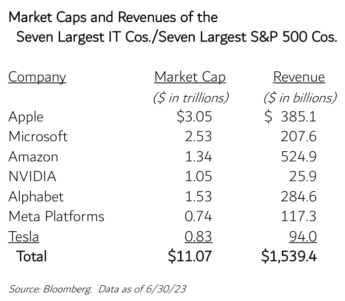
Apple and Microsoft, as singular examples, don’t necessarily address the larger question of scale limitations for the IT sector overall. That question can be posed by reference to the combined market capitalizations and revenues of the seven technology companies at the top of the S&P 500.
If their collective $11 trillion of market value were a GDP figure, as opposed an amalgam of subjective valuations, only two nations would have a larger one: the U.S. and China. The next largest would be Japan, at $4.4 trillion.
To be sure, market capitalization is a type of valuation, while GDP is a measurement of goods and services produced and sold—so the above comparison is a bit apples-to-oranges. One can simulate a GDP calculation for the technology giants by adding up their revenue, since GDP is a final sales calculation.
These technology giants’ combined annual revenues of $1.5 trillion is equivalent to 33% of the GDP of Japan, and roughly equal to Mexico’s. However, Mexico has a population of 126.7 million people. These seven firms collectively employ 2.347 million people—meaning they collectively produce revenues of $679,000 per employee.
The country with the highest GDP per capita is Monaco, at $234,317, three times higher than the U.S. Thus, the per capita revenue output of the seven technology giants, is 2.9x that of Monaco.
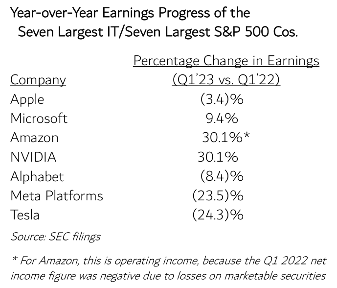
Collectively, these seven companies are 27.6% of the S&P 500. They trade at rather high multiples of forecasted earnings, which are presumed to grow at very high rates. However, they are not growing earnings at very high rates. For four of the seven, earnings were lower in the first quarter of this year than last year’s first quarter. Of the three positive results, Microsoft’s earnings were up only 9.4%.
This year through July 21st , the equity market does not appear to be troubled by these results—the stock price performance of these companies has been nothing short of sensational, with an equal-weighted average over 81%.
It is hereby acknowledged that this section’s analysis is, by degrees, complex or subtle, and could well be subject to flaws like data selection bias, since there are so many factors that can impact large, financially powerful and dynamic companies like these.
To whatever degree it is flawed, though, none of this analysis should be necessary. The entire Commentary was opened with the proposition that a bubble could be recognized by simply observing if the sector weight in the S&P 500—which is a valuation measure—is inflated by some multiple above its normal, economically rational level. Everything else is commentary and pleading and can be countered by opposing commentary or indifference; until the peak is passed.
A Non-Technical Take on a Rare Financial Instrument: Opportunity-Cost-Free and Insurance-Cost-Free Inflation Hedges (the Asset-Light and Royalty Business Models)
The Impossibility of Inflation Hedging Via Passive Investing
Most equity investments are now done via indexes like the S&P 500, the Russell 3000 or some subset, like S&P 500 Dividend Growth index. Technically the investment is an ETF that mirrors the index. As far as the holdings, there is no stock selection involved other than that, by definition, each of the holdings is a member of the index. If the S&P says you’re part of the index, then you’re part of the index, whatever the inclusion criteria are.
The inclusion criteria describe external particulars such as market cap, trading volumes, industry sector or growth rates. But there’s no analysis, no selectivity as to internal predictive characteristics of a business, because then it wouldn’t be passive investing, it would be active management. And that is why an index can’t be an inflation hedge.
Inflation is a different investment challenge, because the functional problem for a business in an inflationary environment is whether the operating expenses will rise faster than the revenues. If they do, then the company’s profitability will suffer. If sales growth exceeds expense increases, that’s a company that would benefit from inflation. But how do you know in advance without doing some fundamental analysis?
The basic inflation challenge for most businesses is that their greatest expense is employee compensation. Many people presume that if the inflation rate is 10%, a company could make up for it simply by raising the price of its product or service by 10% so as to afford an across-the-board salary increase, so the employees can maintain their purchasing power.
The oddity is that if a company did that, the employees would not keep pace with inflation. That’s because we have a progressive tax structure. In a workforce that receives a 10% salary increase, many employees will be pushed into a higher tax bracket; eventually, they all will be, and their take-home pay will decline. The only remedy is for the company to increase wages by more than 10%. But if it does so, it would not be inflation- neutral; its profitability would be hurt by inflation.
Another presumption is that a company could remedy that problem by raising its prices by 12% or some other sufficiently high number. Of course, that’s possible for one or a few companies, but it’s not possible in the aggregate. If every company raises the prices of their goods and services by more than the rate of inflation, that would no longer be the rate of inflation. The weighted total of all the price increases would be the new inflation rate.
The only kinds of businesses that can maintain their profitability in this circumstance are those with relatively low people expenses in relation to their revenue. But not all of such companies work that way. There’s also the challenge of asset intensiveness. Some businesses require substantial physical capital – plant and equipment, property – and the cost of maintaining those assets rises in an inflationary environment. The question then becomes whether customers will accept price increases for that company’s products above the increase in non-personnel operating costs. A certain amount of analysis is required, and that requires qualitative judgments, too. That’s active management.
Inflation is a certain contingency, and one that might not necessarily be probable, but which will have a serious systemic impact on a portfolio if it does occur. Most known contingencies have known forms of response or hedges, though their cost and effectiveness differ.
The greatest disadvantage is that it is usually very costly to maintain a hedge against a contingency whose arrival date is uncertain, or which has arrived but will be persistent—which is to say a long-term hedge. So much so, that very few people maintain hedges for other than short-term purposes, although short-term hedges are a very major business.
Royalty Companies
Which is why true inflation beneficiary businesses are so effective relative to the vast majority of other companies. Oddly enough, It is not actually so important that their earnings increase during a period of rising prices, because you can get that in any miner—at least for a while, before inflation pressures impact their own cost of doing business. It’s more important that they remain profitable during the long periods before that contingency manifests. Which is to say that the hedge actually earns a return during the interim. Pretty much every form of insurance costs money. For casualty insurance, it’s an explicit cost, the annual premium. For an asset like gold, it might incur storage costs, and it incurs opportunity cost in the form of foregone interest income that would have accrued in a money market or bond instrument. Over enough years, those are substantial.
Our focus has been on certain asset-light and royalty businesses that, being profitable even during non- inflationary environments, incur neither opportunity cost nor insurance cost. They are natural hedges
Source: Factset. Producer: Newmont Mining (NEM), Royalty: Franco Nevada (FNV), Commodity: LBMA Gold AM ($/ozt)
Source: Factset. Producer: Cleveland Cliffs (CLF), Royalty: Mesabi Trust (MSB); Commodity: CRB Iron Ore 62% FE CFR China Cash ($/t)
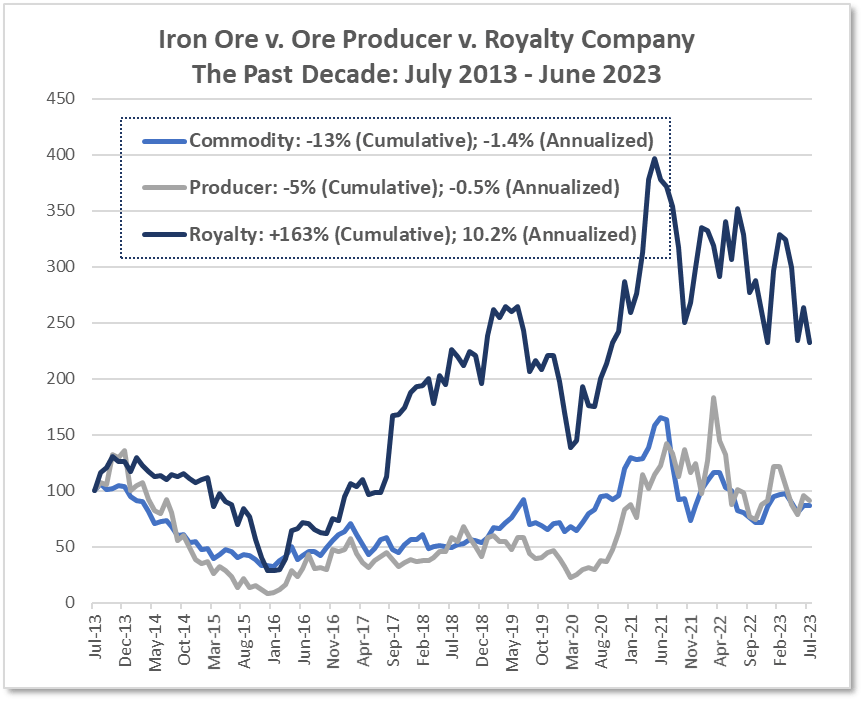
In the case of royalty companies, the inherent profitability of their asset-light operating structure can be visualized when their returns are charted alongside either the asset from which they earn their royalties or alongside a conventional operating company, like a miner, that earns revenues from the same asset. The substantial excess return of the royalty company in the accompanying charts is a visual depiction of the long-term earnings differential, captured over time in the stock return.
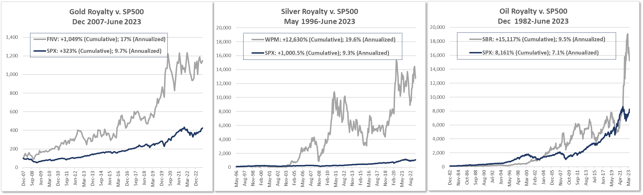
In the case of a gold royalty company like Franco Nevada, over the 15 years since it came public, it has generated a double-digit annualized return, versus a mid- single-digit rate of return from the underlying gold price. The price of one of the largest gold mining companies was flat. This remarkable return was simply the result of the accumulation and reinvestment of its high margin royalty earnings.
The same result is seen for an iron royalty company versus both iron ore prices and an iron ore miner: a double-digit annualized return over the course of a decade despite that the price of the underlying asset was in decline, as was the price of the miner.
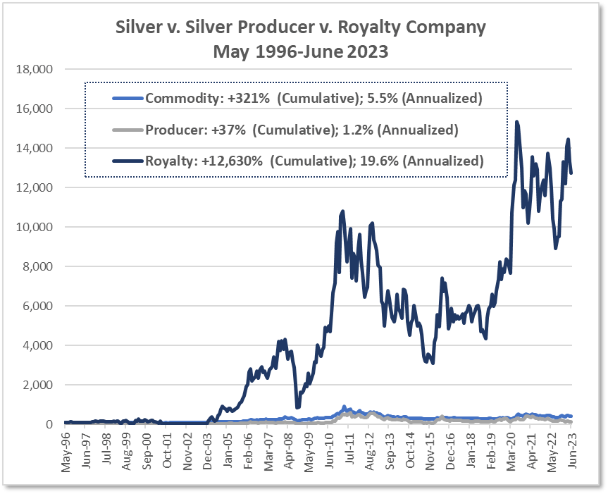
Source: Factset. Producer: First Majestic Silver (FR), Royalty: Wheaton Precious Metals (WPM), Commodity: LBMA Silver ($/ozt)
Wheaton Precious Metals was predominantly exposed to silver until 2015, when it changed its name from Silver Wheaton Corp. It now derives only roughly 50% of its revenues from silver. Its public price history dates to May 1996, and it likewise shows the same pattern of asset-light earnings-based returns versus the underlying commodity and the commodity producer.
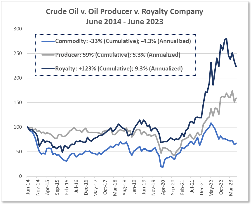
Source: Factset. Producer: Exxon (XOM), Royalty: Sabine Royalty (SBR), Commodity: WTI Crude Oil ($/bbl)
The case of the oil royalty company Sabine Royalty Trust is rather interesting. Sabine was chosen so as not to distract the attention with the words Texas Pacific Land Corp, which are of uncommon interest lately. Sabine has the distinction of being the oldest publicly traded royalty, so there’s plenty of historical data. Over the past 40 years since its IPO in 1982, it has returned an annualized 13.2%. The price of the underlying asset, oil, has risen by 2% a year, and ExxonMobil provided an annualized total return of 12.9%. The cumulative differential, is 15,117% vs. 122% for oil and 13,724% for the producer.
Source: Factset. Producer: Exxon (XOM), Royalty: Sabine Royalty (SBR), Commodity: WTI Crude Oil ($/bbl)
If the return period were to start in June 2014, after which oil dropped from its $100-plus range, the annualized return relationships would be no different: Sabine 9.3%; oil (4.3)%; ExxonMobil 5.3%.
Sabine shares some commonalities with TPL. As a Trust, it has been protected from potentially dilutive management decisions like issuing additional shares or making poor acquisitions. That management risk control feature was the case for TPL when it was structured as a trust. Sabine has NO employees at all. The only internal operating expenses that could be impacted by an inflationary environment are Trustee’s fees (0.3% of revenues) and outsourced administrative fees, such that it has a 97% pre-tax profit margin.
Sabine also demonstrates the plasticity of officially estimated reserve lives in response to improved drilling technology and higher oil prices, particularly if the geological reserves are extensive. The benefit of improved technology is clear enough. The impact of higher oil prices on stated reserves might be less obvious. At higher oil prices, existing oil reserves that might have been uneconomic to produce previously, become worthwhile to extract, and this difference is reflected in the stated reserves figures.
Over the past four decades, Sabine has produced 3x to 4x more volume than the original estimated reserves. The current reserve level is still two-thirds of the originally stated figures, and the estimated reserve life is still the same original 9-odd years.
The Sabine experience also highlights, particularly in light of global oil production capacity challenges, that it is critical to differentiate between ordinary energy companies and those with very long-lived reserves (which are difficult to find).
This final set of charts is more impressive, in its way. The message is not that these various royalty companies outperformed the S&P 500 over the past 15 to 40 years, but that for much or most of these periods, the commodities upon which they earn their revenues were flat to down—an extended bear market—while the S&P 500 was primarily in an historic extended bull market.
Securities Exchanges
Securities exchanges share a similar attribute with royalty companies: extraordinarily high free cash flow margins—the truer measure of profitability than GAAP net income—that essentially have no peer. They have sustainable after-tax free cash flow margins of 35% to 55%. The companies at the top of the S&P 500, widely considered to be the most profitable, are about half that level. The IT mega-cap companies average about a 20% free cash flow margin, and the largest other companies in the index, like UnitedHealth and Johnson & Johnson, earn about the same.
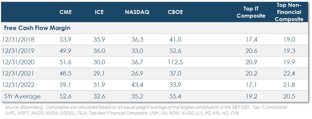
CME Group, for instance, has 3,460 employees. Its $5 billion of revenue amounts to $1.44 million per employee. Microsoft’s 221,000 employees generate $923,000 of revenues each, and Johnson & Johnson’s 152,000 employees produce $620,000. CME Group’s compensation and benefits are only 15% of revenues.
The only physical assets on the balance sheet, Property, amount to $455 million, which is dwarfed by its annual free cash flow of $2.6 billion. That’s an asset light business 14 .
Similar to the commodity royalty companies, one aspect of the past four decades has been distinctly unfavorable for exchanges. It was a period of persistently declining interest rates, not just domestically but globally. The excess money persistently pouring into financial assets and away from physical assets resulted in ever declining financial asset volatility—a side effect of the misallocation of capital from physical investments, as some economists would judge, and a marker of the financialization of the economy that characterizes this bubble period.
Moreover, the world’s central banks came to pursue similar, even coordinated monetary policies, with similar impacts on interest rates and financial asset valuations. This engendered an increasing correlation between different international economies and national stock and bond markets, suppressing what was once considered to be intrinsically different economic cycles among nations. For a time, much was written about the ‘correlation bubble.’ Though not so much lately.
That environment was hardly favorable for securities exchanges, whose earnings benefit from greater spreads and greater volatility in all the assets that various parties bring to the exchange to hedge risk. That includes interest rate risk, currency risk, credit risk, and on and on. Exchanges thrive on volatile, uncertain, and changing economic conditions. Their earnings will benefit from rising interest rates, any upheaval in currency markets, rising inflation, and the like.
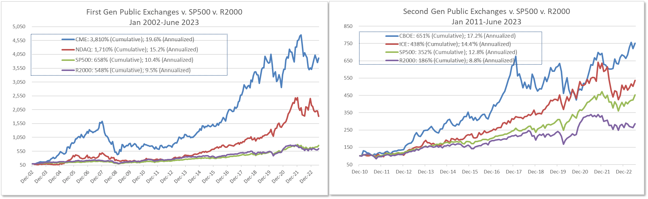
Irrespective of decades of less than advantageous conditions, though, exchanges are constant free cash flow and ROE generators. As with the royalty companies, their cumulative earnings manifested in stock returns that at least matched or dramatically exceeded the major indexes. As it almost must be, for the exchanges are the croupiers of the financial markets, always taking a small fee on the spread of activities in a very big game, and with almost no capital at risk. Restated for royalty companies, royalty companies are a form of croupier of the commodity markets, though through a different mechanism than the exchanges.
Valuation Note
I have been warned of a risk in presenting this cornucopia of impressive long-term return charts—that they might raise questions about the stock valuations. Along the lines of ‘if they’ve all done so well, isn’t it too late, haven’t we missed the boat?’ (Despite that the question doesn’t seem to arise for bubble sectors!) The answer is no, because those returns simply tracked the earnings trends of these companies. They earn more than the average company, and they earn a lot more than their conventional industry-sector counterparts, such as the miners.
A related question often comes after seeing Wall Street earnings estimates and P/E ratios in comparison with the stock market. The asset light company P/E ratios seem high. It is a faulty valuation measure, though, and gives the wrong result. Like comparing the identical temperatures of two houses, but one is in Jackson, Mississippi, with 90% average humidity and the other in El Paso, Texas (TPL country), with 50% humidity. It’s the right idea, but the wrong measure. One needs a wet-bulb thermometer reading.
The typical business, whether asset-intensive or employee-intensive, requires substantial reinvestment of earnings each year just to stay competitive, whether it’s to replace ageing equipment or develop improved equipment. This means that stated net income, which is what the P/E ratio is about, doesn’t necessarily measure true profits.
If you were the 100% owner of Pepsico, as your private company, its $8.98 billion of net income would not be something you could put in your bank account each year. That’s because, in 2022, you had to spend $5.2 billion to maintain your business and keep from falling behind. Based on what’s left over, what you could put in your pocket, your true P/E would not be 29.2x last year’s net income, it would be 38.3x 15 .
So, the apples-to-apples valuation comparison—like historical sector weights, also not a standard feature on financial websites—is on a post- capital-expenditure basis.
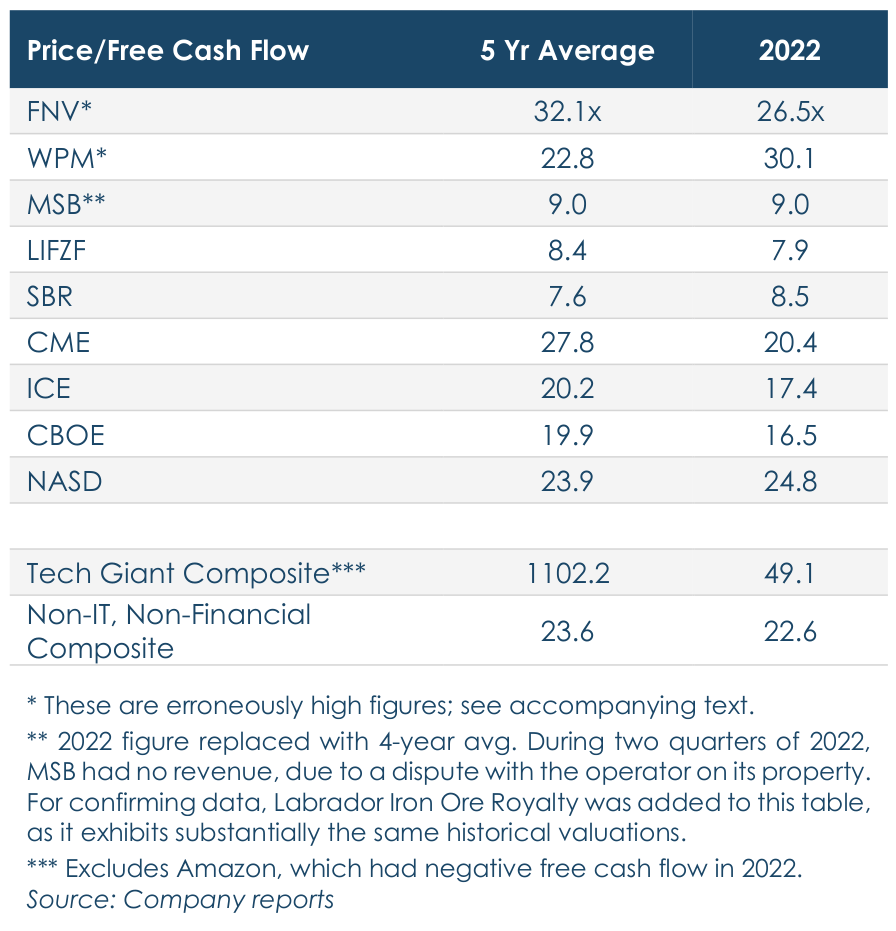
On this basis, the asset light businesses are priced something like what’s shown in the accompanying table.
Like everything in investments, you can’t simply rely on any unidimensional set of figures or formulas, as attractive as that prospect might be. If it were that simple, anyone could outperform. But that means everyone could outperform, and that can’t happen. As so often, the Devil is in the details; on the other hand, the details revealed by the extra work can be advantageous.
In summary, the IT companies at the top of the S&P 500 traded, at year-end 2022, at an average 49x that year’s free cash flow. This is an invalid number, though. It excludes the negative 35x multiple of Amazon. Obviously, if there were a way to include a valuation multiple for Amazon, the IT group multiple would be even higher than reported.
This short discursion is important no matter what style of equity investor one might be, because that is how the P/E ratio on any index or ETF is reported: the negative figures are removed, which markedly lowers the reported valuation vs. the financial reality.
For the representative royalty companies, the average valuation on 2022 earnings was 18x, which is consistent with the 5-year figure. This is erroneous, too. Two Devil’s details about this figure.
- There’s a sharp divergence between the single-digit valuation multiple of the iron ore and oil royalty companies and the 25x to 30x range for the gold and silver focused companies. Does that mean the precious metals miners are that much more expensive? Or that they are even expensive?
- What the summary figure can’t show is that only one quarter of the over 400 properties that Franco Nevada has a royalty interest in are being actively operated. The rest are in various states of development. In unrealistically simplistic fashion, without regard to what percentage of these mines might never be productive or how long it will take for all of them to begin operations, this means Franco Nevada’s royalty revenues could be four times higher than they are now. That’s based on investments the company has already bought and paid for, so to speak. The true valuation multiple, however that might be calculated is far, far lower. That is how single-factor, unidimensional growth or valuation statistics can be very misleading. It’s an example of why indexes can’t be inflation hedges, because they cannot make such evaluative judgments. A ‘value-oriented’ ETF, for instance, would have to reject Franco Nevada as expensive, even though it’s actually inexpensive.
- For Wheaton Precious Metals fewer than two-thirds of its royalty-interest properties are now producing revenue, the rest being in development.
The four major U.S. securities exchanges traded at an average 19.8x free cash flow at year-end 2022.
Are There Private-Investment Ways to Participate in the Inflation-Beneficiary Strategies?
A number of clients have raised this question recently. The idea is to try to avoid the severe-market- downturn-phenomenon, when selling in one sector can beget selling in every sector, and substantially all publicly traded securities drop together, at least for a time.
First, that is not always true. During the three years of the Dot.com bubble collapse that began March 2000, the annualized return of the Horizon Kinetics equity strategies did quite well simply by not owning technology and unregulated utilities (think Enron), particularly as a lot of investment capital fled the collapsing sectors straight into high-quality blue-chip companies like the pharmaceutical giants. In this coming cycle, if the precipitating event is a commodities-based inflation surge, the core royalty and exchange holdings might do quite well even in the moment.
Nevertheless, that is just a supposition, and the question is legitimate. A private company has the advantage of being free from the momentary selling decisions that impact publicly held stocks. Horizon Kinetics has, indeed, created a number of private investment vehicles in recent years. They are pretty much all centered around business that are inherent inflation beneficiaries, and most have very significant expansion potential. Here is a short summary.
A convenient segue into the oldest of these efforts is to finish reviewing the securities exchange sector.
Miami International Holdings
We do actually have a fund to invest in a rapidly growing private securities exchange, the Miami Stock Exchange, or MIAX. To understand it better, a little more background about the exchange sector.
There has been a lot of consolidation among exchanges. A notable example is CME, which acquired the Chicago Board of Trade in 2007, NYMEX (the New York Mercantile Exchange) in 2008, and the Kansas City Board of Trade in 2012. There are two main motives for acquisitions.
-
- When one exchange buys another, it not only acquires market share, but also new trading products, which provide asset class diversification.
- A less strategic but quite impactful motive is to centralize the additional trading volume of the acquired firm onto the acquiror’s electronic trading and clearing platform. This eliminates an entire set of duplicative operating expenses. On the other hand, if the acquired exchange happens to have superior technology, the buyer can shift its own business onto the acquiree’s system. This is a form of technological arbitrage.
The consolidation process is slowing, because there are a limited number of regulated exchanges permitted in each country. This is largely a function of the regulatory environment, since these are heavily monitored businesses, and the regulatory agencies don’t relish increasing the burden on their oversight capacity. Regulators prefer fewer exchanges to monitor, not more.
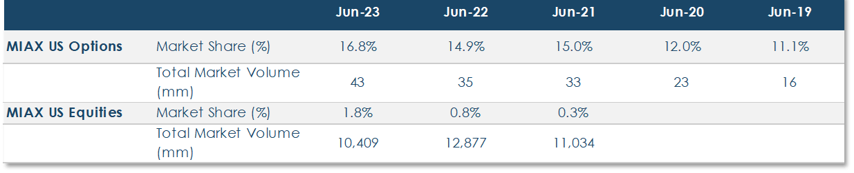
Accordingly, a new exchange is a rarity, but MIAX is an exception. It only commenced in 2012, but has already captured 16.8% of all U.S. options trading. as of June 30th. It is expanding rapidly; in June 2022, its market share was 14.1%, in June 2020 it was 12.0%, and in June 2019, 11.1%. Plus, that’s a growing share of an expanding market, because total U.S. options trading in June 2019 was 16.3 million contracts, and the June 30, 2023 figure was 43 million, 2.6x larger.
Another MIAX venue is soft commodities, via the Minneapolis Grain Exchange, which was acquired in 2020.
Some of the MIAX products got a later start. The. SEC approval for U.S. equities trading followed MIH’s agreement to acquire the Minneapolis Grain Exchange, which owns one of only five clearing licenses in the
U.S. This is a very valuable strategic asset. All of the large exchanges Nasdaq, ICE, CME, and CBOE 16 , via consolidation, also have clearing licenses. MIAX’s. equities trading, which is important to support the options business, is up to a 1.62% market share. As small as that is, it was half that, at 0.84% in June 2022, and 0.26% in June 2021.
MIAX also trades a competing S&P 500 volatility product called SPIKES. Given the great size of the VIX futures market, and certain tracking advantages of the SPIKES version, this could eventually be a very sizable business.
In 2019, MIAX acquired The Bermuda Stock Exchange (BSX), which is a platform for some very interesting off-shore products and growth possibilities in a well-regulated offshore market. BSX is an SEC-designated offshore securities market, which has a formal reporting relationship with the SEC. That puts BSX on par with the likes of the Frankfurt and London stock exchanges, the Mexico and Montreal exchanges, Oslo, and so forth. Of particular interest:
- BSX is the leading market for reinsurance bonds. These have unique yield and independent correlation characteristics that are attractive to many types of institutional investors. It is a growing market.
- BSX’s flexibility to more readily list cryptocurrency-related products like Bitcoin and Ethereum futures.
Among MIH’s investments in serving the cryptocurrency asset class, this May it fully acquired LedgerX, a CFTC-regulated futures and options exchange and clearinghouse that offers both Bitcoin and Ethereum options, swaps, and futures. These include what are termed mini contracts that are 1/100th of a bitcoin and 1/10th of an ETH, so as to be usable by individual investors. Since launch, investors have traded over 12 million contracts, representing over $1.1 billion of notional value. MIAX recently announced that it would be trading additional cryptocurrencies.
In 2022, MIH filed with the SEC for a proposed IPO, which was postponed later in the year after the 25% market decline. The registration statement was not withdrawn, though, and an IPO is still planned.
Side Note: The Important Juncture of Regulated Securities Exchanges and Cryptocurrencies
MIAX’s growing cryptocurrency involvement is hardly distinctive. There isn’t a major regulated securities exchange that is not participating in some manner. Last quarter’s Commentary described the substantial digital asset investments and trading by the two largest U.S. exchanges, CME Group and Intercontinental Exchange, none of which happened without detailed regulatory review and approval. Since then:
- The CBOE now operates a digital asset exchange that trades spot cryptocurrency. Cboe Digital lists five products: bitcoin, Bitcoin Cash, Ethereum, Litecoin, and USD Coin.
- The London Stock Exchange has a digital asset trading venue that will provide clearing services for cash-settled bitcoin index futures and options.
- The Deutsche Boerse acquired a small cryptocurrency custody company and a crypto data analytics company.
The important question is, Why are they all doing this? There is one answer that says it all. And it’s just a single number. That number is $11.6 billion 17 .
That is the average daily dollar value of bitcoin traded last week.
Apple has a $3.02 trillion market cap, over 5x greater than Bitcoin, and is universally accepted as a high- quality growth company extraordinaire. Over the same week, Apple’s 5-day average trading volume was $12.1 billion. But that’s not an apples-to-Apple comparison. Bitcoin trades 7 days/week, Apple 5 days. On a 5- day-equivalent basis—times 7÷5—Bitcoin traded $16.2 billion/day last week.
Now you can see why the exchanges are getting involved. These numbers also answer a frequent cryptocurrency acceptance question; there’s more than $10 billion a day of active, applied acceptance of Bitcoin.
It doesn’t end there. Ethereum’s 7-day avg trading volume is $5.6 billion. This is about equal to the trading volume of Meta Platforms, depending whether you use the 7-day trading or the 5-day-equivalent volumes.
Also, these figures are for spot trading. They do not include futures and derivatives volumes. And there are lots and lots more cryptocurrencies.
The exchanges are the tollbooths onto the freeway through which crypto trading will flow. To be a serious global institutional-ready asset class, an orderly, regulated/self-regulated structure is required, and that is precisely what the securities exchanges have done for a very, very long time. Theirs is a proven structure upon which regulators have been able to rely and with which they work extremely closely. This could be a major secular benefit to the exchanges.
How major? In success mode, as one comparator among many, foreign exchange trading on a typical day amounts to $7.5 trillion, an amount that is universally anticipated to increase. That is about 138x the notional value of gold futures trading and about 19x the current value of U.S. equity trading. On a risk/reward basis for the exchanges, though, they have invested very modest amounts in these early ventures, so if those ventures fail, they will simply go on as they always have.
Consensus Mining & Seigniorage Corp. ( CMSC )
Say whatever else you will about it, cryptocurrency mining is, in the proper use of the term, unique. There is no other form of business with its characteristics, and it is wholly uncorrelated with anything an investor can actively find or accidentally trip over in any asset allocation offerings. There are a handful of publicly traded crypto mining companies, but they operate very differently than Consensus Mining and with different strategic objectives.
Company Background CMSC was formed in late 2021, when Horizon Kinetics combined two private mining funds that originally date to 2017. Those were established first with our own and, eventually, with client capital. CMSC has strategic partnerships with Horizon Kinetics in hosting, server repair and management that enable it to operate with minimal overhead, which is an important operating feature.
Administrative operating expenses for 2022 were only about 3% of revenues. This may be compared with an average 43% for other publicly traded bitcoin mining companies, a burden largely due to executive compensation, but there is no small amount of other overhead, like investment banking fees, legal, marketing, and so forth. CMSC carries no debt, with assets comprised of cash, PP&E and mined coins.
Bitcoin mining, the blockchain—the true efficient market—is revolutionary in more ways than one. Rather unlike the Efficient Market Theory that is presumed to operate for publicly traded stocks. Mining is a profitable endeavor, if done with proper understanding of the shifting cost, revenue and profit margin dynamics of the Bitcoin ecosystem. A unique aspect of mining is that all the data one requires to make those determinations is immediately available, along with built-in analytics to help. Not much guessing required, and no one has an information advantage. That’s because the blockchain software is all open-source code; every participant can see the entirety of the system’s operating activity. Therefore, everybody is – or, at least, can be – on the exact same basis.
General Motors can’t take a quick look at Tesla’s operating efficiency figures or see how many shifts it’s running, at least not without a corporate espionage budget. Unlike for a typical business, mining servers can be turned off immediately, if one of the cost variables, like electricity, crosses a certain threshold during the course of a day, and be turned on again just as quickly. A car manufacturer can’t do that, nor could the utility providing the electricity; it would be far more costly than absorbing a few hours’ loss. The point is that a cryptocurrency miner has unusual flexibility around if/when and at what price to deploy capital (to buy additional servers) and operate its servers, along with other pricing and expense variables, so as to only operate when it’s profitable to do so.
What Mining is Really About The strategic reason for mining—at least CMCS’s reason—is very different than people tend to think. The “mining” terminology is sometimes misleading. It is not the gold mining model, of mining a bitcoin and then selling it for cash. The intent of a fixed-issuance cryptocurrency is to escape the inevitable debasement of fiat currency, so why would one wish to mine for bitcoin, produce a profit, and then exchange that profit for the fiat currency? The idea is to accumulate bitcoin, not U.S. dollars—which, by the way, returns to the notion of a hedge against a known risk.
Back to the gold mining analogy, what if, in the year 1900, some mining company owner had the epiphany to only sell enough gold to cover operating costs and keep the remainder in a vault, meaning on the balance sheet. One can imagine what that company’s net asset value would be today relative to an ordinary miner with the same production history that just sold its gold production along the way. The answer is obvious; the accumulator’s net asset value would be far, far greater.
The analogy ends there, though. Although there’s a lot to be said in favor of gold, it can’t begin to approach the ultimate potential value of cryptocurrency. If the price of gold rises enough, there will eventually be more supply, limited only by how rapidly mining can be expanded. Perhaps sufficient supply to cause a price collapse. No matter how high the price of bitcoin gets or how high the demand, the ultimate supply stays constant. If there’s greater demand, the situation will be characterized by digital scarcity. CMSC is designed to hold digital scarcity instead of gold scarcity.
An ETF Improvement Machine
CMSC has an additional strategic dimension. This too, is not about the mining per se, but what the mining economics do. They have a transformative attribute. When CMSC buys a mining server, it is essentially paid for with its mined bitcoin reserve. That server has an operating life of several years, after which it is no longer profitable to operate. The business objective is to have earned enough bitcoin by that time to have paid for the server and its operating expenses and to have some additional increment of a bitcoin left over. That is, through the process of mining, to turn a given quantity of bitcoin into a bigger quantity. A finite-life, fully-paid-for server is converted into an infinite-life coin with digital scarcity value.
If that process continues over time, more and more bitcoin will accumulate on the balance sheet. At a certain point, that becomes interesting. Presently, there is controversy about if and when the SEC will approve an ETF for spot or actual bitcoin; it has already approved bitcoin futures ETFs. If CMSC, as an example, were to eventually accumulate enough bitcoin, it could be viewed as an alternative to an ETF. A prospective ETF buyer might find this operating structure to be superior in some ways.
For ease of explanation, consider a bitcoin ETF that exists in a steady state mode—no money coming in for new purchases, and no requests for redemptions—so that it owns a constant number of bitcoins. Except that it can’t own a constant number. An equity or bond ETF extracts its fees from the dividend or interest payments. But there are no bitcoin dividends or interest. A bitcoin ETF would have to sell sufficient bitcoin to pay the fee, so the per-share number of bitcoin would be in constant decline. Over time, the cumulative difference would be impactful. An operating miner that ‘banks’ its bitcoin earnings and accrues an ever- greater balance sheet position, might be a superior vehicle. The potential market for such a vehicle could be very large.
CMSC is preparing for a direct listing on the OTC Markets. This could take place in late 2023 to early 2024.
As an end note, the term “seigniorage” in CMSC should not be ignored. It was historically the prerogative of kings and other potentates and, in recent history, central banks to create money. It is an interesting, well- researched study topic that confirms what seems to be universally intuitive and lived knowledge: that the right to create money, seigniorage, is very profitable. As some comedian might say, with the appropriate intonation, “Otherwise, they wouldn’t do it.”
Diamond Standard Ltd.
Through proprietary, patented software and technology, Diamond Standard, established in 2018, accomplished something not previously possible. It found a way to make diamonds, notoriously individually unique, a tradeable, fungible commodity, like gold or silver, with precise dollar-value quantities, like $5,000
worth or $50,000. That opens the door for diamonds to be used in conventional portfolio-based asset allocations, just as for gold. That’s an extraordinary accomplishment: creating a wholly new global-scale investable asset class.
Diamonds have always used as a store of value: they have the greatest value-density of any ordinary physical asset; $10 million worth can be carried in your jacket pocket. But they’re not homogenous, like gold: each diamond is unique, every ounce of gold the same. There couldn’t even be a reliable diamond price index, although generalized working indexes have been created. That will now change.
Diamond Standard’s conceptual and technological breakthrough—or rather, that of its founder and CEO, Cormac Kinney—was to make the calculations and design the selection process to algorithmically select and assemble a packet of several diamonds from a very large sample of millions, each of varying size and quality, but which together amount to a precise value.
The company’s first ‘coin’, a $5,000 denomination, was sold in April 2021, and its first $50,000 ‘bar,’ designed to be 10x the value of a coin, was sold in March 2022.
Since then, the company has taken the series of steps necessary to create an institutional-investor-ready asset class, which requires, among other things, a diamond trading market with price transparency and regulatory oversight.
- In May 2022, it established the Diamond Standard Fund, an unlisted, closed-end fund for accredited investors, that holds diamond packets. The fund was co-sponsored by Horizon Kinetics, which also has an equity interest in Diamond Standard itself.
- At the same time, it established the Diamond Standard Index, which is available on Bloomberg LP and Revinitiv.
- Thus far, regulators have approved a proposed plan for Canadian publicly traded vehicles to hold Diamond Standard’s coins and bars. The ETF itself is expected to be approved for launch later this year.
- The CBOE has completed its legal due diligence and agreed to list carats on its spot market in the
U.S. A DS carat is a $1 share of a DS coin or a bar (used interchangeably). Carats represent electronic document titles to underlying commodities—and are therefore commodities themselves, not securities. Because CBOE is CFTC regulated, the completion of this process signals an affirmation that carats are indeed a commodity. The listing, tentatively scheduled for this coming September, is especially important because it will provide a national market clearing price on a regulated exchange.
Futures and options trading are one of the final critical steps to gaining institutional acceptance, since these firms require such instruments to manage the liquidity and volatility of their positions.
There are two particularly relevant aspects of the diamond market that are germane to the question invited this section: Are there any private-investment methods to participate in the inflation-beneficiary strategies? There are two in particular worth noting:
- First, is the sheer magnitude of the natural demand for an institutionally tradeable diamond commodity in relation to its current almost negligible size.
- Second is that there is no market with as favorable a set of supply/demand characteristics as diamonds. Possibly, financial history has never witnessed such a favorable combination.
Market Demand Magnitude
Were there none of the valuation challenges for a diamond buyer or seller, no required face-to-face for the transaction, no security and custody concerns, one can imagine how different that world would be. Those are the reasons why investors are estimated to hold roughly 30% of the $9 trillion of investable gold supply and about 15% to 20% of the supplies of silver, platinum and palladium. But for diamonds, only about 1% of the $1+ trillion supply is held by investors. The demand opportunity—one might well call it the pent-up demand opportunity—is somewhere within that very great scale. Diamond Standard has created and, in a variety of business expansion paths, sits in the center of that opportunity.
Supply Decline Diamonds are unique in a different way, too, the import of which can’t be overemphasized. The available geological supply available to be mined is shrinking. The first figures to be aware of are of global production. In 2005, global production was 177 million carats; in 2021, the most recent tally, the figure was 116 million.
Global Production, Rough Diamonds, 2005-2021
/274921/worldwide-production-of-rough- diamonds/
In isolation, this might be interpreted as a cyclical decline subject to rebound. That would be a valid assumption for oil or gold, for which there are substantial in situ supplies. The only limiting factor on additional supply today is the prevailing price; that is the limiting factor holding economically feasible production to the current levels.
For diamonds, the limiting factor is geological. Around the world many of the relative handful of major diamond fields will be exhausted within the next 10 years. Diamonds are typically found in geological structures known as kimberlite pipes, a column of magma ejected from deep within the Earth into the Earth’s crust. The process is similar to the creation of a volcano, with the salient difference that the magma does not reach the surface. The kimberlite structures were created hundreds of millions of years ago, and only a limited number are accessible with modern mining technology.
Geologists believe that the bulk of the planet’s gemstones are located 150 kilometers below the surface of the Earth and cannot be extracted by conventional means. By comparison, the Komsomolskaya coal mine in Russia, its deepest, is about 1,100 meters deep. The deepest mine in the world is an AngloGold Ashanti mine in South Africa, which extends 3.84 kilometers.
On a market demand/supply/investment return basis, one can make the ready inferences from the proposition that the diamond market is at the inception of an orders-of-magnitude global demand increase and an intersection with, at the least, a geologically limited ability to even maintain supply.
The Artificial Diamond Factor It’s easily understood why some people have perceived the Diamond Standard venture to be at risk from the threat of artificial, or lab- grown, diamonds. They are less expensive and have been represented as more environmentally benign, since they are not mined.
However, lab-grown diamond prices have collapsed in recent years. It is estimated that current artificial diamonds sell at a 75% to 90% discount to natural diamonds 18 .
This outcome is entirely consistent with the 2,000- year-plus recorded history of money creation and debasement. Every form of money or store of value for which the supply could be increased at will eventually collapsed. It need not even have been supplied by a central authority like a king or central bank. In colonial America, there was a brief period, during a severe shortage of coinage, when sheafs of tobacco leaves were used as money, good enough money to be accepted in payment of taxes and in exchange for gold. Tobacco farmers, of course, grew more and more tobacco, so that after not so many years, the prices collapsed.
Natural diamonds are not only a limited-supply resource, they are on a geologically-limited supply decline curve. They can be a store of value, because they have scarcity value. Establishing a true, new global institutional asset class, should this come to pass, is a very big deal.
As to the environment-damage footprint of artificial diamond manufacture, in creating the required intense pressure and heat conditions, it is highly energy intensive. On average, according to one study, producing one polished carat of lab-grown diamond releases three times the amount of greenhouse gases as one polished carat of a mined diamond 19 . Therefore, the choice of one over the other for environmental reasons is not clear-cut.
That’s the broad brushstroke picture of Diamond Standard as an investment proposition.
Footnotes1 Not officially; more on this below. 2 Q1 2023. 3 As of July 20, 2023. 4 https:// www.rochester.edu/newscenter/much-ado-about-nothing-329352/ 5 How Reliable Are Weather Forecasts? 6 Naomi Oreskes ,The Scientific Consensus on Climate Change.Science306,1686-1686(2004).DOI:10.1126/science.1103618 7 At both the Yen/Dollar exchange rate at the time and today, which, interestingly, is the same 138¥/$. 8 December 1980 Inflation Adjusted Price. 9 March 27, 2000 10 https:/ /w w w.ssga.com/us/en/intermediary/etfs/insights/2023-gics-changes-companies-impacted-and-what- you-need-to-know 11 https:/ /w w w.statista.com/study/12322/global-internet-usage-statista-dossier/ 12 Internet users worldwide by OS 2012-2022 | Statista 13 Gross property before deducting accumulated depreciation and amortization. 14 There is a very large intangibles asset balance, but that is the result of periodic strategic acquisitions; it is not an asset that requires maintenance or reinvestment in the way that operating assets do. 15 Using a simplified free-cash-flow calculation that does adjust for special charges and gains, but not stock-based compensation, changes in current assets and liabilities, and related short-term adjustments. 16 CBOE clears the VIX through Option Clearing Corporation 17 Average bitcoin daily trading volume from July 17 – July 23, 2023. Source: Bitcoin price today, BTC to USD live, marketcap and chart | CoinMarketCap 18 https:// www.cnbc.com/2023/06/22/diamond-prices-have-fallen-18percent-from-their-peak-and-analysts-predict-more- pain.html 19 https:// www.gemsociety.org/article/sustainable-alternative-to-diamond-mining/ IMPORTANT RISK DISCLOSURES:The charts in this material are for illustrative purposes only and are not indicative of what will occur in the future. In general, they are intended to show how investors view performance over differing time periods. Past performance is not indicative of future results. The information contained herein is subject to explanation during a presentation. Certain of the material herein is intended to portray the general nature of investor communications provided by Horizon Kinetics from time to time to existing clients. None of the investments or strategies referenced should be construed as investment advice and just because one investment is appropriate for one account does not necessarily mean it is appropriate for another. No investments should be made without the analysis of, among other things, an investor’s specific investment objectives, which considers their overall portfolio and any income requirements. The accounts referenced herein pursue an unconstrained strategy – meaning they are not limited by capitalization, geographic region, or investment techniques. They generally primarily seek capital appreciation with a secondary objective of income. Note that indices are unmanaged, and the figures shown herein do not reflect any investment management fee or transaction costs. Investors cannot directly invest in an index. References to market or composite indices or other measures of relative market performance (a “Benchmark”) over a specific period are provided for your information only. Reference to a Benchmark may not reflect the manner in which a portfolio is constructed in relation to expected or achieved returns, portfolio guidelines, correlation, concentrations, volatility or tracking error targets, all of which are subject to change over time. This material references cryptocurrencies, including bitcoin. Horizon Kinetics’ subsidiaries manage products that seek to provide exposure to bitcoin and other cryptocurrencies. The value of bitcoins is determined by the supply of and demand for bitcoins in the global market for the trading of bitcoins, which consists of transactions on electronic bitcoin exchanges (“Bitcoin Exchanges”). Pricing on Bitcoin Exchanges and other venues can be volatile and can adversely affect the value of the bitcoin. Currently, there is relatively small use of bitcoins in the retail and commercial marketplace in comparison to the relatively large use of bitcoins by speculators, thus contributing to price volatility that could adversely affect a portfolio’s direct or indirect investments in bitcoin. Bitcoin transactions are irrevocable, and stolen or incorrectly transferred bitcoins may be irretrievable. As a result, any incorrectly executed bitcoin transactions could adversely affect the value of a portfolio’s direct or indirect investment in bitcoin. Only investors who can appreciate the risks associated with an investment should invest in cryptocurrencies or products that offer cryptocurrency exposure. As with all investments, investors should consult with their investment, legal and tax professionals before investing, as you may lose money. The S&P 500 Index (“SPX”) is a broad- based index widely considered as a proxy for overall market performance. It is the property of Standard & Poor’s ®. This is not an offer to sell or a solicitation to invest. Opinions and estimates offered constitute the judgment of Horizon Kinetics LLC (“Horizon Kinetics”) and are subject to change without notice, as are statements of financial market trends, which are based on current market conditions. Under no circumstances does the information contained within represent a recommendation to buy, hold or sell any security, and it should not be assumed that the securities transactions or holdings discussed were or will prove to be profitable. Subsidiaries of Horizon Kinetics LLC manage separate accounts and pooled products that may hold certain of the individual securities mentioned herein. For more information on Horizon Kinetics, you may visit our website at www.horizonkinetics.com. The Core Value and Small Cap separate account strategies are managed by Horizon Asset Management LLC. Not all investors will experience the same holdings, returns or weightings as the corresponding composite. No part of the research analysts’ compensation was, is, or will be, directly or indirectly, related to the specific recommendations or views expressed by the research analysts in this report. No part of this material may be copied, photocopied, or duplicated in any form, by any means, or redistributed without Horizon Kinetics’ prior written consent. ©2023 Horizon Kinetics LLC ® All rights reserved |
Editor's Note: The summary bullets for this article were chosen by Seeking Alpha editors.
For further details see:
Horizon Kinetics Q2 2023 Commentary