TPLC - Private Domestic Sector Prints -$10 Billion Deficit Pointing To Worse Markets In November
2023-11-13 04:17:21 ET
Summary
- US sectoral flows for October 2023 show a deficit in the domestic private sector, negatively impacting asset markets.
- The federal government injected $76 billion into the private sector, but bank credit creation decreased by $15 billion.
- Fiscal flows are expected to continue supporting the economy and fueling the bull market during the Presidential election year.
The purpose of this article is to examine the US sectoral flows for October 2023 and assess the likely impact on markets as we advance further into November 2023. This is pertinent as a change in the fiscal flow rate has an approximately one-month lagged effect on asset markets and is a useful investment forecasting tool. Other macro-fiscal flows can point to events months or years ahead.
The table below shows the sectoral balances for the US which are produced from the national accounts.
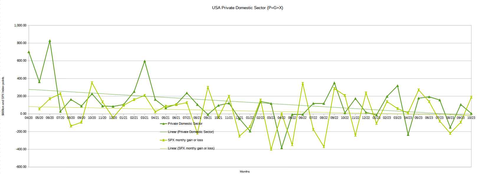
In October 2023, the domestic private sector recorded a deficit of -$10B and this is a negative result for asset markets as financial balances in the private sector have fallen overall month over month.
From the table, one can see that the -$10+ billion private domestic sector funds deficit came from a healthy $76 billion injection of funds by the federal government (and this includes the new injection channel from the Fed of around $11B from interest on reserves that went directly into the banking sector), less the -$71B billion that flowed out of the private domestic sector and into foreign bank accounts at the Fed (the external sector X) in return for imported goods and services. Bank credit creation went backward with a minus -$15B and resumed the downward trend in bank credit creation that started in January of this year. Bank credit creation will be discussed in more detail later in this article.
The chart below shows the sectoral balance data plotted in nominal terms. The calculation is federal government spending or G, plus the external sector (X and usually a negative factor) to leave that amount of money left to the private domestic sector, or P, an accounting identity true by definition.
US treasury and SPX and author calculations
The chart suggests that the SPX's next move would be for flat to lower markets given that financial balances in the private domestic sector have fallen in October by a substantial amount month over month. One would expect the monthly close for the SPX to be the same as or slightly lower than the last.
The following chart emerges when one graphs the change rate of the information in the US sectoral balances table above and adjusts for impact time lags. This is like a long-range market radar set.
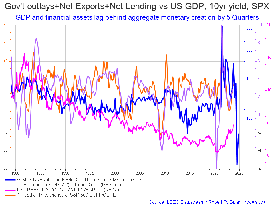
The blue line shows the fiscal impulse from federal government outlays plus bank credit creation and less the current account balance and leads by up to five quarters (a year and three months). Short term, the financial aggregates, and following co-variant factors, are rising into 2024 whereupon they come down sharply.
The important change over the last month is that the blue line has been updated and now shows the recovery of the fiscal spending impulse change rate at the end of the first half of 2024. So we now know there will be weakness in the middle of next year and that it does not go further or last much longer. For a time there the drop was looking prolonged and precipitous.
This model provides a guide to inflection points but not to the depth of those changes of trend.
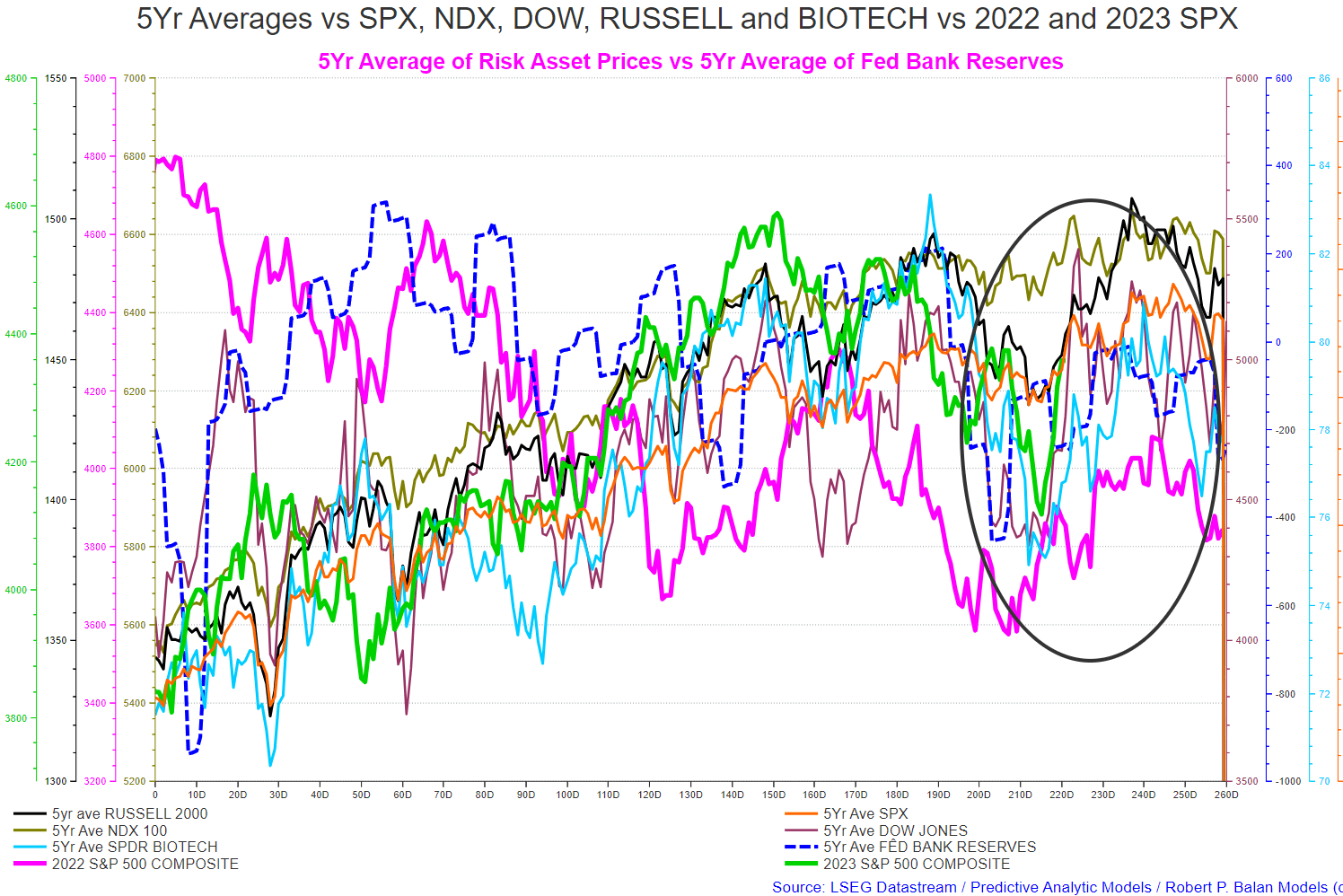
The chart below shows the five-year average of the seasonal stock market patterns for the SPX ( SPX ), NDX ( NDX ), Dow ( DIA ), Russell 2000 ( RTY ), and Biotech ( IBB ) market indexes. The black oval shows roughly where we are (trading day 204) at the time of writing and the end of the green line on the chart below.
The five-year index averages call generally rising markets from now (trading day 225 at the time of writing) into trading day 240 (early December) and then flat to falling markets to about trading day 255 (late December) and then rising into the new year until trading day 30 (the first week of February).
The model was exceedingly accurate this month just went and went exactly as predicted with markets rising out of the seasonal bottom at the trading day 210 area. What is seasonally different this year is the sheer size of the deferred federal taxation event that took place in October and this could well halt the rally for a time while this financial loss is digested.
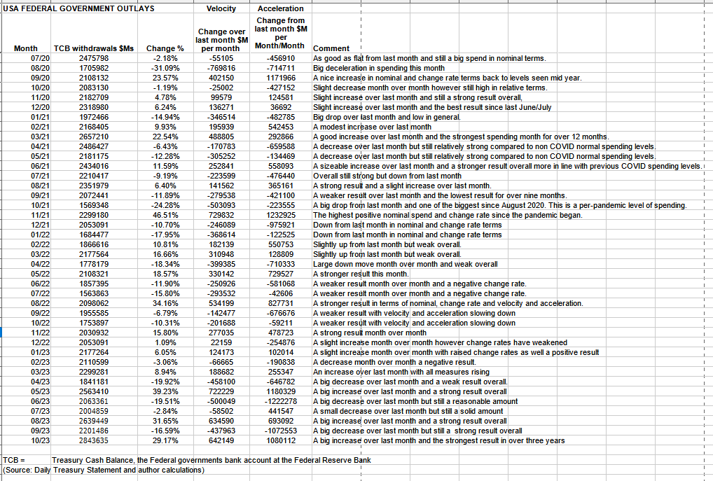
The table below shows the total federal government withdrawals from their account at the Federal Reserve Bank. A withdrawal by the federal government is a receipt/credit for the private sector and therefore a positive for asset markets.
US Treasury and author calculations
The table shows that total outlays were a huge 29+% increase over the previous month and a very strong $2.8T+. This is the highest amount of spending in the three years shown in the table which covers the large COVID-related expenditures the highest of which was over $2.6T+ in early 2021.
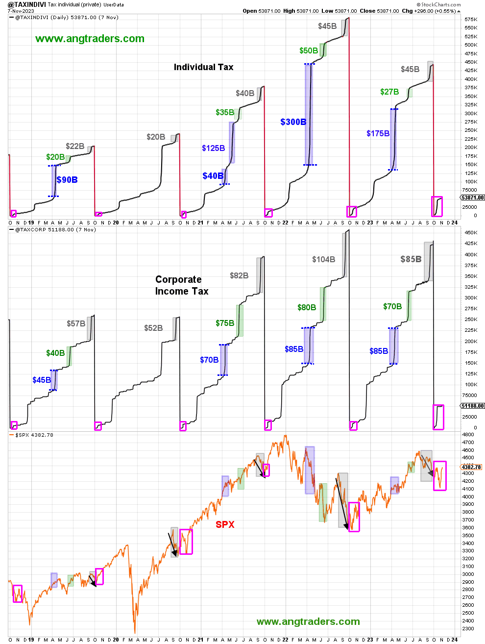
Despite the large total expenditures the deficit for October was quite small and this was because the level of taxation and various federal government taxes, fees, levies, and charges largely offset the large expenditure.
Unfortunately for the private sector, October included an out-of-the-ordinary deferred federal taxation payment event that deleted a lot of money out of private bank accounts. The following chart shows this as a comparison with the last few years at the same time.
ANG Traders Away from the Herd SA Market Service
On the chart above one can see on the top panel from the pink rectangles how much larger the tax take was this October just as compared to previous years. On the lower panel one can see how these liquidity drains cause corresponding market dips in the SPX at about the same time.
ANG Traders Away from the Herd SA Market Service
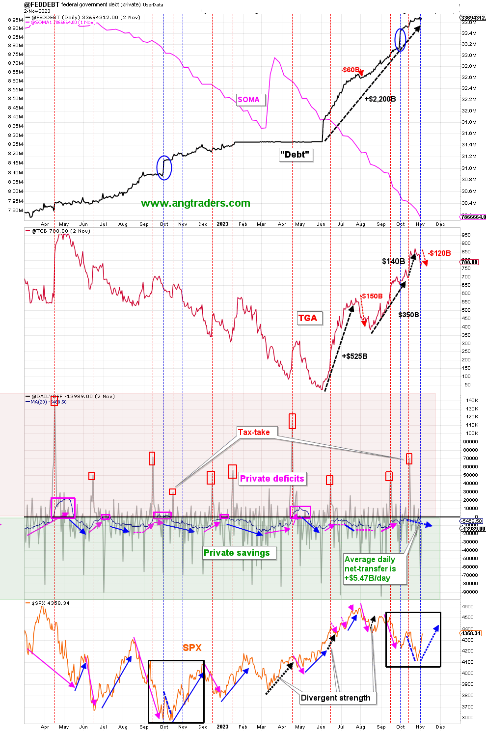
On the chart above the second last bottom panel highlights in red and green the financial relationship between the currency creator (red area) and currency users (green area). One's loss is the other's gain and vice versa, the difference is that the federal government creates the money via its central bank while the private sector does not have this luxury. Federal taxation removes spending power from the private sector but the federal government does not "need" the money as it can create, ad hoc, as much as it needs at any time. This information has been cleaned off the treasury churn and is a truer representation of federal outlays going into the private sector.
...the fiscal-flows will continue to fund the economy and feed the bull market during this Presidential election-year.
Fund-Flows
- The +$77B net transferred on Nov. 1, and the +$14B on Nov.2 have pushed the 20-day average up to +$5.47B/day , compared to +$6.67B/day average at this time last year; The gap between last year and this, is narrowing.
- So far in the fiscal year (starting Oct.1), the total net-transfer is +$120B, compared to last year's +$139B. Since the nominal spending is running $70B above last year, it won't be long before the net-transfers will exceed last year's. Higher fund-flows will feed the bull market.
(Source: Mr. Nick Gomez, ANG Traders, Weekly Report for Subscribers the Away from the Herd SA Market Service).
The next major fiscal milestone is a fiscal surge from a large Treasury interest payment in the middle of this month. This month is free of major federal taxation events and is one of the reasons why asset markets tend to rise into the end of the month and into the beginning of December and sometimes beyond. Remember that there is a major federal taxation event in mid-December and it is a clear run from now until then.
At the White House in the last month, amid threats of a government shutdown, a continuing funding resolution was passed to keep normal fiscal flows operating. No new budget has been authorized yet and as each continuing resolution terminates the threat of a government shutdown reemerges and sends negative fiscal and market sentiment shock waves into asset markets that lower highs and deepen lows that would have occurred otherwise due to the institutionalized fiscal flows. Likely, there will not be a formal budget passed in the fiscal year 2024 and the US federal government will lurch from one continuing resolution to another with the ever-present threat of government shutdowns. As far as I know, the USA is the only country on the planet with the problem.
The problem is so bad that the Moody's bond rating agency has again dropped the US credit rating. Moody's has lowered its outlook on the United States credit rating to "negative" from "stable" while affirming the rating at Aaa, the highest investment-grade notch. This change is attributed to a significant increase in debt servicing expenses and the presence of "entrenched political polarisation." The last point is the most relevant while the first is based on the myth that the federal government can run out of its sovereign dollars.
The main bone of contention is funding for the Ukraine war. How does this resolve? Historically war funding decisions at this point in the land and business cycle resolve to the upside in that funding will be made and the war goes ahead. The Iraq invasion almost 20 years to the day (one business cycle) is an example of this. The US ended up spending over $1T on the Iraq invasion and occupation and I expect the same to occur in Ukraine. Massive fiscal flows helped the business cycle to rise to its boom in 2026 and eventual bust in 2029/30.
Remember that it was the end of the large Iraq war fiscal expenditures that played a part in the collapse of aggregate demand that produced the GFC boom and bust in 2006.
The next Fed meeting is in the middle of next month where most likely another small rate rise will be made that will make life harder for people on variable interest loans such as for cars and credit cards. An in-depth look at the impact of a rate rise or pause is covered in this FOMC article for October/November 2023 that I wrote last month. At the last meeting, they paused but I do not think they are finished though the rate of increase is slowing.
Generally speaking, I believe the Fed will raise the interest rate from now until the peak of the real estate cycle in about 2026 at every clear opportunity and then bring it down again close to zero as it did in 2007 and more recently in 2019 once a recession or serious financial crisis has occurred. It takes a clear and present stock market crash and recession for the Fed to change its policy path once it has started raising rates.
Mr Robert P Balan of Predictive Analytic Models Market Service
The chart above shows how the FFR is led by the 10-year yield CPI and initial claims. The chart suggests a rounding top to the FFR and that it is close to its terminal rate or the rate at which it will stay until forced down by a recession or market crash that it is helping to produce. The market will adjust to this new higher-rate environment and begin borrowing and investing again based on the new normal driven by the need to make and produce things that have to be consumed to live and do business.
The chart below shows in green the effective federal funds rate and bank credit creation [blue] and the unemployment rate [red] since 2000. The grey bars are recessions. One can see that the Fed raises rates to a clear and present recession and then lowers them again and that in that time bank credit creation rises with no perceivable change to its trajectory. People need credit to fund the building of their homes and sacrifice in other areas of spending to obtain that goal/need no matter if interest rates are high or low. Times of higher interest simply mean a smaller lower quality home and quality of life for those people at that time. In short a more miserable existence.
Another inference one could draw is that a raising of the federal funds rate to its "terminal rate" leads to recession and a rise in the unemployment rate six to twelve months later. The true driver is demographics however Fed monetary policy exacerbates these natural rises and falls often hand in hand with fiscal policy.
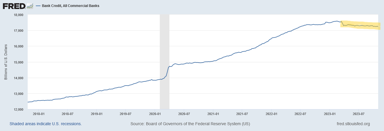
Bank credit creation has been down and negative for most of this year during the Fed's interest rate-raising campaign. This is despite most major banks across the world reporting good earnings thanks mainly to wider net interest margins as rates go up, when banks have good earnings and are growing their capital base they are more likely to lend but cannot do so if there is no demand for loans at that time. The US banks in particular are receiving free money from the Fed in the form of interest on reserves and this has not happened on such a scale before. At this late stage in the real estate business cycle, there is normally a strong credit creation phase for home mortgages. This phase has not gotten started yet, before it can the doubts about healthy bank lending margins continue to have to be cleared away and this takes time to adjust to and become the new normal. It would seem that humans need about a year to adjust to the new normal.
One must remember that before the last land-led boom-bust in the US in 2007 (the GFC), there was also a slowdown in credit creation a few years before the eventual peak and one can see that on the following chart highlighted yellow.
The scale of the chart washes out the magnitude of the credit slowdown at the time and so the following chart puts this into perspective.
The 2003/2004 credit creation slump was overcome and from there until the peak in 2008 a further 64% more credit was created. A move from $5.6T in 2003 to $9.2T in 2008, an increase of some $3.6T or nearly $1T per year over four years.
When one compares the 2000s credit creation slump with the present slump a similar picture appears as the following chart shows.
The last two charts are at the same scale and indicate that the current credit slump adjustment phase is time-wise reaching its end whereupon credit creation begins again uninterrupted into the coming land-led market cycle boom and bust.
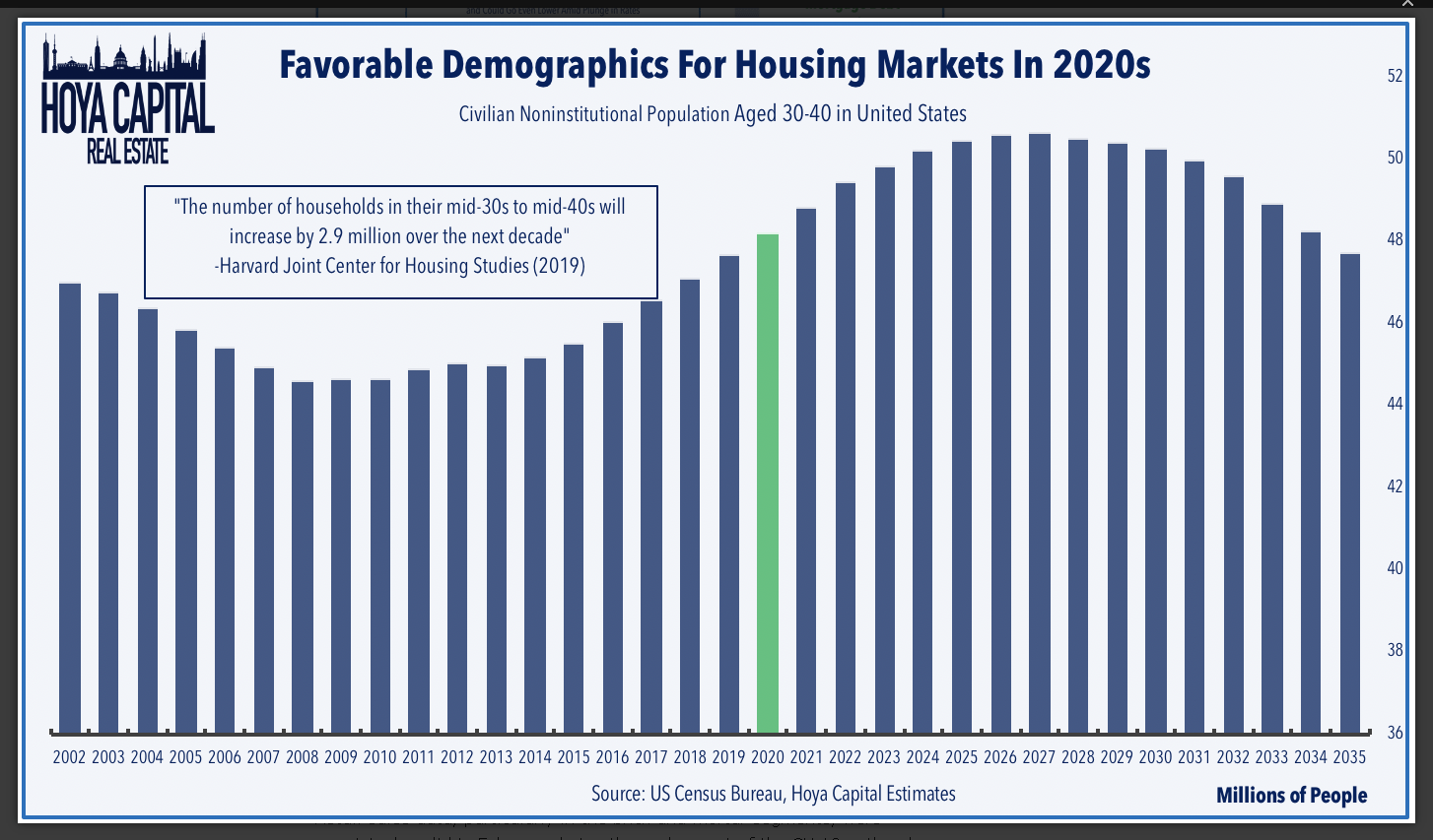
The boom-bust itself is driven by raw demographics and must come as it is a baked-in force of nature. There is a natural peak in the working-age population and the age of 30 to 40-year-olds rising into and falling after 2026/27 as the chart below shows.
If credit creation rises at the same proportional rate this cycle, that is by a 64% increase of the 2023 start amount of $17.3T, then by the end of the cycle bank credit could reach a total of some $28T by 2027. That is a yearly growth of some $2.7T, and a total loan growth of some $11T which one could hardly imagine taking place. But did take place last time around.
If credit were required to build all the homes referred to in the information box in the chart above then that alone would drive the demand for 2.9M homes at $600K per home = $1.74T. Then come commercial and industrial loans, auto loans, credit cards, student loans, etc.
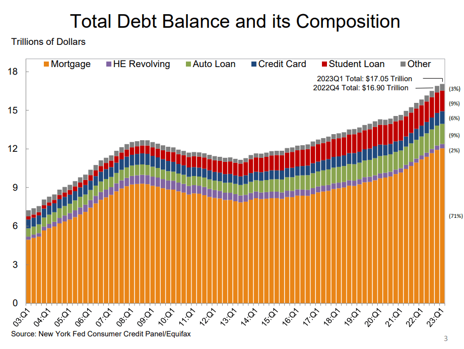
The composition of the loan book is shown in the chart below.
The housing chart that was shown last month indicating that the home builder ETFs were peaking and heading downwards appears to show the beginnings of a change of trend. The brown EFT line is rising again as are the other co-variables such as the pink new private housing starts the blue housing units authorized by permits and the green residential private domestic investment line. This is all happening in the face of a rising median price of new one-family homes, bright blue line, and the 30-year Freddie Mac contract, black dotted line.
Mr Robert P Balan or Predictive Analytic Models SA Market Service
The end to the adjustment to a new era of higher rates and the continuation of higher bank margins appears to have arrived and is trumped by the sheer need for new homes for new families.
It is important to review the housing market regularly because the housing cycle is the business cycle and it is nearing its peak.
On the larger world macroeconomic side, we have the G5 chart below. The chart below comes from Mr. Robert P. Balan. The chart shows the level of money creation by the top five world governments (the G5) in a change rate format, along with a host of other indexes. This chart gives a sense of important inflection points and direction.
Mr Robert P Balan or Predictive Analytic Models SA Market Service
The chart shows that the black-dotted G5 fiscal flow is generally rising upward into 2025 and this provides a strong financial undercurrent for assets markets going forward. This combined with the stronger national-level fiscal flow background provides a firm ground for national asset markets to advance.
If you are looking to make a market entry, sometime in the last quarter of 2023, or the first quarter of 2024 is likely to be a good time judging by the macro tidal forces that underpin the asset markets. The seasonal pattern and macro pattern are pointing to a strong Xmas/New Year rally and a good first quarter to 2024 for asset markets that might reach as far as into 2025.
For further details see:
Private Domestic Sector Prints -$10 Billion Deficit Pointing To Worse Markets In November