DIA - Private Domestic Sector Prints -$125 Billion Deficit Pointing To Worse Markets In September
2023-09-14 13:17:43 ET
Summary
- US sectoral flows for August 2023 show a negative result, with a fall in financial balances in the domestic private sector.
- The chart suggests that the SPX's next move would be for lower markets heading into September.
- Fiscally September is normally a stronger month, pointing towards a turnaround for markets in October.
The purpose of this article is to examine the US sectoral flows for August 2023 and assess the likely impact on markets as we advance into September 2023. This is pertinent as a change in the fiscal flow rate has an approximately one-month lagged effect on asset markets and is a useful investment forecasting tool. Other macro-fiscal flows can point to events months or years ahead.
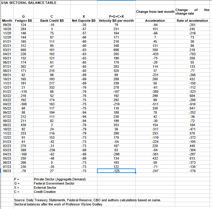
The table below shows the sectoral balances for the US which are produced from the national accounts.
In August 2023, the domestic private sector recorded a minus -$125B fall in financial balances overall, a negative result.
From the table, one can see that the minus -$128+ billion private domestic sector deletion of funds came from a large minus -$79+ billion extraction of funds by the federal government (and this includes the new injection channel from the Fed of around $11B from interest on reserves that went directly into the banking sector), less the -$73B billion that flowed out of the private domestic sector and into foreign bank accounts at the Fed in return for imported goods and services. The bank credit creation was a small bright spot in that it was positive rather than negative and added $27B to the money supply. Hopefully, this change of fortune in bank credit creation is the start of the speculative credit creation that drives the last and most powerful phase of the land cycle into the land-led boom and bust of 2026.
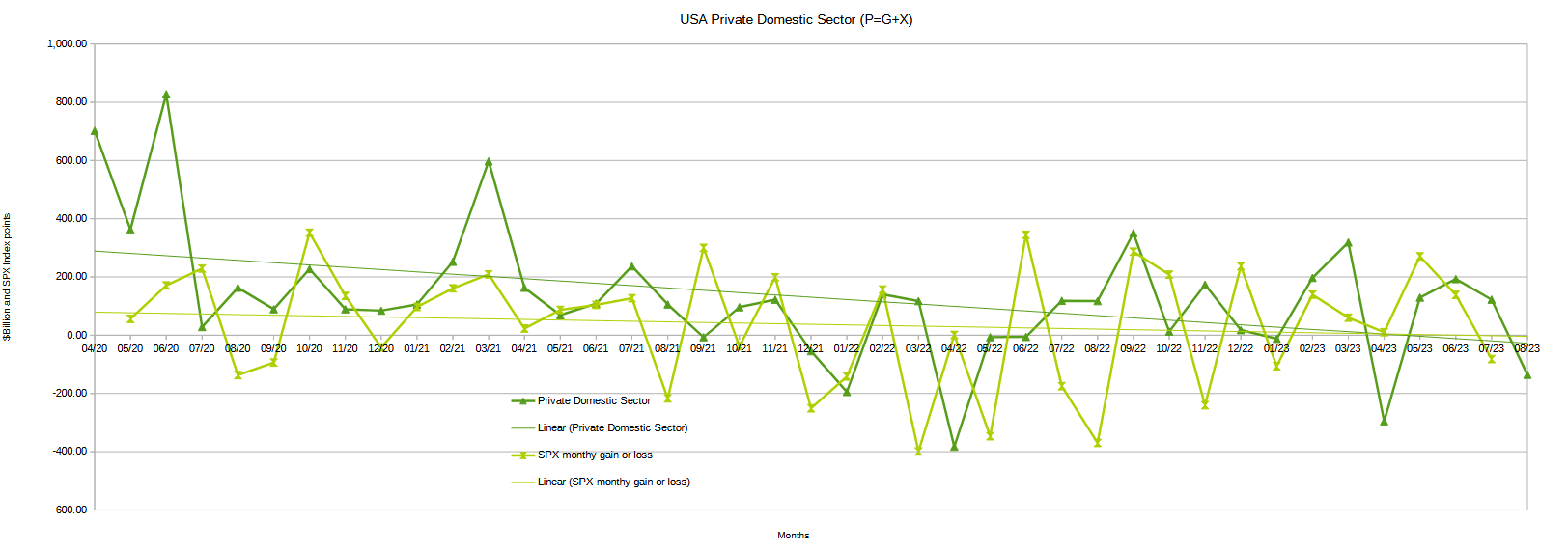
The chart below shows the sectoral balance data plotted in nominal terms. The calculation is federal government spending or G, plus the external sector (X and usually a negative factor) to leave that amount of money left to the private domestic sector, or P, by accounting identity true by definition.
The chart suggests that the SPX's next move would be for lower markets heading into September given that financial balances in the private domestic sector have fallen in August by such a large amount and are above to do so again when the mid-September federal corporate tax collections takes place.
Last month the chart was showing flat to weaker asset markets and that is what we got. This coming month will most likely be worse.
August is seasonally not normally a private domestic sector deficit month and this year is an outlier and a surprising result. The table below shows that this time last year the federal government injected over $200B into the economy whereas this year it took $90B out. The good news is that September is normally a lot stronger and points toward a turnaround for markets in October.
The first table in this article also shows the private domestic sector balance plus credit for several years prior and each August has been positive until now.
The following chart emerges when one graphs the change rate of the information in the US sectoral balances table above and adjusts for impact time lags. This is like a long-range market radar set.
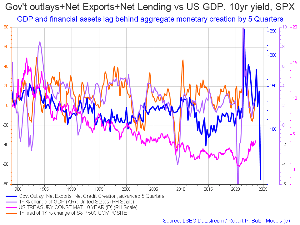
The blue line shows the fiscal impulse from federal government outlays plus bank credit creation and less the current account balance and leads by up to five quarters (a year and three months). Short term, the financial aggregates, and following co-variant factors, are rising into 2024 whereupon they come down sharply. They come down so low in mid-2024 that such a low has not been seen along the X-axis of the chart and it goes back to 1980!
The chart below shows the five-year average of the seasonal stock market patterns for the SPX ( SPX ), NDX ( NDX ), Dow ( DIA ), Russell 2000 ( RTY ), and Biotech ( IBB ) market indexes. The black oval shows roughly where we are (trading day 183) at the time of writing and the end of the green line on the chart below.
The five-year index averages call for a rise into trading day 190 (the last half of September) and then a big drop into trading day 200 (the first week of October). Following that asset markets should generally rise into the end of the calendar year capped off with the seasonal Xmas/New Year rally. Note that the overall trend is one of rising markets from left to right driven by overall positive fiscal flows in the order of a private domestic sector surplus of about $1.5T.
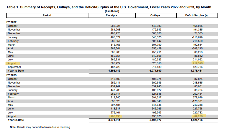
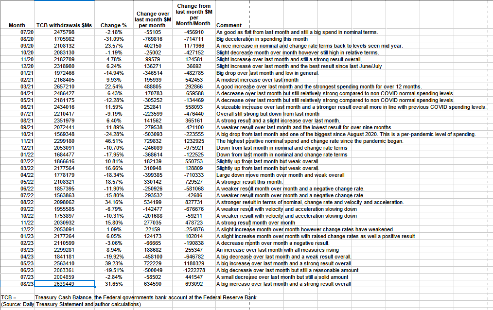
The table below shows the total federal government withdrawals from their account at the Federal Reserve Bank. A withdrawal by the federal government is a receipt/credit for the private sector and therefore a positive for asset markets.
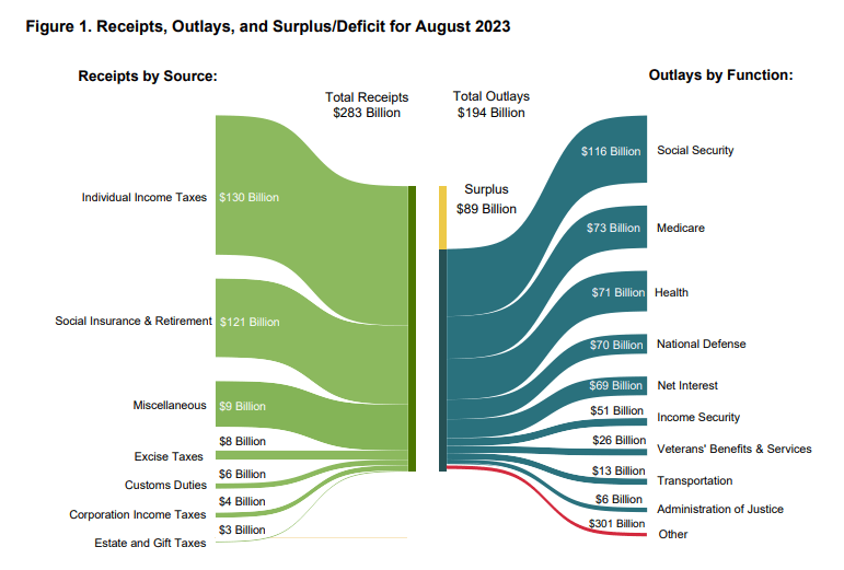
The table shows that total outlays were over 30% more than the previous month and a strong $2.6T. Despite that, the private domestic sector balance was negative because of the sheer size of the tax and other extractions as shown in the diagram below. Most of the "outlays" were what we call treasury churn where a large portion of the federal expenditures were on the redemption and then issue of treasury securities rather than real spending. When one strips out the treasury churn the real numbers look much leaner and weaker.
The chart below (top panel) shows graphically the relationship between the federal government (currency creator) and the private sector (currency user) and is from ANG Traders. The top panel highlights in red and green the financial relationship between the currency creator (red area) and currency users (green area). One's loss is the other's gain and vice versa, the difference is that the federal government creates the money via its central bank while the private sector does not have this luxury. Federal taxation removes spending power from the private sector but the federal government does not "need" the money as it can create, ad hoc, as much as it needs at any time. This information has been cleaned of the treasury churn mentioned above and is a more true representation of federal outlays.
The black rectangles are highlighting September fund-flows. One week ahead of the Sep 15 tax-take, the corporate tax collected is $8B less than last year. The 20-day average net-transfer is +$10.8B/day, compared to +$8.6B/day last year. The September corporate tax-take was $65B last year. We expect a lower tax-take this September and, from a fund-flow perspective, less of a dip in the SPX compared to last year, but continue to expect weakness in the September/October time-frame.
(Source: Mr. Nick Gomez, ANG Traders, Weekly Report for Subscribers the Away from the Herd SA Market Service).
ANG Traders
ANG Traders
The next major fiscal milestones are the mid-September federal taxation take and then a small Treasury interest payment at the end of the month. The end of September is the conclusion of the federal government budgetary year and then a new one starts in October. With recharged budget allowances there should be a splurge of new federal spending to drive the private domestic sector and asset markets higher into the end of the year.
At the White House in the last month, it was relatively quiet with the summer holiday in full swing. That is about to change as the politicians return from their summer break and get into agreeing and passing the next round of federal funding. Already there is talk of shutdowns and boycotts and all the other things that led the Fitch ratings agency to lower the USA's credit rating recently. It is not that there is an actual insolvency risk but rather a risk of poor leadership and bad management.
The next Fed meeting is on 20-21 of September where most likely another small rate rise will be made that will make life harder for people on variable interest loans such as for cars and credit cards. The 30-year mortgage market and its associated real estate are also now frozen as no one would want to break a fixed-interest 30-year loan now only to have to get a new loan at a much higher rate. No more re-financing, no more upsizing or downsizing. Mortgage loans now are mostly for newly developed and purchased real estate at the new full interest rate. This is starting to show now in the macro charts.
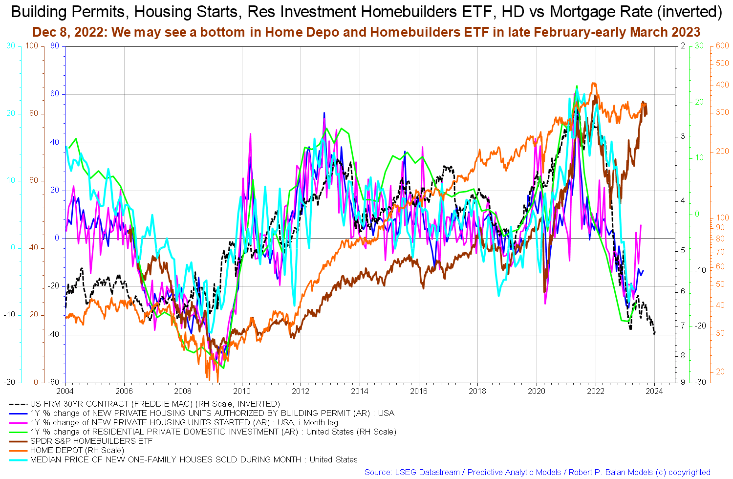
The chart above shows key indicators for real estate markets and is noteworthy because it shows that after an epic run against the trend of rising interest rates, the Homebuilder ETFs are running out of steam and appear to be hewing to the gravitational pull of the higher interest rates.
What happens now is that housing construction slows, rents rise as the population continues to grow and needs and demand shelter. Competition for a constricted supply of new housing drive up both rents and values after a pause. When rents have risen enough it becomes economic to build again and so another uptrend starts but in the meantime, Homebuilder ETFs have peaked and will retrace from here for many months and then have another bull run.
In order to accommodate the higher cost of credit the wave of new homes that eventually come will be smaller, lower quality, and generally inferior to those that have come before. Thanks to the Fed and its rate rises life generally will be of a lower standard as more and more gross domestic income is channeled into interest payments that have no counterpart cost of production. Pure economic rent.
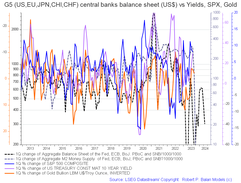
On the larger world macroeconomic side, we have the G5 chart below. The chart below comes from Mr. Robert P. Balan of the Predictive Analytic Models Market Service. The chart shows the level of money creation by the top five world governments (the G5) in a change rate format, along with a host of other indexes. This chart gives a sense of important inflection points and direction.
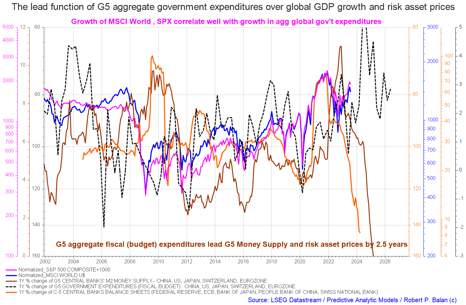
The good news is that after navigating a large drop in monetary aggregates they are now broadly rising to a peak in mid-2024 with some turbulence along the way.
The chart above is similar to the one above it however shows the quarterly change rather than the one-year percentage change. What it shows more clearly than in the other chart is that while aggregate balance sheets and the aggregate M2 money supply are rising they are doing so from a lower base. What used to be 100s of billions is now a change rate of tens of billions.
If you are looking to make a market entry, sometime in the last quarter of 2023, the first quarter of 2024 is likely to be a good time judging by the macro tidal forces that underpin the asset markets. The seasonal pattern and macro pattern are pointing to a strong Xmas/New Year rally and a good first quarter to 2024 for asset markets.
For further details see:
Private Domestic Sector Prints -$125 Billion Deficit Pointing To Worse Markets In September