IBB - U.S. Private Domestic Sector Prints A Whopping $363 Billion Surplus Pointing To Better Markets In December
2023-12-11 08:11:03 ET
Summary
- US sectoral flows for November 2023 analyzed for impact on markets in December.
- Whopping $363 billion private sector surplus pointing to better markets in December.
- Fiscal flows expected to continue funding the economy and feeding the bull market during the Presidential election year.
The purpose of this article is to examine the US sectoral flows for November 2023 and assess the likely impact on markets as we advance further into December 2023. This is pertinent as a change in the fiscal flow rate has an approximately one-month lagged effect on asset markets and is a useful investment forecasting tool. Other macro-fiscal flows can point to events months or years ahead.
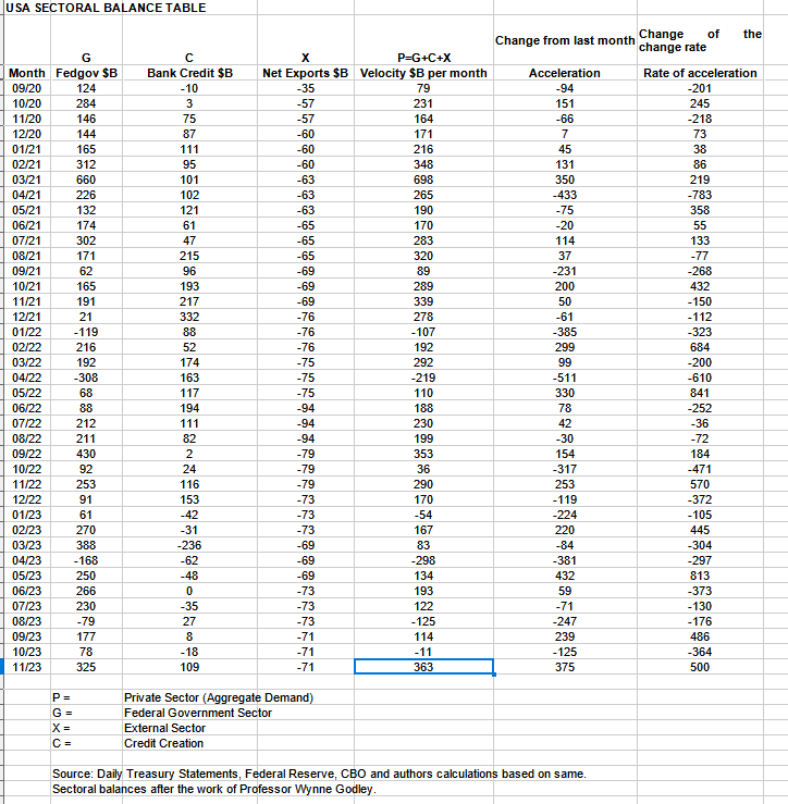
The table below shows the sectoral balances for the US which are produced from the national accounts.
US Treasury and author calculations
There was a super bullish private sector result for November that just ended. No wonder markets are going up right now and have been doing so this month. Last month should have been flat to lower stock market however a melt-up came instead and looks to continue. Tax take coming up in the middle of the month though and that may cause it to pause a little.
In November 2023, the domestic private sector recorded a surplus of $363B and this is a very positive result for asset markets as financial balances in the private sector have risen by this much.
From the table, one can see that the $363 billion private domestic sector funds surplus came from a healthy $325 billion injection of funds by the federal government (and this includes the new injection channel from the Fed of around $8B from interest on reserves that went directly into the banking sector), less the -$71B billion that flowed out of the private domestic sector and into foreign bank accounts at the Fed (the external sector X) in return for imported goods and services. Bank credit creation took a large leap forward and finally broke the dry spell that has endured almost all year and printed a $109B contribution.
The wakening of bank credit creation is very important as it is a key driver of the real estate boom and bust that is coming over the next few years into 2026. One of last month's themes was the adjustment time to the new normal of higher rates and the timing for a new bout of credit creation after about one year of adjustment which appears to have taken place right on cue. Uncanny.
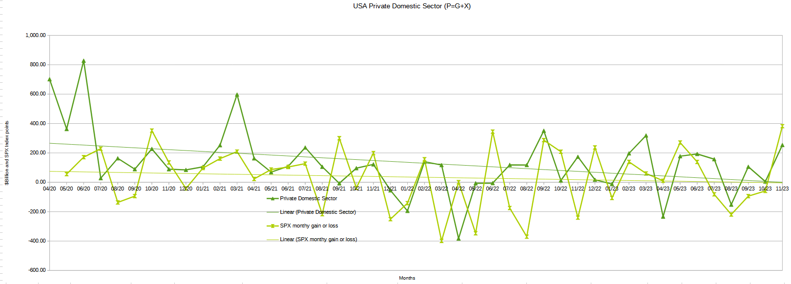
The chart below shows the sectoral balance data plotted in nominal terms. The calculation is federal government spending or G, plus the external sector (X and usually a negative factor) to leave that amount of money left to the private domestic sector, or P, an accounting identity true by definition.
US Treasury, SPX and author calculations
Last month this chart predicted a flat to lower monthly end to the SPX given the poor private domestic sector balance result from the month before. The actual result however was a 380+ point meltup.
This month the chart naturally predicts a continuation of the rally into December and that December will close higher than November. Refer to the seasonal stock market model below for more detail on how this might play out to month's end given most of the rally may now be behind us.
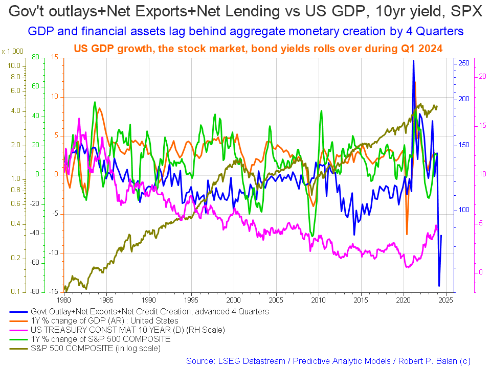
The following chart emerges when one graphs the change rate of the information in the US sectoral balances table above and adjusts for impact time lags. This is like a long-range market radar set.
Mr Robert P Balan of the SA Predictive Analytic Models Investing Group
This month this chart has been reworked to not only show the SPX as a one-year percentage change rate but also in a nominal logged format.
The blue line shows the fiscal impulse from federal government outlays plus bank credit creation and less the current account balance and leads by up to four quarters. Short term, the financial aggregates, and following co-variant factors, are rising into 2024 whereupon they come down sharply but already the chart is showing that they recover later in the same year. There is more detail on this later in the article.
This model provides a guide to inflection points but not to the depth of those changes of trend. The drop in early 2024 looks precipitous but may not be in nominal terms. There might be some market weakness then and the main uptrend continues.
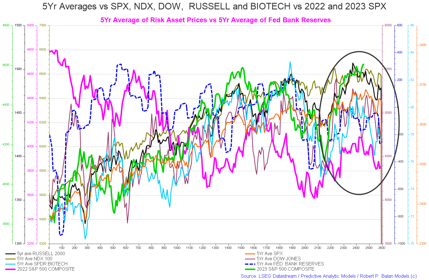
The chart below shows the five-year average of the seasonal stock market patterns for the SPX ( SPX ), NDX ( NDX ), Dow ( DIA ), Russell 2000 ( RTY ), and Biotech ( IBB ) market indexes. The black oval shows roughly where we are (trading day 246) at the time of writing and the end of the green line on the chart below.
Last month at trading day 225 the chart predicted that the index averages were calling for generally rising markets into trading day 240 and that is precisely what we got.
The chart predicts (trading day 246 at the time of writing) falling markets to about trading day 255 (late December) and then rising into the new year until trading day 30 (the first week of February).
Mr Robert P Balan of the SA Predictive Analytic Models Investing Group
We have two models saying different things and in this instance, I would go with the second model of institutionalized fund flows and patterns and err on the side of caution until trading day 255.
The table below shows the total federal government withdrawals from their account at the Federal Reserve Bank. A withdrawal by the federal government is a receipt/credit for the private sector and therefore a positive for asset markets.
US Treasury and author calculations
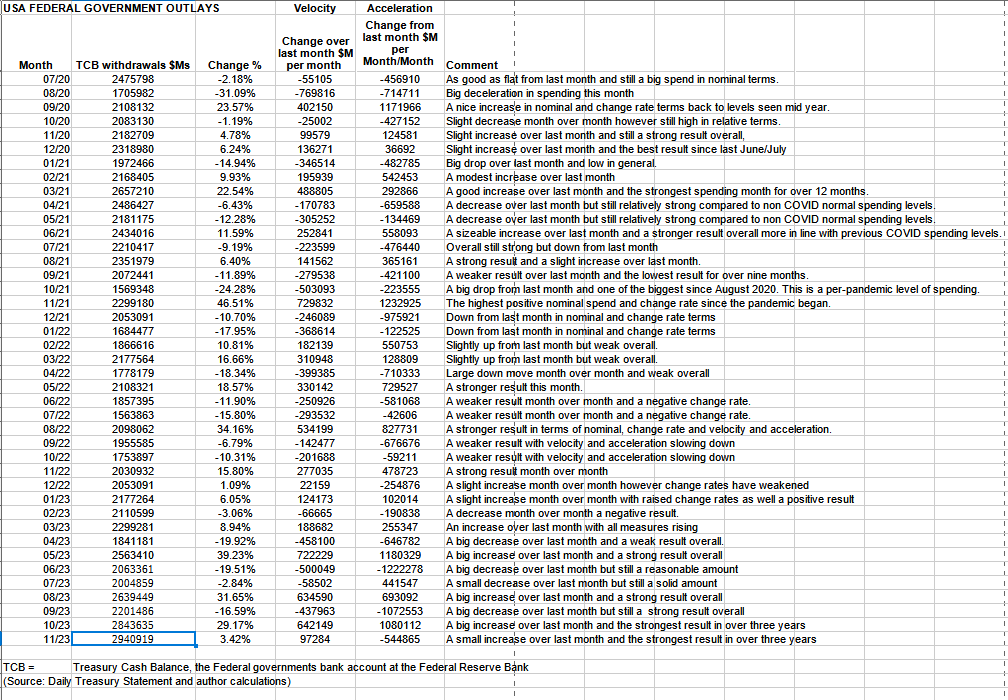
The table shows that total outlays were an increase over the previous month and a very strong $2.9T+. This is the highest amount of spending in the three years shown in the table which covers the large COVID-related expenditures the highest of which was over $2.6T+ in early 2021.
Bumper federal spending also corresponded with a bumper federal deficit and corresponding private sector surplus. Whereas last month it did not because federal taxation was so high that nearly all the federal spending was taxed out again and this did not allow financial assets in the private sector to grow larger.
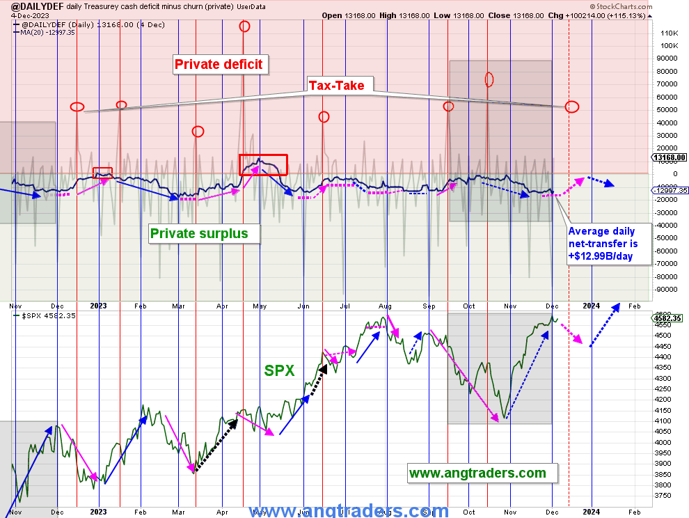
Mr Nick Gomez of the SA Away from the Herd Investing Group
The chart above, top panel, highlights in red and green the financial relationship between the currency creator (red area) and currency users (green area). One's loss is the other's gain and vice versa, the difference is that the federal government creates the money via its central bank while the private sector does not have this luxury. Federal taxation removes spending power from the private sector but the federal government does not "need" the money as it can create, ad hoc, as much as it needs at any time. This information has the treasury churn removed and is a truer representation of federal outlays going into the private sector than the official ones.
The net-transfer into private bank accounts during the month of November was +$302B, which is 22% higher than last November's $248B transfer.
The regular end/start of-the-month deposits will mark the high point of the average net-transfers and, like last year, the SPX is vulnerable to reaching a local-high and then weakening as we approach the mid-December tax-take (red circles above).
The longer-view is looking very rosy; the net-transfer, so far, in the fiscal year (two-months in) is +$331B which is 4% higher than last year's +$318B (note that October 2023 had a huge delayed tax-take that 2022 did not have). If this rate is maintained, then the net-transfer for fiscal 2024 would be +$2.0T ($331B x 6), compared to +$1.7T last year.
The TGA is currently holding $300B more (future-spending) than at this time last year.
(Source: Mr. Nick Gomez, ANG Traders, Weekly Report for Subscribers the Away from the Herd SA Market Service).
Mr Nick Gomez of the SA Away from the Herd Investing Group
The next major fiscal milestone is a fiscal contraction from a large federal taxation event in the middle of this month where corporations pay their fourth installment of their 2023 estimated tax. Similarly, in mid-January there is a taxation event of a similar size. So there is a series of liquidity sinkholes coming up shortly that will lower stock market highs and deepen dips.
At the White House in the last month, the only positive fiscal event of note was that more student debt was forgiven. One can expect the current logjam of spending over Ukraine and other conflicts of concern to the USA to be resolved to the upside with more spending on all wars going into the end of the decade. Federal government spending of any sort drives markets onward and upwards.
Property Sharemarket Economics
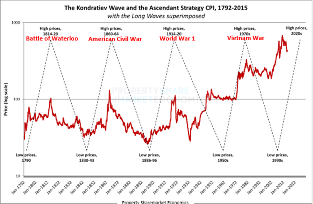
The chart above shows how the Kondratiev wave peaks with high prices and war. This cycle will be no different and is right on track as we head into the 2020s and the peak and end of the present Kondratiev commodity cycle.
The next Fed meeting is in the middle of this month where most likely another small rate rise will be made. This article I wrote earlier this month covers an in-depth look at the impact of a rate rise or pause. At the last meeting, they paused but I do not think they are finished though the rate of increase is slowing.
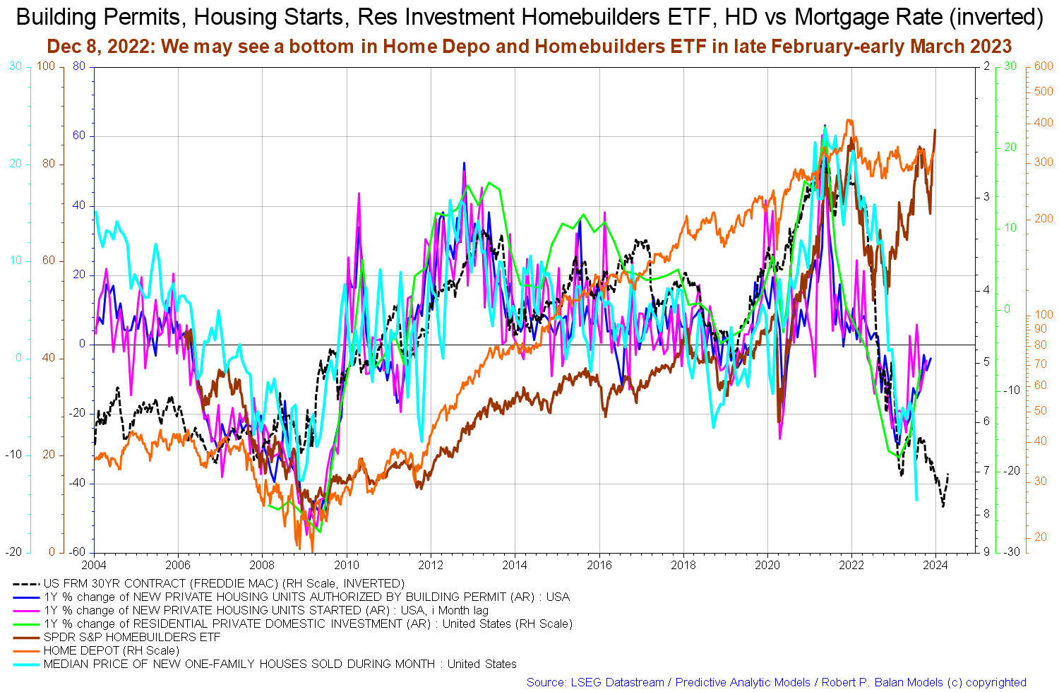
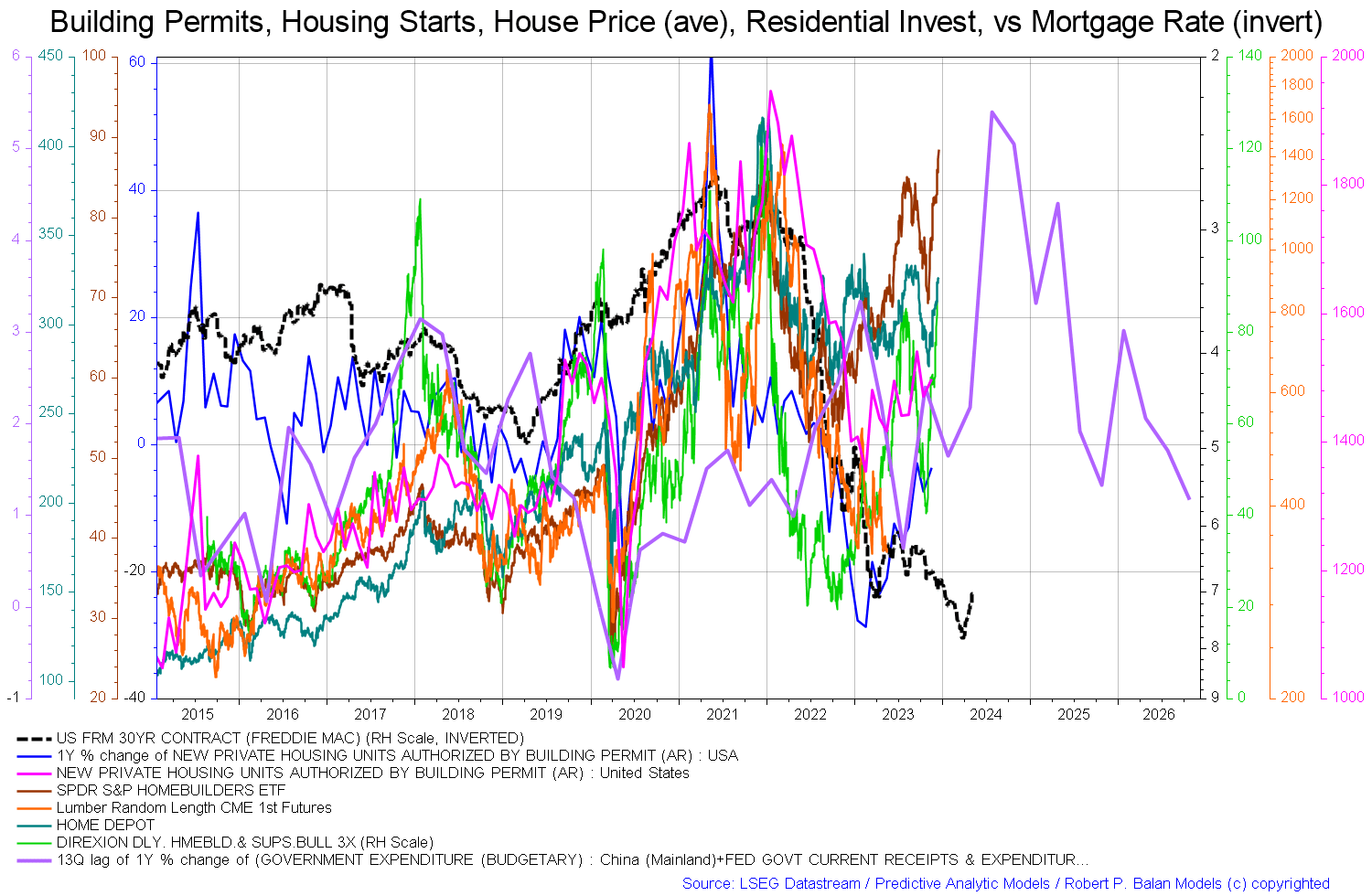
The housing chart below that was shown last month indicating that the home builder ETFs were showing the beginnings of a change of trend has been confirmed by this month's update of the same chart shown below. The brown EFT line is rising again as are the other co-variables such as the pink new private housing starts the blue housing units authorized by permits and the green residential private domestic investment line. This is all happening in the face of a rising median price of new one-family homes, bright blue line. The 30-year Freddie Mac contract, black dotted line, has come down a little and has helped drive real estate forward through slightly lower financing costs.
When rates go meaningfully downwards two main things happen. Firstly people thinking of buying will buy and fix a mortgage at the new lower rate. Secondly, those people already with a mortgage will seek to refinance at a lower rate. This creates a flow of fee income to banks and allows more aggregate income to flow to things other than interest payments such as real goods and services.
Mr Robert P Balan of the SA Predictive Analytic Models Investing Group
It is important to review the housing market regularly because the housing cycle is the business cycle and is nearing its 2026 peak.
Mr Robert P Balan of the SA Predictive Analytic Models Investing Group
The chart above again shows aspects of the housing market. In this instance, we have the price of lumber (orange line and that tends to rise in a boom) appearing to bottom and be close to a local low. Now all rising are the home-builder ETF ( NAIL ), Home Depot ( HD ), housing starts, and permits. Important to note though is the purple government expenditure line that is due to put in a local bottom in early 2024 before rising through most of the rest of 2024 before dropping and rising again into 2025. This line is the fiscal carrier wave that sets the overall trend for all other waves that follow in its wake.
It is interesting to compare this chart with the W.D. Gann Decade Cycle chart shown below.
Property Share Market Economics
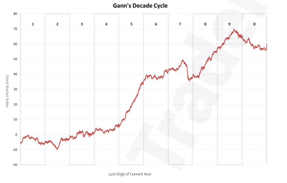
The decade cycle compares the shape of the stock market for each year of each decade. For instance, all years ending in 1 make up the first column of the chart. Next year will be 2024 so we would look at the fourth column to see how the stock market might typically react. Gann began this work in the 1920s and the chart above is the same work carried forward to the present day. One sees that 2025 is a particularly good year on average and that this also matches with the fiscal flow projection in the chart just above this one. It is no coincidence that fiscal flows tend to bunch and flow and contract at the same time each decade in a seasonal pattern similar to the yearly seasonal patterns in the 5-year index averages chart shown earlier in this article.
On the larger world macroeconomic side, we have the G5 chart below. The chart below comes from Mr. Robert P. Balan. The chart shows the level of money creation by the top five world governments (the G5) in a change rate format, along with a host of other indexes. This chart gives a sense of important inflection points and direction.
Mr Robert P Balan of the SA Predictive Analytic Models Investing Group
The chart shows that the black-dotted G5 fiscal flow is generally rising upward into 2025 and this provides a strong financial undercurrent for assets markets going forward. This combined with the stronger national-level fiscal flow background provides a firm ground for national asset markets to advance. The fiscal results that are manifesting here echo the wisdom found in the Gann decade cycle shown above.
If you are looking to make a market entry, sometime in the first quarter of 2024 is likely to be a good time judging by the macro tidal forces that underpin the asset markets. The seasonal pattern and macro pattern are pointing to a good second quarter to 2024 for asset markets that might reach as far as 2025.
For further details see:
U.S. Private Domestic Sector Prints A Whopping $363 Billion Surplus Pointing To Better Markets In December