DFSV - Value Vs. Growth 10-Year Return Spread At Historic Extremes: I'm Buying AVUV
2023-08-22 16:27:22 ET
Summary
- Most of the 10-year periods where large-cap growth has outperformed small-cap value have been those ending within the past three years.
- A small-cap value portfolio has had zero periods with negative 10-year returns since 1930, while the large-cap growth portfolio has had several "lost decades".
- Continued outperformance of large-cap growth not only requires trillion dollar companies to keep growing at high rates, but also continued multiple expansion.
- Current metrics and historic patterns indicate a heightened risk of another lost decade for large-cap growth, during which we expect small-cap value to outperform.
As a value-oriented investor, two questions I have been very often asked over the past five years are:
- Why have the total returns of value stocks lagged those of growth stocks by so much lately?
- When, if ever, can we expect value to outperform growth again?
In this article, I wanted to provide an updated look, with charts, at how unprecedented this lag of value versus growth has been historically, and why I expect it to turn over the next decade. My data source for all these charts is the Ken French data library , which was last updated at the end of June 2023. Unfortunately, Ken French's portfolios are not directly investable, so as a proxy, I will be using the Avantis U.S. Small Cap Value ETF ( AVUV ) as my investible proxy for US small cap value, versus the Invesco QQQ ETF ( QQQ ) as my proxy for US large cap growth, and I plan to briefly discuss some of their alternatives at the end of this article. I am comparing growth versus value only within the US stock market for this article, though my main focus, and that of my Investing Group, is on the relative value foreign stocks offer versus US stocks at this time.
Small Value's Longest Lag (So Far) Is Now
My first trio of charts is of two of the six po rtfolios Ken French created from the US stock market as divided by size and value . My last analysis of these six portfolios was in my July 2022 article on small cap value , which was just before this year's turnaround that I see as making this latest lag of growth versus value so unprecedented. For these three charts, I am only comparing the "Small Value" portfolio of small cap stocks with high Book/Market (=low Price/Book) ratios, versus the "Large Growth" defined as those large cap stocks with low Book/Market (=high Price/Book) ratios.
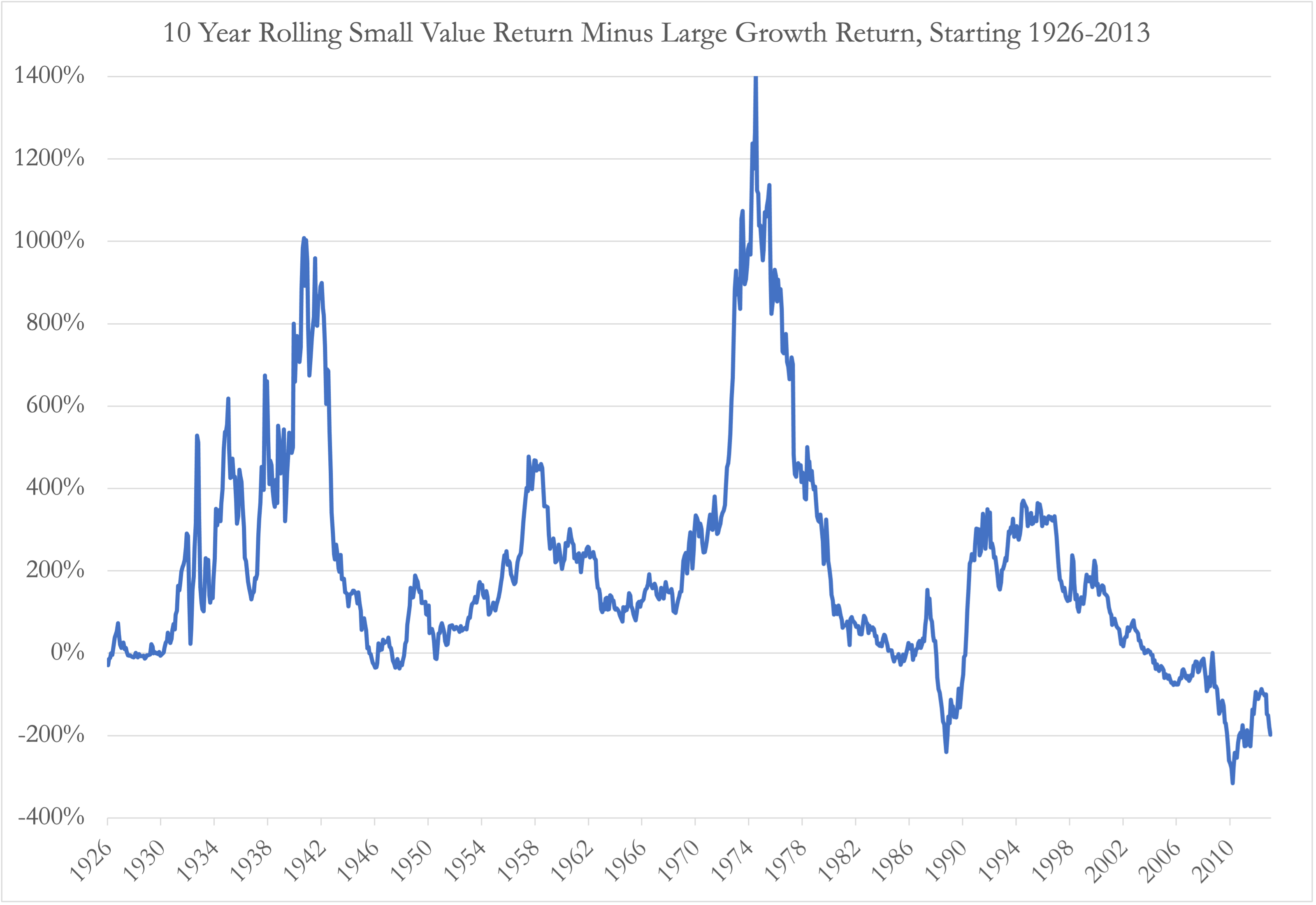
The first chart plots the difference between 10-year rolling returns on the Small Value portfolio minus that on the Large Growth portfolio. The last few years on the far right of this chart shows what many readers of this article probably already know: a 10 year investment in Small Value starting in 2010 or 2013 (so ending in 2020 or 2023) would have lagged the total return on Large Growth by around 200 percentage points over that 10-year period. What I believe is less well known is that a 10-year return lag of 200 percentage points only happened one other time since this data series started in 1926, and that was very briefly on periods starting in February or March 1989 and ending with the dot-com bubble in 1999. There has so far been no other period since 1926 when Small Value significantly underperformed Large Growth over a 10-year period, and the lagging periods ending since 2020 are now deeper and more numerous than the two ending in 1999. Also unlike the periods ending in 1999, Small Value quickly "came back" and significantly outperformed Large Growth in periods starting in the early-mid 1990s and ending in the early-mid 2000s, but 2023 so far seems to be a "double dip" return to periods where Small Value has lagged by 200 percentage points. While past performance alone doesn't tell us much about future returns, this chart is one that makes me skeptical of this year's rally and large growth, and more convinced that Small Value seems likely to outperform Large Growth over the next 10 years.
Ken French Data Library, Author's Chart
This second chart is actually the source of the first chart, and shows the rolling 10-year absolute total returns of the Small Value and Large Growth portfolios. Although I could not figure out how to highlight this on an Excel chart, I believe an important line to look at here is the y=0% line going across this chart, which indicates a "lost decade" of zero total returns over a 10-year period. The main observation that stands out to me here is that since 1930, Small Value has not had another "lost decade" since 1930, while Large Growth investors would have seen lost decades starting in November 1998 - October 2000, and several other periods not much better than a lost decade starting in the mid-1960s to the early 1970s. In other words, the only two times when Small Value lagged Large Growth happened to be periods when Small Value returned only 300% in the 1990s and 100% in the 2010s respectively, and the lag was because Large Growth returned 500% and 300% in these two respective decades. The former period we know was followed by a lost decade for Large Value over which Small Value returned more than 100% again. Patterns like this are why I often prefer to look at rates of return on stocks over periods no shorter than 10 years at a time. Here I find it worth remembering that even "excellent" companies like Coca-Cola can experience "lost decades" over 10-year periods starting with high valuation multiples.
Ken French Data Library, Author's Chart
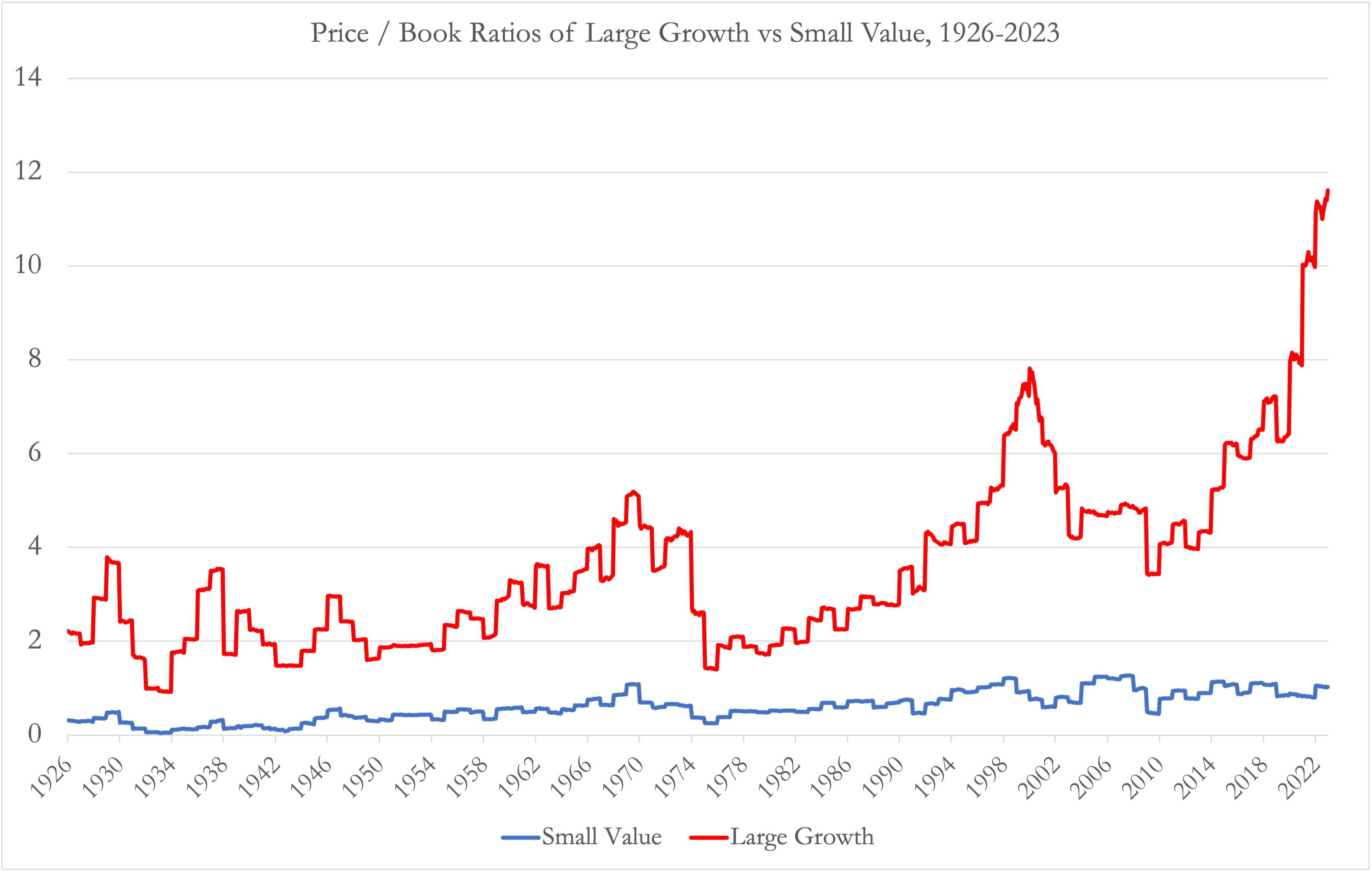
The third chart, in combination with the one above, shows a pattern which would scare me if I had much allocated to Large Growth stocks: each of the lost decade and almost lost decade periods for Large Growth started when the Price/Book ratio of Large Growth stocks were at levels significantly higher than their historic averages. We saw the Price/Book ratio of the Large Growth portfolio exceed 4.0 in the late 1960s and early 1970s before correcting back down to around 2.0 in the late 1970s and early 1980s, and then rising to almost 8.0 in the dot-com bubble of the late 1990s and early 2000s. By this Price/Book metric, now approaching 12, Large Growth now looks even more expensive than in the dot-com bubble, though this may be partly justified due to the higher profitability of these companies today, and also explained by how buybacks reduce the book value denominator of this ratio .
Ken French Data Library, Author's Chart
Measuring Value By P/E Instead of P/B
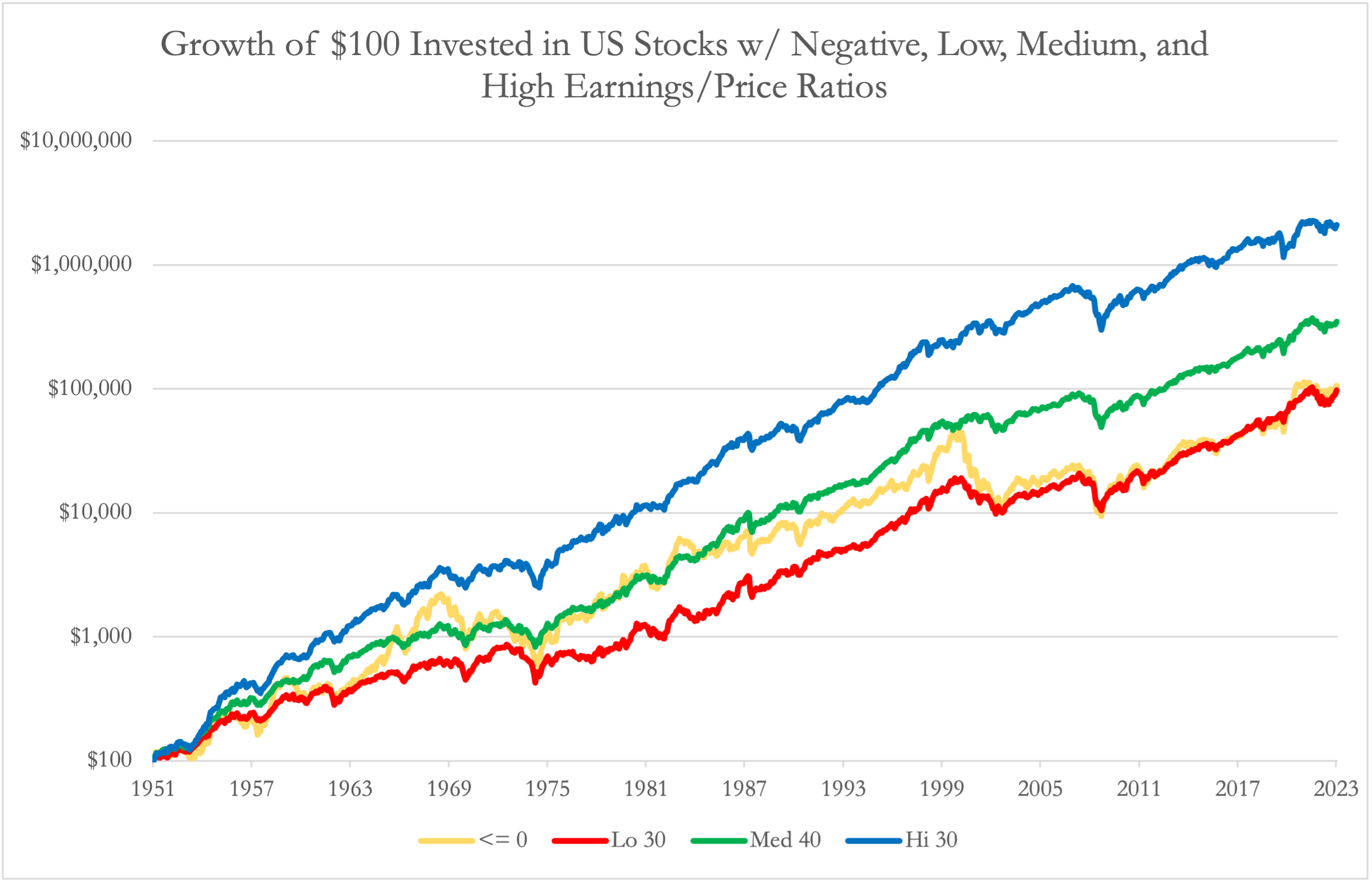
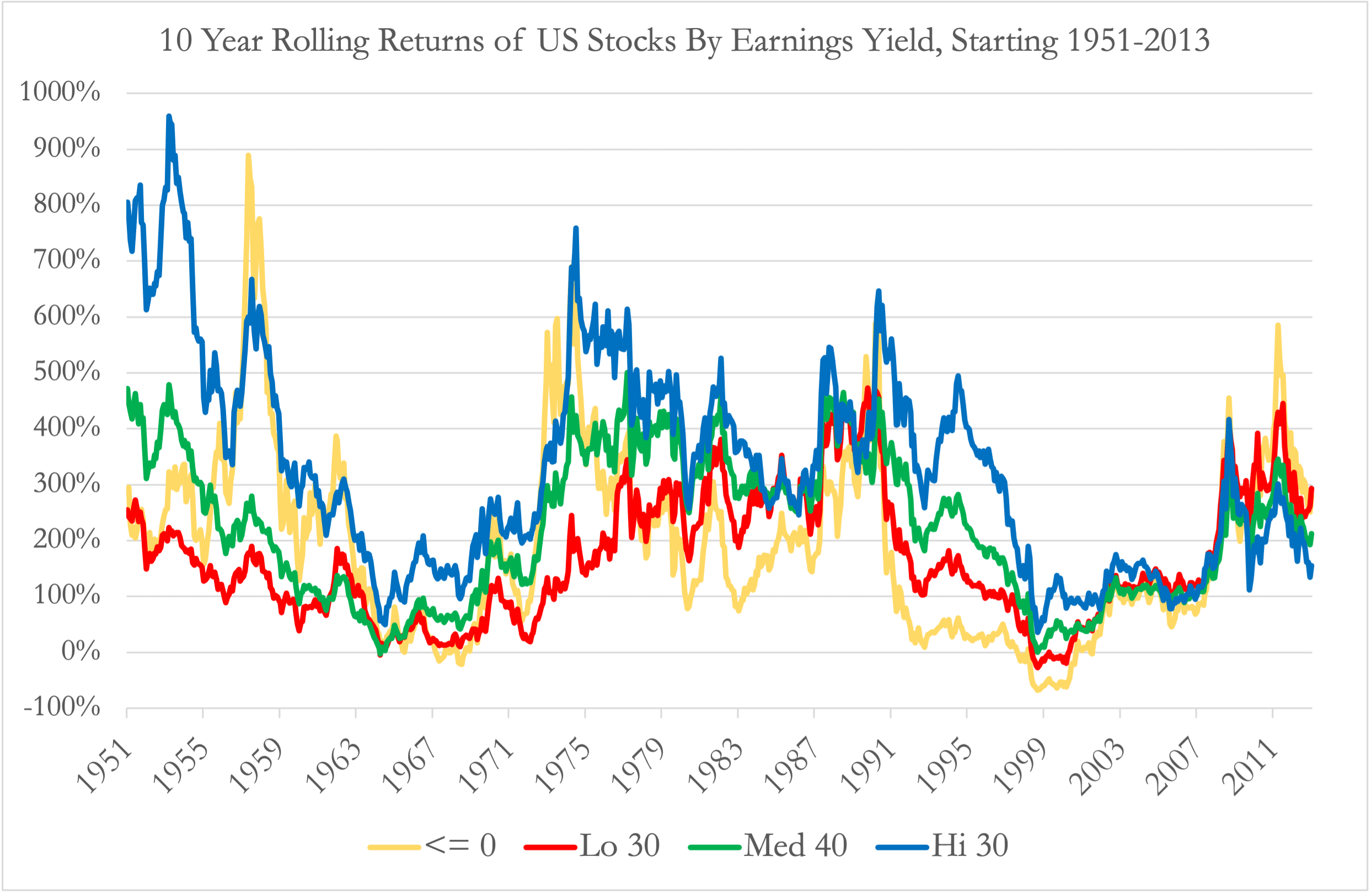
Another look at value that better reflects the higher profitability of some high Price/Book stocks is one that sorts stocks into portfolios based on Price/Earnings or P/E ratio, rather than by Price/Book as above. Two limits of the Ken French data on portfolios sorted by P/E ratio is that it only starts in 1951, instead of 1926, and also does not break these portfolios by size into small cap and large cap portfolios. When I invest in broadly diversified portfolios, I prefer small caps to large caps as the return differences between cheap (value) and expensive (growth) stocks have historically been more significant between small stocks than between large stocks, but I'll take this P/E return data as is for now. If we chart the cumulative returns of $100 invested in the 30% of stocks with the highest Earnings/Price (= lowest P/E) ratios in blue versus those with the lowest Earnings/Price (= highest P/E) ratios in red, we see a pattern similar to those we often see between value versus growth stocks over most of the 20th century. What I find more remarkable about the below chart is how the portfolio of stocks with negative earnings, in yellow, has over significant time periods like the 1960s returned even better than the portfolio of low earnings yield stocks, and over this whole period delivered about the same total return.
Ken French Data Library, Author's Chart
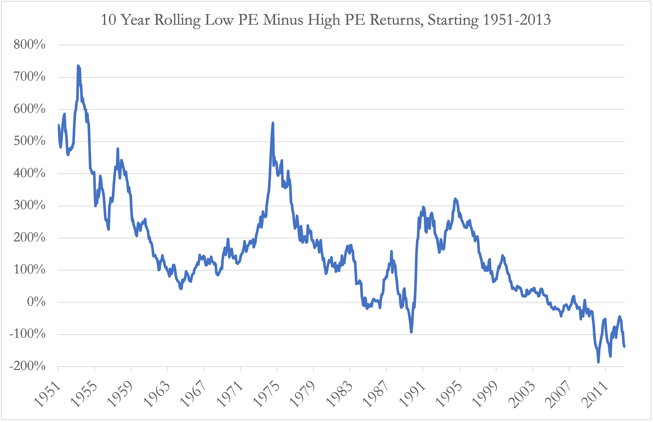
When we alternately look at the difference in 10-year rolling returns between low PE and high PE stocks, like the first one above in this article, we see a trend that may be more worrying to value-oriented investors. This chart seems to imply that the return premium of low PE stocks over high PE stocks may be in a long-term downtrend, declining from 500% over the 1950s, to 200-300% over 10-year periods ending in the early 2000s, to significantly negative for periods ending in the early 2020s. This chart also shows that these most recent 10-year periods ending in the early 2020s saw low PE stock returns lagging those of high PE stocks by significantly more than they lagged in periods ending in the 1999-2000 dot-com bubble. A key question for investors tilting towards value is whether this chart really could be showing a long-term trend where high PE stocks will continue outperforming low PE stocks by ever wider margins, or whether this trend is unsustainable and likely to reverse.
Ken French Data Library, Author's Chart
When I look at the absolute rolling 10-year returns of these different stock portfolios sorted by Earnings Yield, the above chart seems less like one of a trend, and more one of a 20-year cycle where the 1950s was abnormally good for low PE stocks, and the 2010s and early 2020s abnormally bad for low PE stocks. Again, we see that in absolute terms, the high earnings yield stock portfolio has so far never had a lost decade since 1951, and in fact, there have been very few 10-year periods since 1951 over which low PE stocks have not at least doubled (i.e. returned at least 100%). By contrast, the portfolios of stocks with negative and low earnings yields have seen several "lost decade" periods since 1951, and the most recent periods ending in the early 2020s are not ones where high earnings yield stocks delivered below average returns, but rather periods when negative and low earnings yield stocks delivered abnormally high returns.
Ken French Data Library, Author's Chart
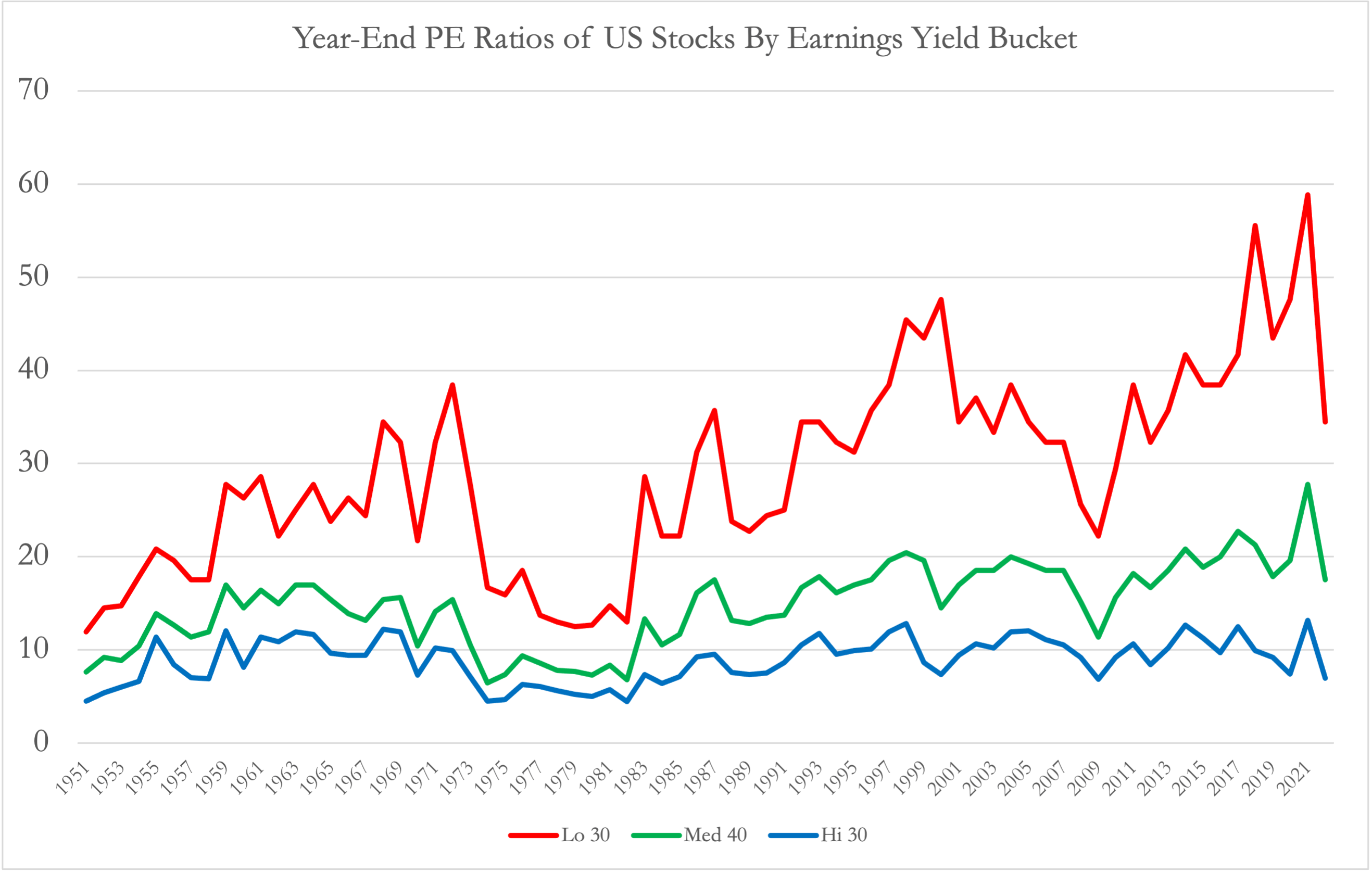
When we chart the PE ratios of the low, medium, and high earnings yield stock portfolios, we see a pattern similar to that of the Price/Book ratio chart above, though perhaps not as extreme. PE ratios hit highs in the late 1960s to early 1970s, then again in the late 1990s, and most recently again in the early 2020s. The former two periods were both followed by lost decades in that portfolio of high PE stocks, while the low PE portfolio continued to return around 100% again over those same decades. The PE ratios in the below chart are as of calendar year end, so does not reflect the significant bounce in the PE ratios of Large Growth stocks so far in 2023.
Ken French Data Library, Author's Chart
This next chart shows a quick proxy for how the five largest US growth stocks, and top components making up about 1/3 of QQQ, have seen significant multiple expansions in both their forward PE ratios and Price/Sales ratios so far this year. So very roughly, it would seem that the red line in the above chart may have already bounced back to at least its 1999 high if not higher, and if history repeats itself, that implies a heightened risk of a lost decade for US Large Growth going forward. Earlier this year, I also wrote more detailed expected rate of return calculations on Apple and Amazon , and that was before this latest multiple expansion.
What This Means For Investible Funds
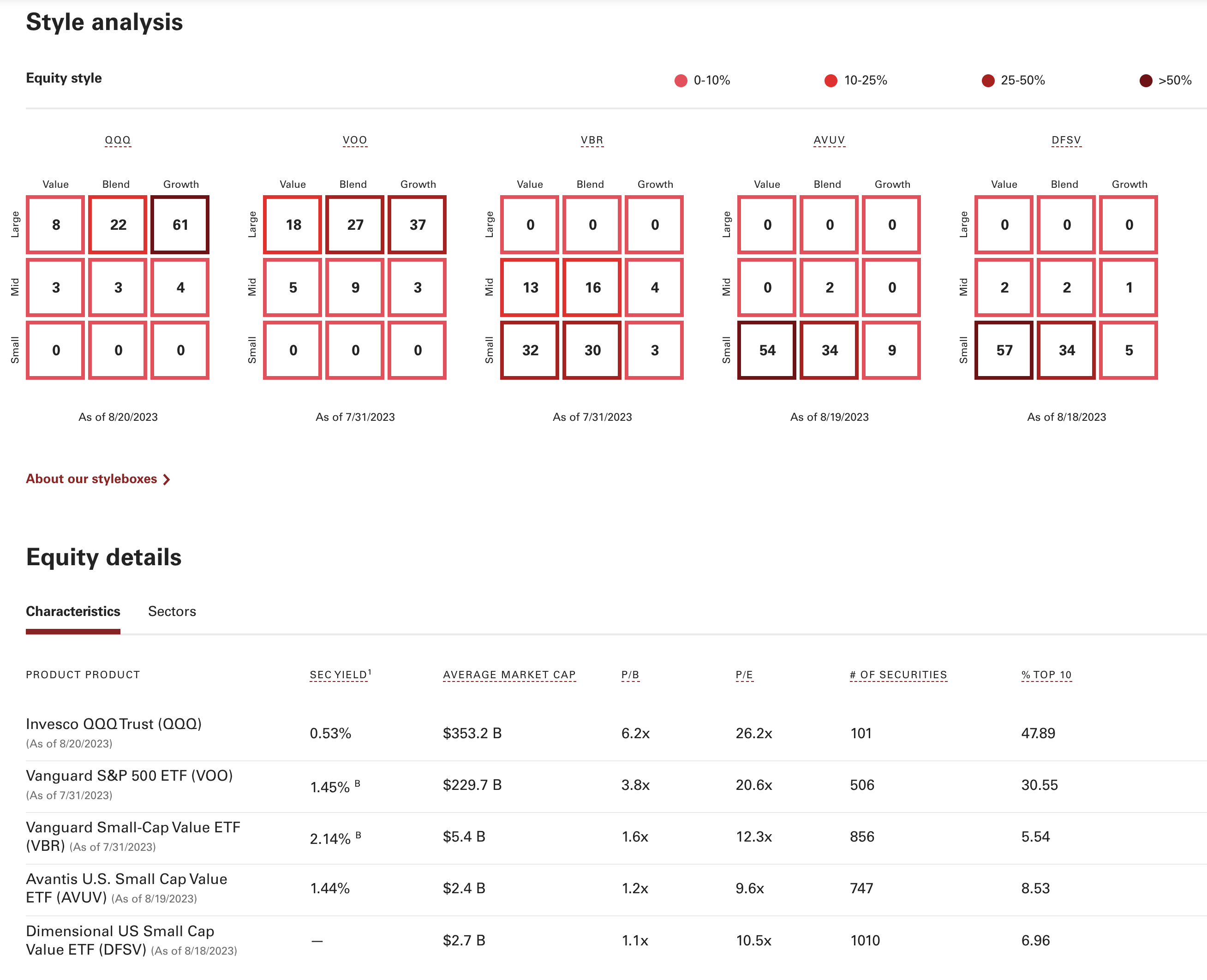
At the beginning of this article, I mentioned that I would use AVUV as my investible proxy for Small Value and QQQ as my investible / tradable proxy for Large Growth, as the Ken French portfolios do not have publicly available tracker funds. Earlier this year, I wrote an updated guide to Vanguard funds , and according to the Vanguard fund comparison tool , we see how much more QQQ is concentrated on Large Growth than the Vanguard S&P 500 ETF ( VOO ), and how much more AVUV is concentrated on Small Value than the Vanguard Small-Cap Value ETF ( VBR ). We see these both in the equity style boxes, and in the ratios, that show QQQ having a significantly higher P/E, P/B and average market cap than VOO, and AVUV having a significantly lower P/E, P/B and average market cap than VBR. I also hold significant positions in the Dimensional US Small Cap Value ETF ( DFSV ), which is similarly concentrated but still significantly different than AVUV, but comparing DFSV and AVUV would be a completely different article.
Vanguard
One last rough calculation, if I weight the past 10 years' returns and revenue growth rates of the 92% of QQQ's weight for which I have 10-year data, I see a weighted average revenue growth rate of around 16% per year, but a weighted average stock price appreciation rate of almost 30% per year. By contrast, I only have 10-year data for 60% of AVUV's weight, but those stocks have an average annual revenue growth rate of 8% per year, while those same stocks' prices have appreciated by only an average of 2.6% per year. While that data and calculation are far from perfect, it very roughly indicates an extreme stretch of the relative valuations of growth versus value versus their actual business growth over the past decade.
Conclusion
I'm one of those investors who experiences zero fear of missing out ((FOMO)) when someone tells me how much more QQQ has risen in price this year versus my AVUV shares. Rather, I think the question investors need to be asking is which of the following is more likely:
- Companies with a trillion dollar market cap continuing to grow revenues at 16% per year, and seeing share price appreciation north of 20% for another decade, or
- Companies with a billion dollar market cap continuing to grow revenues at 8% per year, and seeing share price appreciation of at least another 2%, but more likely 8%, per year over the next decade.
Although I may seem stubborn, the history and current numbers both tell me the latter is far more likely than the former, and that a conservative base case would be to expect another lost decade for QQQ, as seen in the 2000s and would have been seen in the 1970s if QQQ were around then. AVUV, on the other hand, does not require assumptions quite so aggressive to deliver 100% returns over the next decade, as Ken French's Small Value portfolios have during previous lost decades for Large Growth.
For further details see:
Value Vs. Growth 10-Year Return Spread At Historic Extremes: I'm Buying AVUV