QQQ - Is The Stock Market Overvalued?
Summary
- Looking at a 150-year history of the cyclically-adjusted price-to-earnings (CAPE) ratio of the S&P 500 index suggests that the stock market is very overvalued.
- However, this analysis ignores that earnings today are not the same as earnings from 150 years ago. Adjusting for these differences makes the market overvaluation seem much less dramatic.
- Furthermore, interest rates, while considerably higher than last year, are still relatively low by historical standards. Adjusting for this makes stocks look very close to fairly valued.
The Cyclically-Adjusted Price-to-Earnings Ratio
There are many perspectives on the question of whether the stock market is overvalued. In this article, we look at one measure in particular, the Campbell and Shiller cyclically-adjusted price-to-earnings ratio ((CAPE)). The CAPE ratio looks at the inflation adjusted price of the S&P 500 index relative to the last 10-year average of inflation-adjusted S&P 500 earnings. The benefit of averaging earnings is that this makes the CAPE ratio much less sensitive to cyclical fluctuations in corporate earnings, which tend to occur right around every economic downturn. You can download the CAPE ratio and see explicitly how it is calculated from Robert Shiller's website , as well as from other sources, like the NASDAQ data site for example.
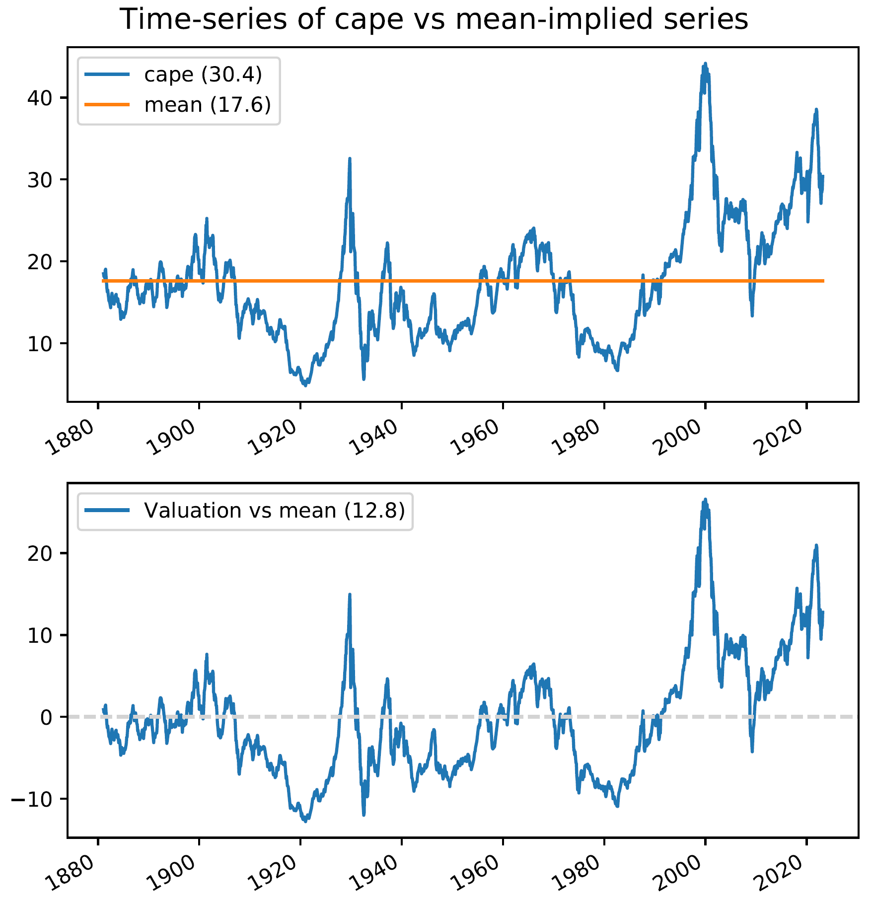
Based on the current value of the CAPE ratio, many argue that the U.S. stock market is very overvalued. Looking at the CAPE ratio going back to the 1880s shows that the CAPE ratio is, indeed, high relative to its long-term average level of 17.6 (the orange line below).
The bottom chart shows the CAPE ratio relative to its long-term average value. Currently, CAPE is 12.8 points above its long-term average, which is one of the main data points underlying the "stocks are expensive" narrative.
Are the 1880s a good benchmark for 2023?
One of the implicit assumptions in the above analysis is that the investing world of the late-1800s is a good proxy for the investing world today. But many things have changed in the last 150 years. Three things in particular may contribute to today's price to earnings (P/E) ratios being higher, on average, than P/E ratios from the 1880s.
- First, it is possible that the expected returns on the overall stock market have decreased over the last 150 years. This one is hard to refute definitively, but looking at realized stock returns over 20-year periods does not suggest that stock returns are lower now than in the past (in fact, they appear to be higher).
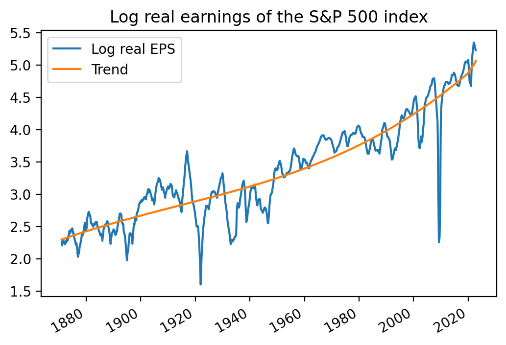
- The earnings growth of S&P 500 stocks may have accelerated since the 1880s. This would result in higher P/E ratios through the simple algebra of stock prices being equal to expected future dividends divided by discount rates minus anticipated growth rates (i.e., D/(r-g) or the dividend discount model ). Looking at the graph below, it certainly looks like the per-share earnings growth of the S&P 500 index has accelerated in the last several decades relative to the early part of the sample.
- The other major difference, while a bit of a wonky accounting issue, is actually really important. Tangible investment by companies (e.g., buying a printing press) shows up as an asset on the balance sheet, and does not represent a hit to earnings. But intangible investment, like a firm's repository of computer programs, does not show up as an asset, and is charged against earnings. As the economy moves away from tangible to intangible capital, corporate earnings mechanically shrink because of the differences in this accounting treatment. Morgan Stanley has a good piece on this. So today's earnings may just be systematically understated relative to the earnings of 150 years ago.
Log real earnings of the S&P 500 index (QuantStreet, Robert Shiller's website)
Adjusting for differences
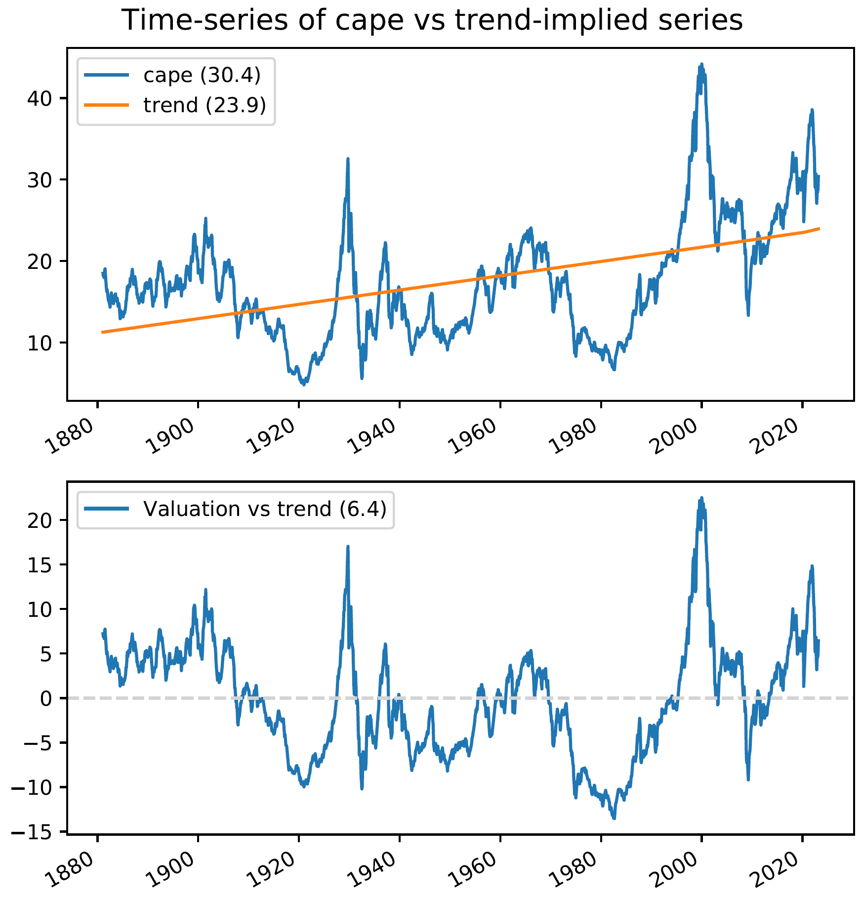
It is, of course, difficult to model all of the disparate influences that might render 1880s earnings and P/Es different from those of 2023. One "trick" is to check whether the time series in question (i.e., the CAPE ratio) has what economists call a time trend . A time trend reflects the possibility that a particular series may be steadily increasing or declining over a long period of time. The following chart repeats the one we saw earlier, but rather than assuming a constant CAPE ratio over 150 years, the graph shows the time trend in the CAPE ratio. The time trend is the best fitting straight line to the CAPE ratio so that the peaks above the line and those below exactly offset.
CAPE ratio with time trend (QuantStreet, Robert Shiller's website)
The first observation is that there is a distinct time trend in the CAPE ratio over the last 150 years. This effect is highly statistically and economically significant. The average level of CAPE in the 1880s was just over 10, and it is now over 20 (actually 23.9). Will this average level of CAPE fall back to its low-teens level from 100+ years ago? For the reasons already discussed, to us this seems unlikely.
Second, the bottom panel of the chart shows that the current CAPE ratio is still high relative to the long-term trend, but the difference is now 6.4 points, exactly half of what we saw in the first version of this analysis.
What about interest rates?
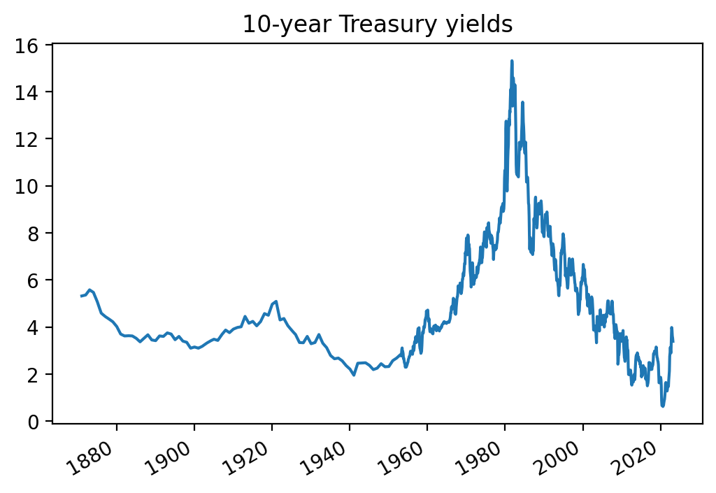
Recalling that a very simple model for stock prices is that they equal D/(r-g), that is the expected future dividend divided by the discount rate minus the expected growth rate, changes in interest rates, via their effect on the discount rate in the above formula, may also impact the P/E ratio of the stock market. Lower interest rates should be associated with higher P/E ratios. We now modify the above analysis to extend our trend model to also take into account the current level of 10-year Treasury rates. As the next chart shows, while interest rates are now higher than a year ago, they are still quite low by historical standards.
10-year Treasury yields (QuantStreet, Robert Shiller's website)
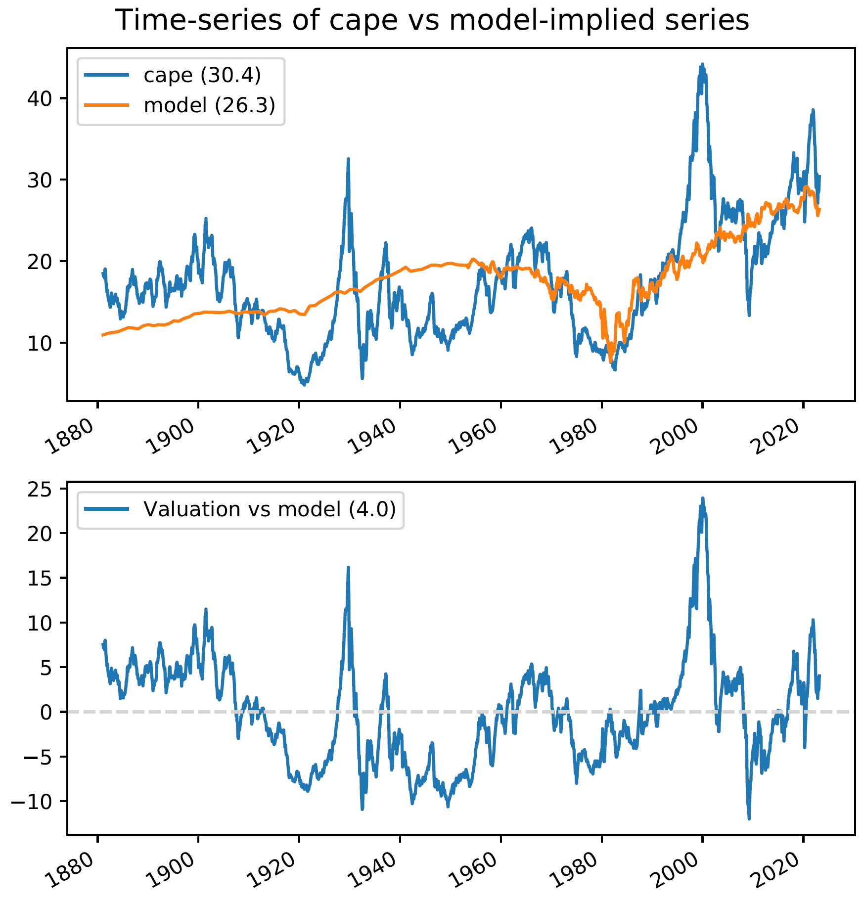
Taking into account the current level of interest rates produces our third and final analysis of the CAPE ratio. The orange line below, superimposed on the blue CAPE ratio, shows the level of the CAPE ratio implied by both the time trend in the CAPE ratio and the current, relatively low, level of interest rates.
CAPE ratios and model-implied CAPE ratios (QuantStreet, Robert Shiller's website)
The bottom panel of the chart shows the current CAPE ratio minus the model-implied CAPE ratio, where the model takes into consideration the time trend and the current level of interest rates. The CAPE ratio is still higher than the fair-value CAPE ratio level (of 26.3) but the difference is now down to 4 points. This represents a little bit of overvaluation of the U.S. stock market relative to its 150-year history, but the overpricing is much less dramatic than the raw CAPE ratio would suggest.
How is this possible?
When you are bombarded by warnings of the imminent demise of U.S. stocks, just keep in mind that comparing today's CAPEs to those of 150 years ago is really an apples-to-oranges comparison. There are two competing hypotheses here. One -- the doomsday hypothesis -- argues that the market is skating on an irrational plateau of overvaluation, a bubble sure to be imminently pricked. The other hypothesis is that things change over time, and that these changes have led to permanently higher average CAPE ratios than those that prevailed in the past.
Which view is correct? Only time will tell. Our money is on the permanently higher CAPE hypothesis.
As always, investors should make sure to position their portfolios in line with their own risk tolerances and liquidity needs.
For further details see:
Is The Stock Market Overvalued?