T - SPFF: Erosion Goes On So Does Inflation
2023-06-22 14:23:31 ET
Summary
- Global X SuperIncome™ Preferred ETF is a preferred stocks fund with an attractive 6.5% yield.
- SPFF has lagged competitors since inception and also in 2023.
- It has lost about 40% in share price and 37% in distributions since inception.
- Bonus: how to deal with decay in high-yield funds.
This article series aims at evaluating ETFs (exchange-traded funds) regarding past performance and portfolio metrics. Reviews with updated data are posted when necessary.
SPFF strategy and portfolio
Since my latest article with a sell rating on Global X SuperIncome™ Preferred ETF ( SPFF ), the fund has lost 6.5% in total return (including distributions), whereas the S&P 500 (SP500 is up 11%. This post renews my opinion with updated data. SPFF is a high-yield fund paying monthly distributions. As of writing, it has 48 holdings, a distribution yield of 6.51% and a total expense ratio of 0.48% (previously 0.58%). It started investment operations on 07/16/2012 and tracks the Global X U.S. High Yield Preferred Index. It was previously tracking the S&P Enhanced Yield North American Preferred Stock Index.
As described in the prospectus by Global X ETFs ,
The Underlying Index tracks the performance of the highest-yielding preferred securities listed in the United States (…). The Underlying Index is comprised of preferred stocks that meet certain criteria relating to size, liquidity, issuer concentration and rating, maturity and other requirement .
The Fund's portfolio turnover rate was 39.39% in the most recent fiscal year. The portfolio is heavy in financial companies, especially in the banking industry. The next table lists the top 10 holdings.
| Issuer ticker |
| Name |
| % of Net Assets |
| WFC 7 1/2 PERP |
| 8.35 |
| BAC 7 1/4 PERP |
| 6.74 |
| T 4 3/4 PERP |
| 4.33 |
| JPM 4.55 PERP |
| 3.62 |
| COF 5 PERP |
| 3.47 |
| T 5 PERP |
| 3.14 |
| MS 6 1/2 PERP |
| 3.12 |
| ALL 5.1 PERP |
| 3.05 |
| DUK 5 3/4 PERP |
| 2.98 |
| COF 4.8 PERP |
| 2.76 |
However, this is a bit misleading about risks related to individual companies, because the fund may hold more than one security issued by the same company. The next table lists the top 10 issuers with aggregate weights and fundamental ratios. The portfolio is very concentrated: these top 10 constituents represent about 59% of asset value, and each of the top two names, Bank of America and Wells Fargo, weighs about 10%. Please note that the fund doesn't hold the tickers listed below, but preferred stocks issued by these companies.
| Ticker |
| Name |
| Weight% |
| EPS growth%TTM |
| P/E TTM |
| P/E fwd |
| Bank of America Corp. |
| 10.07 |
| -5.30 |
| 8.60 |
| 8.42 |
| Wells Fargo & Co. |
| 9.92 |
| -27.18 |
| 11.89 |
| 8.73 |
| Capital One Financial Corp. |
| 7.57 |
| -42.98 |
| 7.47 |
| 9.06 |
| AT&T, Inc. |
| 7.47 |
| -157.72 |
| N/A |
| 6.48 |
| Ford Motor Co. |
| 6.23 |
| -74.93 |
| 19.65 |
| 7.78 |
| ATH |
| Athene Holding Ltd |
| 5.17 |
| JPMorgan Chase & Co. |
| 3.62 |
| 0.60 |
| 10.50 |
| 9.78 |
| Morgan Stanley |
| 3.12 |
| -25.94 |
| 14.83 |
| 13.32 |
| The Allstate Corp. |
| 3.05 |
| -172.25 |
| N/A |
| 58.09 |
| Duke Energy Corp. |
| 2.98 |
| -31.62 |
| 28.12 |
| 16.27 |
Performance
Since 8/1/2012, SPFF has lagged the S&P 500 by over 11 percentage points in annualized return, and a 60/40 portfolio by 4.6 percentage points. Dividends are included in these numbers. Risk metrics are mixed: volatility is low, but the maximum drawdown is deep. Anyway, the risk-adjusted performance (Sharpe ratio) is inferior to both benchmarks by far.
| Total Return |
| Annual.Return |
| Drawdown |
| Sharpe ratio |
| Volatility |
| SPFF |
| 21.65% |
| 1.82% |
| -35.92% |
| 0.14 |
| 8.98% |
| SPY |
| 288.27% |
| 13.27% |
| -33.72% |
| 0.84 |
| 14.49% |
| 60% SPY + 40% BND |
| 146.37% |
| 8.63% |
| -21.80% |
| 0.8 |
| 9.36% |
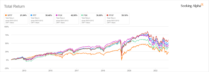
The next chart compares the total returns since 8/1/2012 of SPFF and four other preferred stocks ETFs:
- iShares Preferred and Income Securities ETF ( PFF )
- Invesco Preferred ETF ( PGX )
- SPDR ICE Preferred Securities ETF ( PSK )
- VanEck Preferred Securities ex Financials ETF ( PFXF ).
SPFF is the worst performer of this group.
SPFF vs. Competitors since 2012, total return (Seeking Alpha)
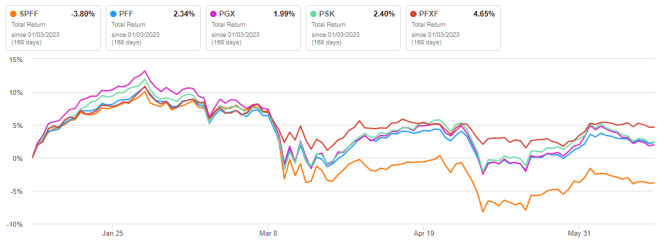
It has also lagged its peers in 2023 to date, and it is the only one in loss in the list (next chart). It seems the recent change of underlying index hasn’t brought a lot of value.
SPFF vs. Competitors YTD, total return (Seeking Alpha)
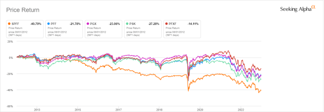
As reported in the previous table, the annualized return reinvesting all distributions since inception is far below the distribution rate. This is a clue of capital decay. In fact, the share price (without dividend) has lost about 40% since inception, which is much worse than competitors:
SPFF vs. Competitors since 2012, share price (Seeking Alpha)
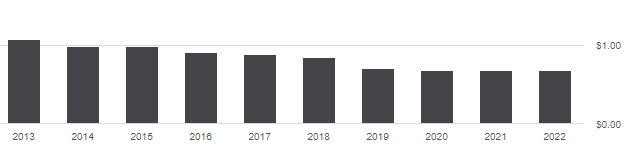
Distribution history is not more attractive. The annual sum of distributions went down from $1.07 in 2013 to $0.67 in 2022. For shareholders, this is a loss in income stream of about 37%, whereas the cumulative inflation has been about 27% in the same time (based on CPI).
SPFF distribution history (Seeking Alpha)
SPFF may be an interesting instrument for swing trading or tactical allocation, but I don’t think it should be a long-term holding in a sustainable retirement plan. Capital and distribution decay is not a specific issue to SPFF: securities with yields above 6% suffer from decay, on average (there are rare exceptions). Even for good fund managers, it's difficult to make a good recipe with bad ingredients.
Bonus: how to deal with decay in high-yield funds
Capital and income decay is an issue in many closed-end funds, like in high yield ETFs. However, it may be avoided or mitigated by rotational strategies. I designed a 5-factor ranking system in 2016, and monitored its performance during several years. I started publishing the eight best ranked CEFs in Quantitative Risk & Value ((QRV)) after the March 2020 meltdown. The list is updated every week. It isn’t a model portfolio: trading the list every week is too costly in spreads and slippage. Its purpose is helping investors find funds with a good entry point. In the table below, I give the hypothetical example of starting a portfolio on 3/25/2020 with my initial “Best 8 Ranked CEFs” list and updating it every 3 months, ignoring intermediate updates. Return is calculated with holdings in equal weight and reinvesting dividends at the beginning of every 3-month period.
| since 3/25/2020 |
| Total Return |
| Annual.Return |
| Drawdown |
| Sharpe ratio |
| Volatility |
| Best 8 CEFs quarterly |
| 123.75% |
| 28.20% |
| -20.60% |
| 1.16 |
| 20.18% |
| SPFF |
| 16.50% |
| 4.82% |
| -21.34% |
| 0.26 |
| 12.59% |
| SPY |
| 85.18% |
| 20.93% |
| -24.50% |
| 0.92 |
| 18.70% |
This simulation is not a real portfolio and not a guarantee of future return.
Of course, past performance (real or simulated) is not representative of future return. However, I think a time-tested rotational strategy in CEFs has a much better chance to protect both capital and income stream against erosion and inflation than a high-yield ETF.
For further details see:
SPFF: Erosion Goes On, So Does Inflation