AFMC - The Private Domestic Sector Prints A $166 Billion Surplus In June Pointing To Better Markets In July
2023-07-18 14:31:52 ET
Summary
- The US private domestic sector recorded a $166 billion rise in financial balances in June 2023, a positive result.
- Macro fiscal flows point to a pause in the growth of asset markets before the general bull market resumes.
- Bull markets can be expected to resume at the end of this year or the beginning of next and last several more years.
The purpose of this article is to examine the US sectoral flows for June 2023 and assess the likely impact on markets as we advance into July 2023. This is pertinent as a change in the fiscal flow rate has an approximately one-month lagged effect on asset markets and is a useful investment forecasting tool. Other macro-fiscal flows can point to events months or years ahead.
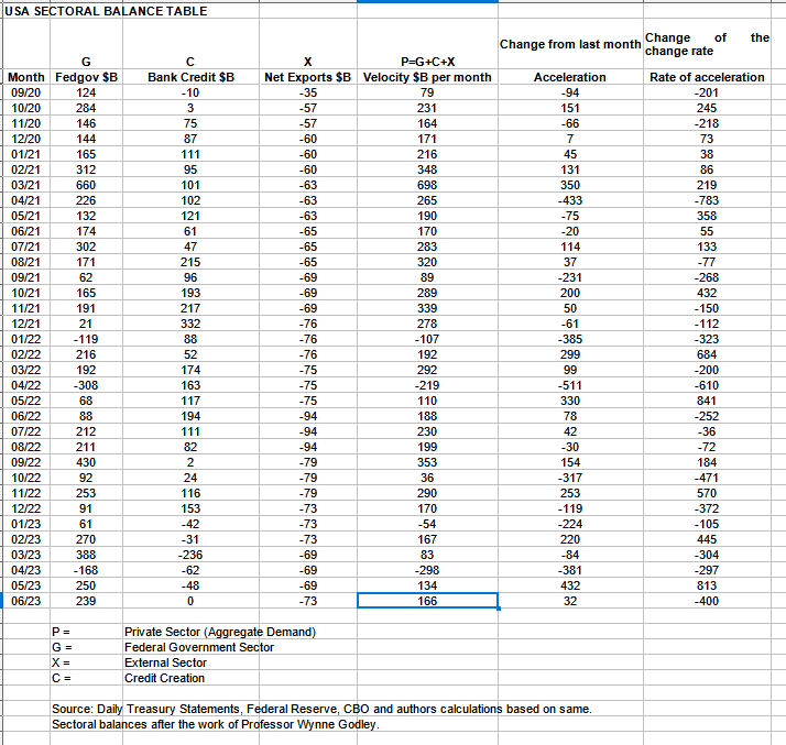
The table below shows the sectoral balances for the US which are produced from the national accounts.
US Treasury
In June 2023, the domestic private sector recorded a $166B rise in financial balances overall and this is a positive result.
From the table, one can see that the $166+ billion private domestic sector addition of funds came from a large $239+ billion injection of funds by the federal government (and this includes the new injection channel from the Fed of around $11.08B from interest on reserves that went directly into the banking sector), less the -$73B+ billion that flowed out of the private domestic sector and into foreign bank accounts at the Fed in return for imported goods and services. There was no contribution this month from bank credit creation which while not positive is a welcome relief from the five-month run of credit retraction where more money was removed as loans were repaid or written off than was created.
The most recent quarterly release of US current account information shows that the negative balance has enlarged as more is imported than exported.
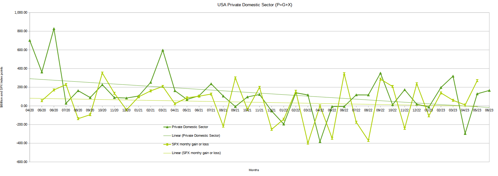
The chart below shows the sectoral balance data plotted in nominal terms. A trend line has been added to give an idea of the broad direction, which is downward for both the private domestic sector (where asset markets are located) and the SPX, though the private domestic sector balance is gently beginning to tilt upward. The calculation is federal government spending or G, plus the external sector (X and usually a negative factor) to leave that amount of money left to the private domestic sector, or P, by accounting identity true by definition.
The chart suggests that the SPX's next move would be for further gains following the upward move in the private-domestic sector balance. Over the last three months, the SPX has managed to stay in positive territory and this month just gone has broken the trend of ever-smaller increases by making a larger move upward.
US Treasury
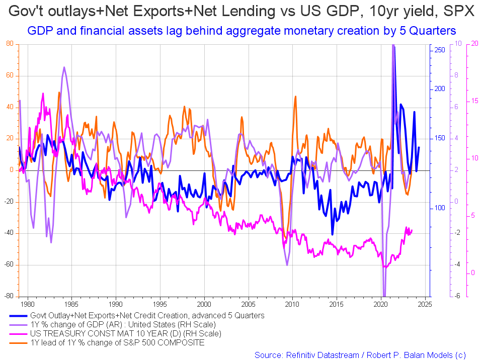
The following chart emerges when one graphs the change rate of the information in the US sectoral balances table above and adjusts for impact time lags. This is like a long-range market radar set.
Mr. Robert P Balan
The change over last month is that the SPX has risen a little more as has the 10-year bond rate.
The blue line shows the fiscal impulse from federal government outlays plus bank credit creation and less the current account balance and leads by up to five quarters (a year and three months). Short term, the orange SPX line appears to be trending back upwards to follow the leading blue line. Longer term the leading blue fiscal impulse line points to a major inflection downward that could take hold anytime now given the coarse granularity of this model. It's time to lower exposure to long positions. The next major inflection point is back upward sometime in 2024.
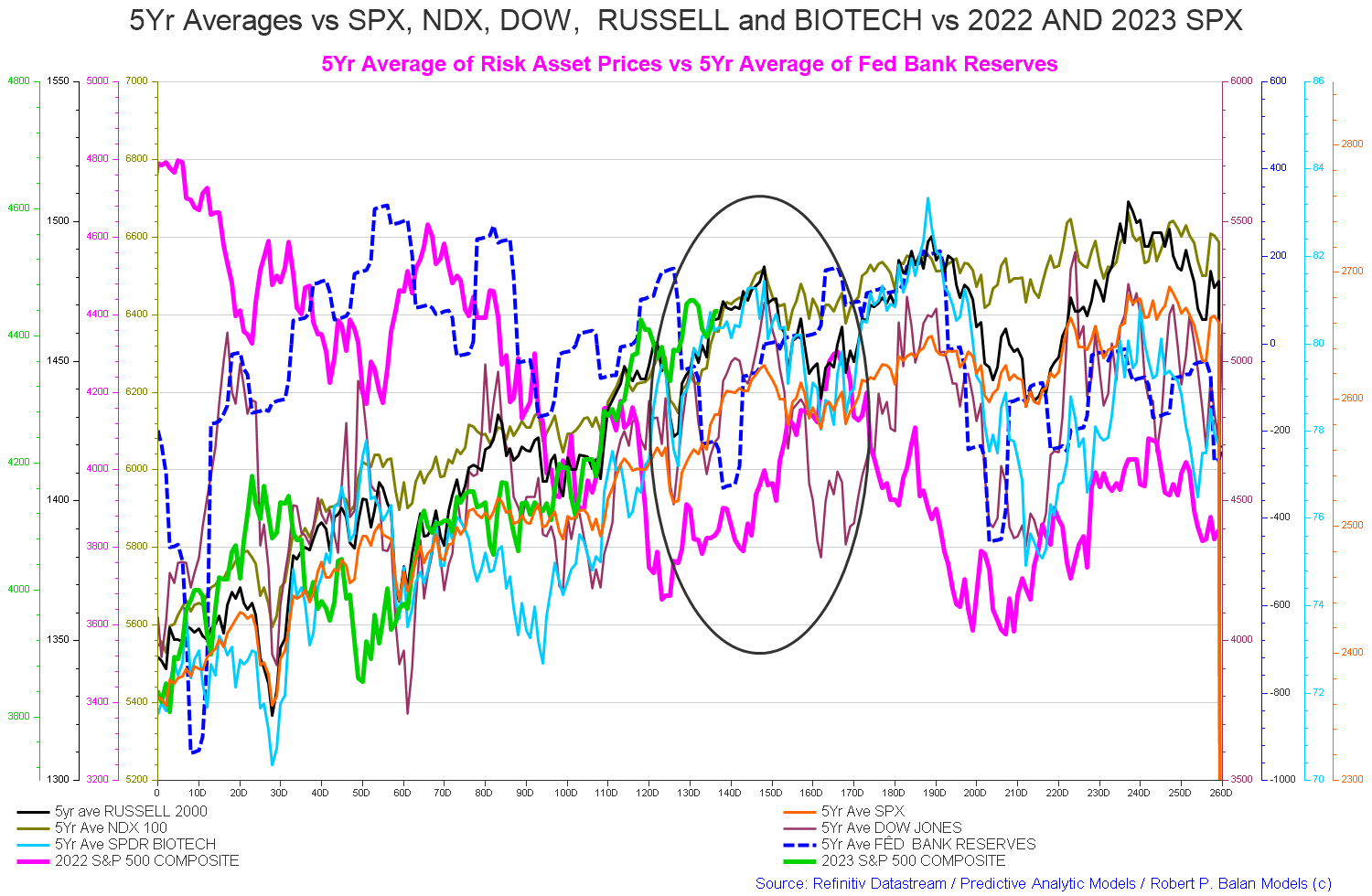
The chart below shows the five-year average of the seasonal stock market patterns for the SPX ( SPX ), NDX ( NDX ), Dow ( DIA ), Russell 2000 ( RTY ), and Biotech ( IBB ) market indexes. The black oval shows roughly where we are (trading day 141) at the time of writing and the end of the green line on the chart below.
The five-year index averages call for a drop now into trading day 160 (the first half of August) and then a rise into trading day 180 (the first half of September).
Mr. Robert P Balan
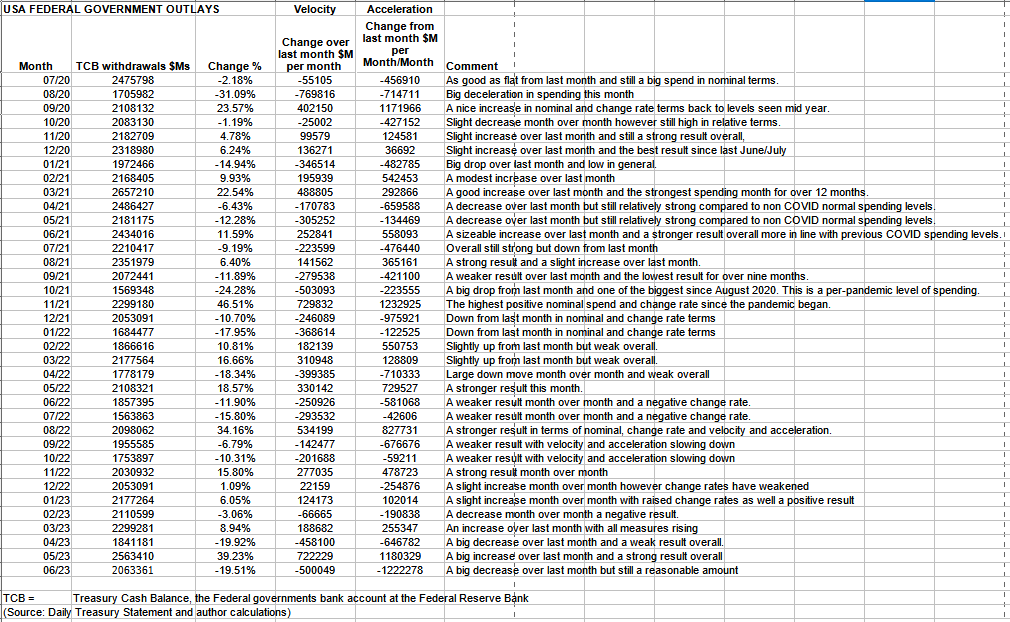
The table below shows the total federal government withdrawals from their account at the Federal Reserve Bank. A withdrawal by the federal government is a receipt/credit for the private sector and therefore a positive for asset markets.
US Treasury
The table shows that total outlays were lower than last month but still a solid $2T+.
Federal taxation in June was relatively light and so the resulting private domestic sector balance shown in the first table was relatively high.
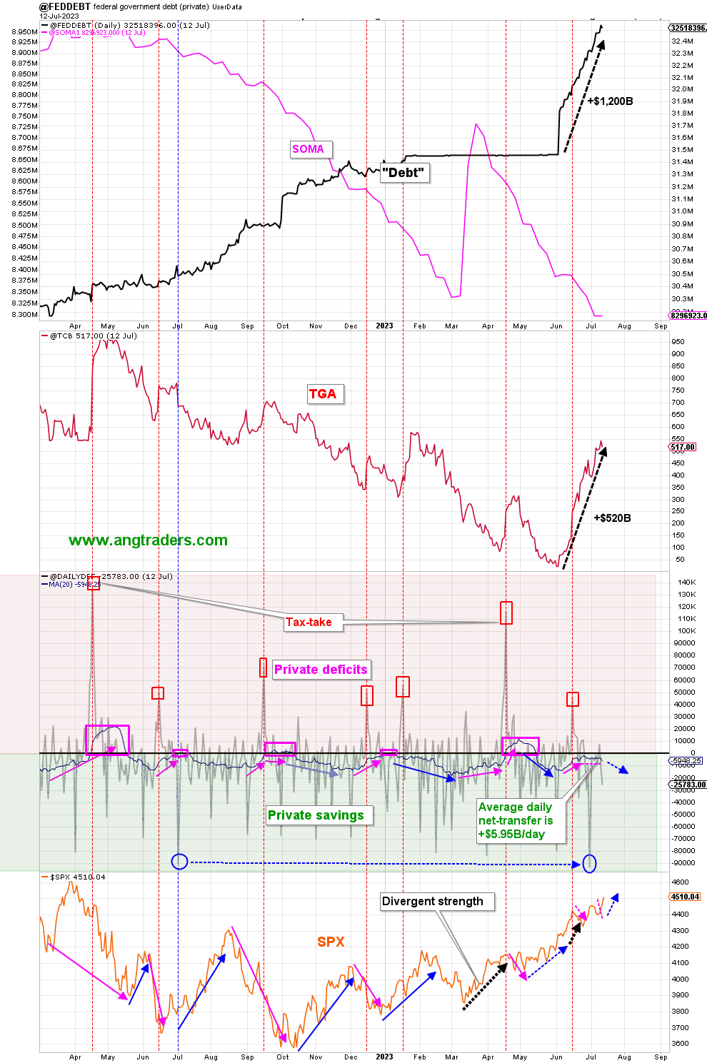
The chart below (bottom panel) shows graphically the relationship between the federal government (currency creator) and the private sector (currency user) and is from ANG Traders. The bottom panel highlights in red and green the financial relationship between the currency creator (red area) and currency users (green area). One's loss is the other's gain and vice versa, the difference is that the federal government creates the money via its central bank while the private sector does not have this luxury. Federal taxation removes spending power from the private sector but the federal government does not "need" the money as it can create, ad hoc, as much as it needs at any time.
The 20-day average of the daily net-transfers has declined slightly, down to +$3.38B/day from last week's +$3.85B/day. The echo of the June 15 tax-drain continues, but it's countered by the $93B net-transfer at the end-of-the-month. The average net-transfer has stalled without becoming a net-drain like in the past (pink-rectangles), and should continue to increase positively until the September tax-take. The SPX could trade neutrally for a few days, but should rally over the next couple of months.
(Source: Mr. Nick Gomez, ANG Traders).
ANG Traders
The next major fiscal milestones are the mid-August Treasury interest payment and then a smaller Treasury interest payment in early September on the plus side of the ledger. Then on the negative side, there's the large federal tax collection in mid-September when corporations pay their next tax installment.
The above chart (top panel) shows the stock of T securities has risen strongly after the removal of the debt limit and this sudden release of liquidity is what has been driving the stock market rally lately. This shows the fluid dynamic impact of the stock of treasuries, which is the fiscal carrier wave that moves all before it, is a much stronger force than bank reserves being drained to buy bonds in the shorter term. The latter impact is measured in days whereas the former impact is measured in weeks and is much stronger. The stock of Treasuries is the tide whereas day-to-day drains on liquidity to buy bonds are merely waves.
The reason the mainstream media gets this wrong is that they believe that the money that buys T securities comes from the private sector at the expense of other asset classes and is based on the widespread loanable funds myth. The truth is that the money to buy the T securities comes from the federal government itself and in so doing creates new money and total liquidity expands accordingly.
One sees that $1200B dollars has been created and about half of that went into the Treasury General Account [TGA] which is the federal government's bank account at the Federal Reserve Bank. The other half would have been used to "make whole" the various federal trust funds whose income was diverted elsewhere during the recent debt limit crisis.
At the White House in the last month, $39B of student debt was canceled in a modern-day Biblical micro debt jubilee.
The Jubilee Year (Leviticus 25) is the “good news” that Jesus – in his first reported sermon (Luke 4) – announced that he had come to proclaim.
Hudson, Michael. ...and forgive them their debts: Lending, Foreclosure and Redemption From Bronze Age Finance to the Jubilee Year (THE TYRANNY OF DEBT Book 1) (p. 19). Kindle Edition.
...a passage in Leviticus 25: 23–38, in which God ordains that every fifty years all dispossessed homes and lands must revert to their original owners; this measure defends the interests of the lowly, in that it restores their ancestral properties, relieves them of debt obligations, and counters the injustice of the few gaining more and more while the many have less and less.”
Hudson, Michael. ...and forgive them their debts: Lending, Foreclosure and Redemption From Bronze Age Finance to the Jubilee Year (THE TYRANNY OF DEBT Book 1) (p. 318). Kindle Edition.
Sadly modern-day law is based on Roman law.
Roman law favored a creditor oligarchy that disenfranchised indebted citizens and concentrated land ownership. This led to debt servitude, depopulation, and to serfdom at the end of the Roman Empire. Stoic philosophers blamed debt for the collapse of the Republic, and grew sentimental for the Bronze Age as having been a Golden Age of mutual aid and equity. The modern world retains the Roman legal principle protecting the claims of creditors against the economic solvency of debtors... After the 2008 financial crash, banks and bondholders were bailed out instead of having to take losses on their bad and often fraudulent loans. This left the economy to limp along with its debt burden kept in place.
Hudson, Michael. ...and forgive them their debts: Lending, Foreclosure and Redemption From Bronze Age Finance to the Jubilee Year (THE TYRANNY OF DEBT Book 1) (pp. 345-346). Kindle Edition.
This means that the income lost to principal and interest payments, on what should have been a free education as offered by more advanced countries on Earth, can now be spent on real goods and services and aggregate demand increases accordingly.
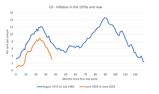
The next Fed meeting is on 26-27 July where no doubt another damaging rate rise of a quarter percent will be made. This is despite the fact that inflation is dropping all by itself due to the cessation of the COVID income support spending and resumption of supply factors formerly shutdown, as the chart below shows.
Professor William Mitchell
Consider the graph above, which shows the 1970s inflation episode, which effectively ran for just under 11 years from October 1972 to July 1983 and the current episode from June 2020 to June 2023 (current data).
The horizontal axis starts each series at the month that the inflation episode really began and then traces the evolution out by the months that follow.
In the first episode, the trace is from the low-point at the beginning (October 1972) to the next time that the inflation rate returned to that level (July 1983).
That event was drawn out.
The inflationary pressures were already emerging in the late 1960s as a result of the expenditure related to the prosecution of the Vietnam War.
It was starting to abate in early 1972, but really started to accelerate after the first OPEC oil shock in October 1973.
As you can see, before the situation could resolve, the wage-price pressures pushed the inflation rate back up and that was exacerbated by the second OPEC oil shock in late 1978 as a result of disruptions in oil supply due to the Iranian revolution.
By stark contrast, the current supply-driven episode did not have any additional propagation mechanisms at play (for example, wages pressure following the supply-side shocks) and that meant the inflation rate didn’t go close to the level reached in the 1970s and turned very quickly down.
It will be exhausted in about 40 months.
(Source: Professor William Mitchell )
An increase in the federal funds rate can be both inflationary and stimulatory to both the economy and asset markets and this is discussed in detail in this fine article by Mr. Nick Gomez of ANG Traders.
Counterintuitively, interest rates are likely to remain at this level or move a little higher and simply reflect the boom stage of the real estate and credit cycle that we are in at the moment. Hard as it is to imagine, the market booms now for several more years and is able to carry the dead-weight loss of higher interest rates on the cost of living and doing business. At the macro level the money that was lost to interest expense results in a lower quality of building and lifestyle than might otherwise have been the case.
On the subject of the real estate and credit cycle, an important milestone was reached this month when the real estate clock created by land cycle investing expert Mr. Phillip J Anderson was moved forward to the 2 PM (14 hours) position. The real estate clock is shown below.
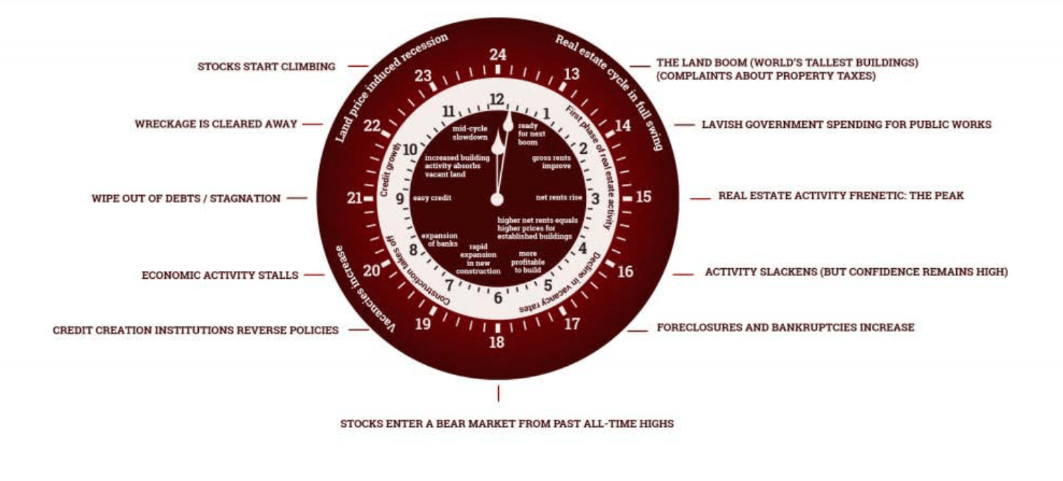
Mr Phillip J Anderson
(Source: Mr. Phillip J Anderson )
In this stage of the land cycle, the following broad features emerge:
Increasing land values and infrastructure spending open up new places (new towns and unloved parts of cities). The story of the era creates new ideas for how money can be made. New businesses start. Seemingly authoritative forecasts of demand raise expectations. Businesses and people relocate. There is a shortage of commercial space. Higher property prices push people outwards in search of more affordable homes. As property and land prices rise with economic growth, this unlocks investment by inducing developers to build. Property prices increase at a faster rate in outer regions than in central ones, reversing the pattern of the first half of the cycle. The Land Boom is broad-based. As the boom ripples out, construction and new lending for real estate go to more marginal developments; that is, into areas with smaller and less affluent populations. As the economy is growing, investors focus more on commercial property,
Akhil Patel. The Secret Wealth Advantage (pp. 251-252). Harriman House. Kindle Edition.
One can see from the first chart in this article that bank lending has been negative and flat for the last six months. This is about to change as another key feature of this part of the land cycle is easy credit.
Following and fueling the Land Boom are the banks. Having successfully survived the mid-cycle Recession, banks are ready to lend as the pace of economic activity picks up and building projects begin. Behind the scenes, they lobby for changes to regulations to enable greater credit creation. Politicians are happy to oblige because the banking systems appears to be in a sound position and because a profitable banking sector is good for the economy and generates large tax revenues. Besides, in this new era who really remembers the last crisis? With land prices rising and the economy growing they are able to lend more and do so more extensively. This increases earnings. Bank lending also follows the boom outwards as central sites become mortgaged. New business comes from marginal sites and more marginal borrowers. More credit availability helps to push prices up even further. A sign that bank lending is pushing up house prices is when the ratio of private debt to GDP increases.
Akhil Patel. The Secret Wealth Advantage (p. 252). Harriman House. Kindle Edition.
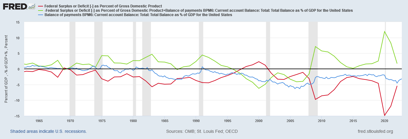
Last month the chart shown below was presented and showed the present condition of the US sectoral balances where the golden rule is that the green private sector balance needs to be large and expanding for the economy and asset markets to prosper. Clearly, this condition is not in effect, quite the opposite. The red line is federal spending and the blue line is the US current account all expressed as a percentage of GDP.
FRED
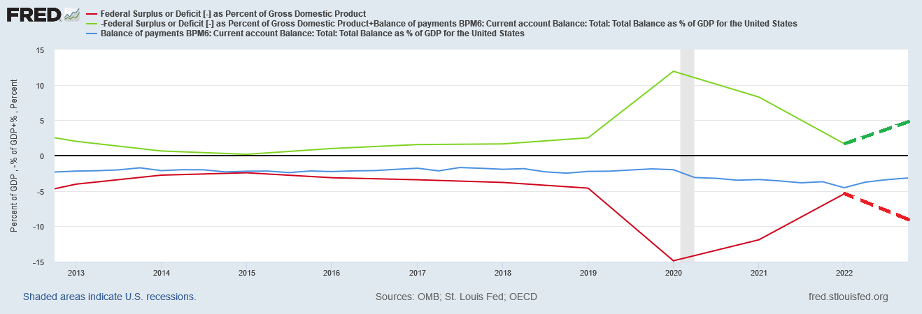
The chart below is a zoomed version of the one above with the forecast sectoral balances (broken red and green lines and author's addition) based on present spending levels given that most of the financial year is now behind us. One sees that the most likely result for 2023 is that the private domestic sector share is expanding outwards. The federal spending deficit is currently running at about 8% of GDP, the external balance is about -3% of GDP therefore making the private domestic sector balance at least 5% of GDP after the formula P = G + X.
FRED
What this means is that the fiscal flows are quite strong and are the main reason the stock market has been rising over the last six months. Under these conditions, a recession is unlikely given that mathematically GDP cannot drop below zero.
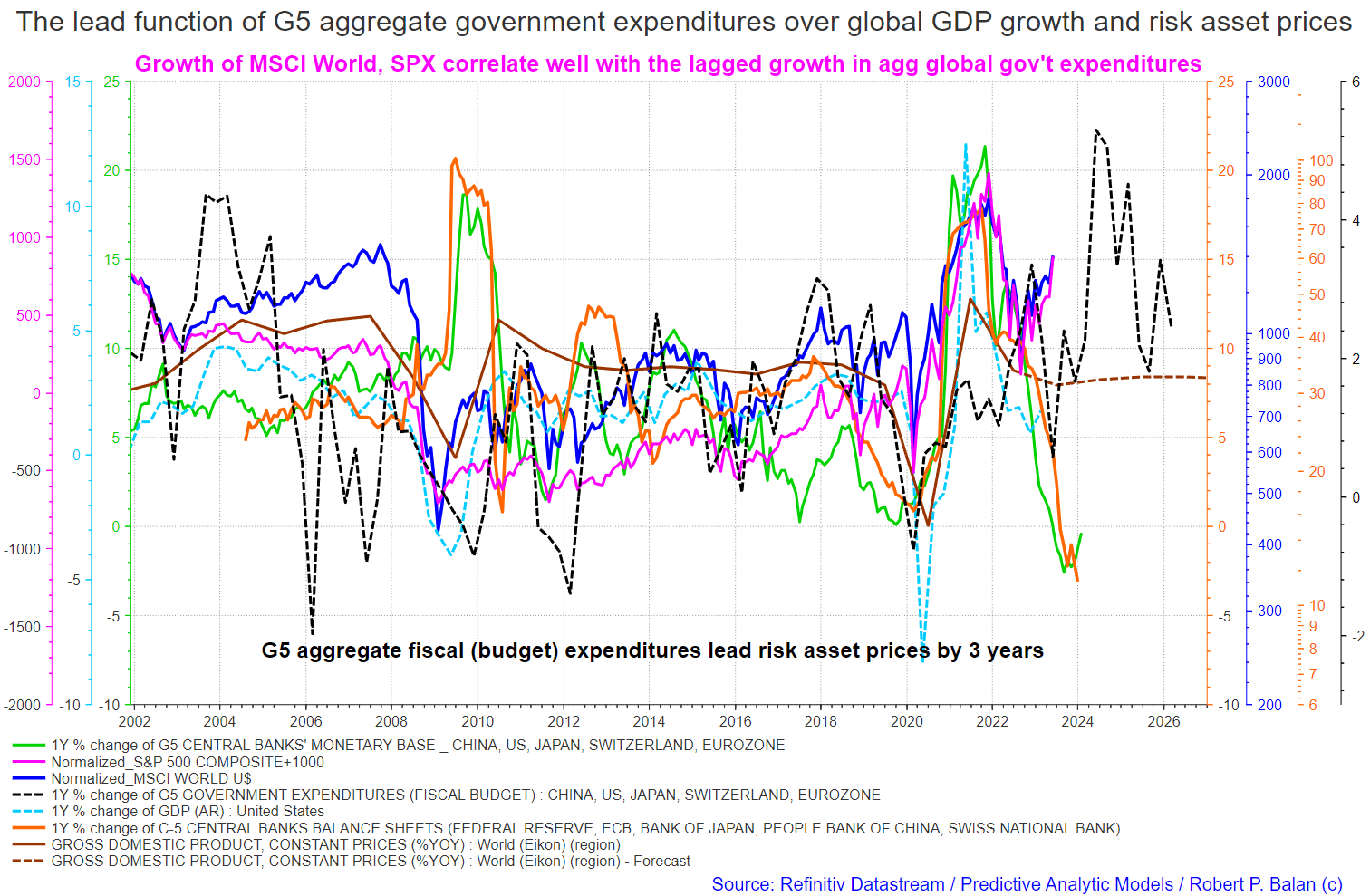
On the larger world macroeconomic side, we have the G5 chart below. The chart below comes from Mr. Robert P. Balan. The chart shows the level of money creation by the top five world governments (the G5) in a change rate format, along with a host of other indexes. This chart gives a sense of important inflection points and direction.
This month PAM market service members were treated to a rare and very valuable macroeconomic forecast from Balan a portion of which is shared below.
1. The bottom of the equity market bear phase which started on Jan. 1, 2022, may have seen on Oct. 12, 2022. From implications of the long-term systemic liquidity flows that we are tracking, the current bull phase may last until Q2/Q3 2024.
2. There's an immediate risk-off period due very soon due to recent tightening of financial liquidity from the build-up of the Treasury General Account. So there could be a month-long pause in the current bull run during early July until early August, but it should just be a minor and brief pause in the current up-cycle.
Mr Robert P Balan
3. Positive global systemic liquidity flows from G5 fiscal expenditures (black dotted line) have been humongous during recent quarters, and its lagged, positive effects on asset prices should sustain a bull market in risk assets until Q2/Q3 2024.
4. If the outflows from C5 global central banks' balance sheets taper down soon, the pause in the liquidity outflows, or possibly even new inflows, should cement a further bull market until Q2/Q3 2024.
(Source: Mr. Robert P Balan)
Another positive point is that the global M2 money supply (green line) has bottomed and started to rise again. This is a very positive factor as an expanding and prospering economy and asset markets need an expanding and growing money supply.
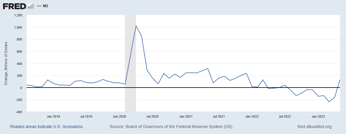
The US is the world's largest and most powerful economy and sets the pace as seen in the chart below.
USA M2 Money Supply (FRED)
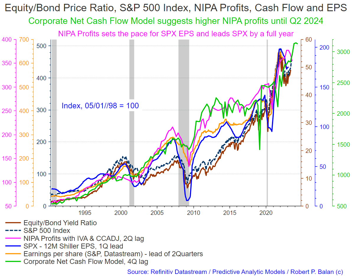
The chart below from the same macro article by Mr. Balan shows the same information in a format more acceptable to the mainstream in that it is expressed in terms of business NIPA profits, cash flows, and earnings per share, all of which have a lagged impact on assets markets such as the SPX and shows that it can rise well into 2025.
This is more palatable to the mainstream as they cannot stomach the fact that it's federal spending that drives business profits, cash flows, and earning per share by a factor of up to three years. This is similar to the mainstream's bond market confusion, mentioned earlier in this article, where the money that buys the federal government bonds comes from the federal government itself and increases overall liquidity, it does not decrease it. The same T security carrier wave also drives co-variant factors such as NIPA profits, cash flows, and earnings per share.
Mr. Robert P Balan
If you are looking to make a market entry, sometime in the last quarter of 2023, the first quarter of 2024 is likely to be a good time judging by the macro tidal forces that underpin the asset markets.
For further details see:
The Private Domestic Sector Prints A $166 Billion Surplus In June, Pointing To Better Markets In July