VV - Understanding The Yield Curve As A Predictor Of Recession
2023-07-24 06:13:43 ET
Summary
- The yield curve, which looks at the spread between the 10-year treasury note and the year bill, has been an excellent predictor of coming recessions since 1960, with only one error made in the mid-1960s.
- Despite its strong track record, the yield curve has recently come under criticism, with Goldman Sachs' chief economist arguing that it is no longer a good recession predictor due to lower liquidity premiums on treasury securities.
- However, the yield curve remains a reliable predictor, with the inversion of the yield curve signaling a high probability of a coming recession.
- The reasons people want to abandon the yield curve signal mostly stem from misunderstandings about how the Fed is and has been operating as well as ignoring the impact of past stimulus.
- The economy is not resilient. The Fed has not been aggressive. The recession is not 'late.' The yield curve signal is not too-old. Read on for more myth-busting and for some clear thinking.
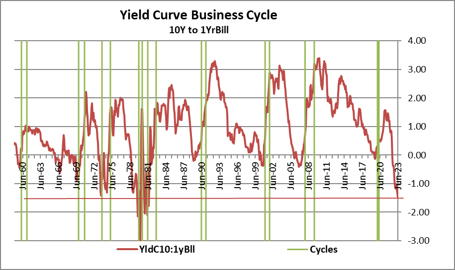
The chart below presents one version of the yield curve. This one looks at the spread between the 10-year treasury note and the year bill. Even the most casual perusal of this chart shows what an excellent predictor the yield curve is of coming recessions that are marked in green bands on the chart below. Such regularity is like a Christmas gift (in July, no less!) and so I decorated the chart in red and green in celebration. Since 1960 there have been nine recessions. Let’s understand from the outset what a recession is: it's a period that is declared as a recession by the business-cycle dating committee of the NBER (the National Bureau of Economic Research). If we take an inversion of the yield curve as the signal that a recession is coming, that signal works well. In fact, there was only one error, made in the mid-1960s, when the yield curve inverted and there was no recession. I'm going to talk specifically about that episode at the end of this article. Like anything else in life, we learn a lot from our mistakes.
Chart 1
Yield Curve 10-Year Note to Year Bill (Haver Analytics, FAO Economics )
Even though the yield curve has this excellent record, it has come under some criticism recently. Jan Hatzius, chief economist at Goldman Sachs, has reduced his probability of recession outlook and he argues that the yield curve is no longer a good recession predictor. Hatzius maintains that because of the lower liquidity premiums on treasury securities, it is easier for the yield curve to become inverted (for short-term rates to become higher than long term rates). However, looking at the chart above it's clear that this is an extremely inverted yield curve, and that risk premium would have to be cut extremely sharply if it's going to be ‘the reason’ to dismiss the kind of inversion that we're looking at in the yield curve. The yield curve on this measure has only been more deeply inverted in the two 1980-recessions when the federal funds rate and the inflation rate we're substantially higher than they are today.
Hatzius looks at the inverted yield curve and converts it to a ‘probability of recession’ statistic, following in the footsteps of “A Current Issues” publication from the Federal Reserve Bank of New York in June of 1996 (specifically Volume 2 Number 7) entitled “The yield curve as a predictor of US recessions,” that was written by Arturo Estrella and Frederick S. Mishkin ( here ). In that paper Estrella and Mishkin argue that the yield curve is a particularly good predictor of recessions; they develop a model using the slope of the yield curve (the difference between short and long rates) to predict the probability of coming recession with this one simple metric. Their paper spans data from 1971 and they used a three-month treasury bill and the 10-year treasury note to establish the yield curve.
Mishkin and Estrella use the yield curve data to estimate a probit model that predicts the probability of recession four quarters ahead. They also estimate recession on several fixed horizons demonstrating the superior predictability of the yield curve for more advanced warnings compared to competing data. This illustrates one of the problems with using these data as raw material and as a time series to project a singular event. If we look at the full scope of these data, the yield curve predicts all recessions since 1960. There are nine recessions, and the yield curve data predict every single one of them. Different specific measures of the yield curve may have slightly different levels of success in making this prediction but the yield curve is a very reliable predictor. However, to get a ‘probability of recession’ measure which is what Hatzius is doing and what Estrella and Mishkin have estimated, you need to have a specific time frame such as estimating four quarters ahead. However, in markets while we're focused on knowing exactly when recession is going to occur, are also interested in knowing if recession is going to occur. So, the vaguer notion of ‘will there be a recession at all’ is separately important as district from the timing of it. The probability of recession approach attaches lower probabilities to the potential for recession than the simple question, ‘does the yield curve predict a recession?’ Having to specify that recession must start exactly X-quarters from today is a high hurdle for a probability statement..
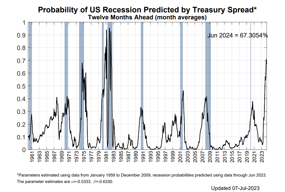
A recent article by Bloomberg published on July 18th entitled “Is the yield curve a reliable recession signal anymore? Written by Edward Harrison provides an updated chart presenting the probit probability of recession analysis as generated by the yield curve and their model ( here ).
The Bloomberg graphic is presented below and one of the things I hope you find interesting about it is that there's a certain dissonance in the fact that the yield curve predicts every single one of the recessions on this chart and yet it only predicted three of them with the probability rated higher than 50%! As I mentioned above, this is partly because the probit model must have a very specific time horizon that it uses to forecast recession. It's not forecasting the amorphous event that might occur at some unknown time in the future; it's forecasting a specific event that it expects to occur at a specific time. And that limiting feature causes the probability of recession to perform worse than the yes/no indicator of recession by using a binary signal of inversion or not.
In fact, if you allow me to twist the references of the statistics, you will notice that every recession that occurs with the probability rating of 30% (0.3) or higher. One possible exception is the 1960 recession, but we don't quite see enough data ahead of time to know if it's true for that cycle - for now let's assume it is true. Since the ‘probability of recession’ shows that recession is predicted correctly anytime the probability is above 0.3 over nine out of 10 occasions we can adjust the probability statement. There is only one false signal since 1960 - And that false signal is there for the raw inversion of the yield curve as in this probit treatment of it. So, in some sense when the probability of recession on the model is above 30% the probability of a recession coming at all is really more like 89% (9 correct signals; one false signal).
Chart 2
Probability of recession predicted by yield curve (Bloomberg)
This is a way to try to reconcile the output generated by these models against the high degree of veracity stemming from the signal of inversion to the event of recession. When we look at the signal of inversion it's a binary signal: either the yield curve is inverted, or it isn't. In this method we set the magnitudes of the inversion completely aside. Doing that we have 9 correct estimates and one false estimate over this entire period. And that's a rather good track record.
This brings us to the next question which is why are people suddenly questioning the veracity of the yield curve signal when it has been so good, so consistent? This to me is quite astonishing and I think it is wrapped up with some of the points I have made in other articles concerning confusion about Fed policy and about economic performance.
Resiliency belief & Market confusion cause yield curve misapprehension
Markets are confused about two things.
- Handicapping Fed policy - First of all, markets are confused about how the Fed could be hiking interest rates so much for so long and the economy could still be growing, and this has spawned the belief in economic resilience. To me that's an easy one to handle because the Fed started out in a deficit position with the federal funds rate below the inflation rate (strike one). Then the inflation rate accelerated, and the Fed waited a full year before raising rates at all (strike two). The Fed only recently got federal funds rate above the 12-month trailing inflation rate (Strike 3!). And no matter what you feel about how to discount the federal funds rate for inflation to create a ‘real funds rate’ or a ‘real funds rate for the outlook’ there can't be any debate about the fact - THE FACT - that most of the period when the Federal Reserve was raising the federal funds rate (and also a full year -a year- before it moved it at all!), any reasonable measures of real interest rates whether deflated by trailing or expected inflation rates were very low - in fact negative. Therefore, from the start of Fed tightening, Fed policy was still very accommodative. And Fed policy has not really gotten restrictive until maybe the last several months. Hence the Fed tightening ‘struck out’ as a device of restriction (strike three!). That has only just been reversed. Looking for the economy to slow from the date of the Fed’s first-rate hike is just plain wrong! Now we will start debating about what kind of inflation rate we want to compare to the federal funds rate in order to create a real interest rate measure. That's a more complicated issue particularly in these times, given the way the Fed has behaved and particularly given how its behavior may have substantially undermined its credibility.
- Assessing resiliency - The second thing that markets are confused about is something you hear lots of Federal Reserve and other market participants talking about and this is economic resiliency. The economy is resilient because it's been growing while the Fed has been hiking interest rates, or so ‘they’ say. Well, we just debunked that one, above. There's also the fact that there's been a tremendous amount of fiscal stimulus and other special programs ranging from a moratorium on mortgage payments and rent payments during COVID, to extending Medicare benefits to people who didn't qualify for them, them, to the recently truncated attempt by the President to forgive students’ educational debt. All these things helped put/keep money into peoples’ pockets stimulating the economy. Even the work-from-home model that became fashionable during COVID and has proved to have legs beyond Covid, has saved consumers money by reducing for some childcare costs and for others transportation to work costs. During the time these changes were initiated economic performance has been augmented. Still, in the first two quarters of last year, while we continued to have strong job growth, GDP contracted slightly, a clear signal that these changes in the marketplace have been a setback to productivity. Against that background I would hardly call the economy resilient. So, let's set the resiliency argument aside as well and see what happens as the policy tailwinds recede. How well does this economy sail into the wind?
Yield curve-recession timing
The timing issue is related to the two points that I make above, one about how long it's taken for the economy to respond after the Fed started hiking rates, and the other this point about resiliency. So, with these two perceptions there is also a perception that the yield curve is inverted and yet recession hasn't started and since that event hasn't happened people are beginning to wonder whether it's going to happen.
The Poison of Poisson and Greif of Godot
In statistics there is a statistical distribution known as the Poisson distribution which is sometimes called the “waiting for the bus distribution." The notion is that not all statistical distributions are the same; they're not all ‘normal’ (bell-shaped), or uniform flat (equal probability outcomes). And then, there's the Poisson distribution that seems to apply in the real world to the event of waiting for a bus. The sense is that buses usually run on a schedule, but if you've been waiting for the bus and one hasn't come for a long time, very often that should be taken, not as a sign that he bus about to come any minute, but as a sign that it's going to be an even longer wait! You should not stay and wait for it. You should go to Plan-B (walk, subway, or Uber). Something unusual has happened! In this situation with the economic performance and the extended yield curve inversion, people are wondering if they waited so long for this event to take effect and if it's not a Poisson event - maybe it’s even going to turn out to be a Godot event.
A stand-up guy or a stood-up guy?
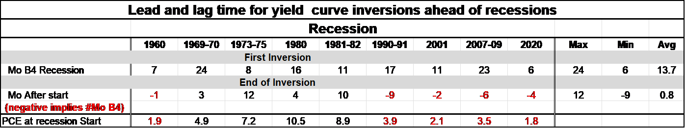
Table 1
Yield curve inversion Vs recession start dates (Haver Analytics and FAO Economics )
The table above is relevant. One of the things this table reminds us of is that the yield curve inverts on average about 13.7 months before the start of a recession. These statistics apply to the yield curve measure I chart above, the gap between the 10-year note and the year-bill. On that measure, the yield curve has already been inverted for 12-months. However, the table reminds us that sometimes it has taken up to 24 months after the yield curve first inverts for the recession to occur. And, in fact, the shortest lag between the curve inverting and a recession starting is 6-months. Four of nine historic recessions still would not have occurred yet. Two would have started just two months ago. We are more impatient than we have been ’stood up.’
The indefatigable yield curve signal
Let’s note in Jon Hatzius’ attempt to dismiss the yield curve as a predictor he says...referring to the yield curve currently as dominating the ‘term premium effect’ to become inverted says… “ In the past, this has generally only happened in situations when a recession was becoming clearly visible—hence the curve’s strong track record as a recession predictor. Looking at the sometimes-long lags in the table above on yield curve inversion, it is hard to take this criticism at face value. Hatzius also argues…” Second , there is a plausible path to Fed easing just on the back of lower inflation” But the core PCE is falling very slowly. It is not clear how fast it will fall in the period ahead. Undermining a solid-performing signal like the yield curve with an unbacked forecast is not a position on solid ground. On balance, the yield curve signal seems to be on as solid footing as ever. Naysayers will have to bring a stronger case to undermine it.
When inversion goes away
The second line in table 1 is somewhat more interesting, if unexpected. These statistics tell us how long after the recession starts the inversion tends last before it is erased and returns to ‘normal.’ There are nine recessions, and the behavior of the yield curve is as evenly split as it can be. There are four with numbers in black, indicating that the yield curve turned normal -that is, the number of months after the recession started before the curve returned to a positive slope. And then there are five numbers (negative) in red, that remind us that there were five recessions in which the yield curve inversion went away before the recession even began .
If you look back at the chart at the top, you will see these episodes quite clearly. What's interesting is that the numbers in black refer to periods in which the inflation rate at the start of the recession was relatively high. Those inflation numbers are memorialized at the bottom of the table. In the 1969-70 recession when inflation was 4.9% the 1973-75 recession when it was 7.2%, the 1980 recession when PCE inflation was 10.5%, and the 1981-82 recession when inflation was 8.9%. Recessions that began with the PCE inflation rate low and, low in this table means inflation of 1.9%, 3.9%, 2.1% 3.5%, and 1.8% (see table) saw the yield curve inversion go away before the recession began. These are marked in the table as red figures. Currently PCE headline inflation is running at 3.8% which would put it more in the grouping of the ‘low inflation recessions’ but if we were to measure inflation from the core, inflation rate is much higher, making it less clear whether we should expect the yield curve to lose its inversion or not before the recession starts - if this pattern is to remain in force.
It's important to note that there's nothing here that would cause us to look at the yield curve or the economy and to suggest that anything from history has changed that makes the yield curve a less applicable measure to the economy or less reliable as a predictor of recession. In fact, the extreme inversion of the yield curve given the probit model approach would seem to be a strong factor favoring our belief that a recession is still coming. Recession is still on the table and ‘to be expected!
The Error
And one mistaken signal since 1960
Chart 3
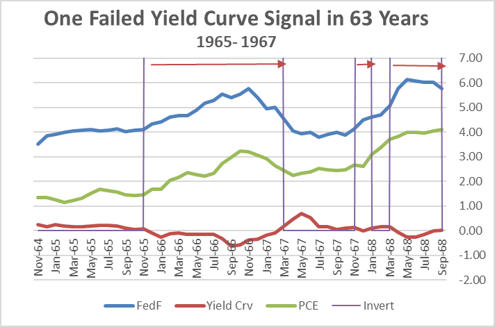
Mid-1960s: Yield curve forecasts recession...none comes (Haver Analytics and FAO Economics)
I noted at the start of this article that there was one failed prediction of recession by the yield curve model and that occurred in the mid-1960s. You’ll see the periods of curve inversions listed on the chart above marked by purple horizontal lines, connected with arrows to try to make it a little bit easier to identify the inversion periods. The last episode of yield curve inversion is actually the episode that is a correct signal and that’s forecasting the recession starting in 1969-70. The first episode is the one that is incorrect from 1965 to 1967 when the yield curve inverted - and in fact did not invert by very much - but it inverted as the inflation rate rose (I used the PCE measure of inflation here which is the Fed’s current target). In response to inflation the Federal Reserve was raising the federal funds rate.
Too much here and now or not enough of it? The balancing act:
I like this episode as a ‘learning experience’ because it shows us some interplay between what the Fed is doing, what the Fed is looking at, what the market is doing and what the market is reacting to. While I am critical today of the Fed being so focused on ‘expected inflation’ (and neglecting current inflation) I hold this criticism because the Fed seems to do this in a dogmatic and dismissive way so that it can set aside the uncomfortable fact of how low interest rates are (and have been) currently relative to the current inflation which has proved to be very high and still stubborn. Using expectations in that fashion to make policy and ignore reality doesn’t seem very smart to me since no one, no matter how many economists one has, or how many models are used, or how many computers are engaged, can be sure of what the future will be. Ignoring or downplaying current inflation is a bad idea. However, when the yield curve got things wrong, in the mid-1960s, it was clearly a period when the Federal Reserve was looking very closely – too closely- at current events and seemed to be tying policy ‘far too tightly to current events.’ This is the opposite problem- too much focus on the here and now and not enough perspective. Hey, it’s always something. Policy must be balanced.
What happened in the Mid-60s was that inflation, which had been accelerating, began to break lower and the Fed very quickly stopped raising the funds rate and started cutting it. As the Fed started cutting the funds rate, of course, the yield curve lost some of its inversion, and eventually, in early 1967, the yield curve lost all its inversion. The Fed had reversed its tightening, so there was no recession. The Fed had brought the federal funds rate back down. Inflation had been about 1.4% when the Fed tightening began, then peaked at 3.2% and fell to a low of 2.2% after the Fed stopped hiking rates. And, as this happened, the Federal Reserve - that had brought the federal funds rate up to 5 3/4 percent - dropped it back down to under 4% by May of 1967. So, the yield curve that saw inflation rising and the Fed tightening to stop it was not just handicapping what the Fed had done but clearly it was projecting that the Fed would be doing more. The Fed did not do more…but it should have!
A complex yield curve signal?
This suggests that the yield curve signal is dynamic and that its signal has some anticipation in it about what it thinks Federal Reserve policy will be in the future. In other words, we might take an inverted yield curve as a signal that the market sees recession coming, but in fact the real signal may be that the market sees recession coming only if the Federal Reserve continues to act the way the market thinks the Federal Reserve is going to continue to act. And if the Fed deviates from that plan, the yield curve might just say, well… never mind.
Given the way the Fed is acting and setting policy today, this could become an issue. What does the market really think the Fed is going to do from here on out? That is always hard to know…even with Fed funds futures markets, forward guidance, and SEPS.
To me this mid-1960s episode undermines the yield curve signal to some extent because it suggests yield curve behavior in real time isn’t just giving us a signal about what will happen in the future based upon what has already happened . It is giving us a signal that depends upon certain kinds of actions continuing to be taken in the period ahead. However, having said that, we can still see that the yield curve has done a remarkable job of handicapping what the Federal Reserve is going to do and that this mid 1960s case – this yield curve error- is unusual. Maybe it was part of the market’s learning process and the Fed’s learning process, too.
Using the rear-view mirror of history to understand the Fed better…
But let us also learn from this mid 1960s case because one of the things that happens here is that this is one of the cases that the Federal Reserve calls a ‘soft landing.’ And understand what this soft landing is: it’s a period when the Federal Reserve raised rates, and let them come back down, where it was able to engineer a decline in inflation from its peak, avoiding recession, but – it’s a case that when the Fed is done - the inflation rate is higher than it was before the Fed started hiking rates . When the Fed started the inflation rate was about 1.4% and when it ended inflation at its very temporary best only fell to 2.2% and then it accelerated severely.
Applicability to today
This is the parallel to our times that I worry about. I worry that the Federal Reserve might be willing to stop tightening and start easing because inflation is off-peak. In which case, the yield curve that has been inverted and then - either with or without a recession- the Curve would normalize. The risk is that the Fed ends its action with the inflation rate off-peak -but higher than its target on balance (as happened in the recessions of 1969-70 and 1973-75) as well as in the non-recession of the mid-1960s.
Chart 4
1960s interest rate Vs inflation trends (Haver Analytics and FAO Economics)
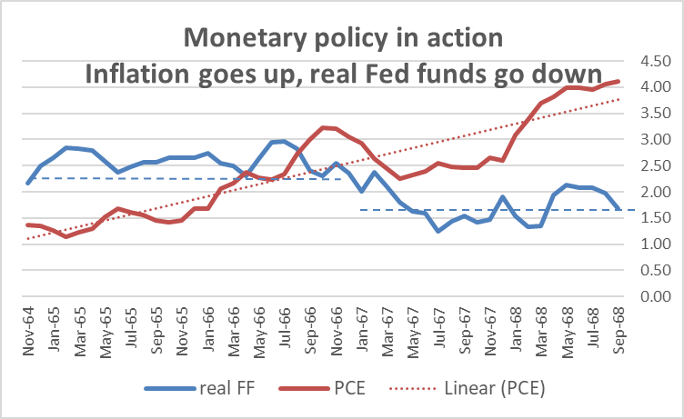
One of the things we see in this early period. Is that PCE inflation, while having its up and ups and downs, is nonetheless accelerating. In Chart 4, the yield curve inversion cycles are no longer labeled on the chart, but you can see how the PCE inflation escalates comes back down and then continues to rise and then accelerates again. I've drawn two horizontal blue dashed lines to indicate where the real fed funds rate was before and then where the real fed funds rate ended after this mini-non-cycle. As inflation was rising, the Federal Reserve let the Fed funds rate fall, undercutting the real interest rate – calculated based on 12-month trailing inflation.
Our cycle
And while our cycle has been one in which the real fed funds rate has been more chronically low even well before the recession began-unlike most (nearly all) past cycles- the problem this time is not a too slow rate hike it’s been a Fed reluctant to start a tightening cycle at all, and then then rushing to catch up. After all that, the real Fed funds rate now is barely positive- the nominal Fed funds rate is barely above the trailing 12-month inflation rate. While the Fed is not making the error of allowing the real fed funds rate to erode, as it previously allowed in the mid-1960s, it previously allowed the real fed funds rate to plummet to extremely low (negative) levels by its policy inaction. Now, barely bringing it up to frictional levels to compensate, this has created ‘waves of stimulus’ people are confusing with economic resilience or as a lagged response to the Fed’s policy action. Instead, it’s what you expect after the Fed’s delayed policy inaction! I still think one important question is whether this real interest rate based upon trailing inflation is high enough. And that question is emphasized by the University of Michigan inflation survey that finds - despite what has been some good inflation data over the past week - that inflation expectations in the Michigan index are still rising… earth to Fed, earth to Fed.
Outlook: R-E-C-E-S-S-I-O-N
Through all of this I am still impressed by the signal from the yield curve and with the prospect of having a recession occur because of any number of peculiar conditions that exist in the economy. As far as economic resiliency is concerned, we will now see how resilient the economy is, now that a lot of those special programs that were there have been taken away and now that monetary policy it's done exploding M2 growth which has begun contracting… and now that the Fed is beginning to elevate interest rates above the trailing 12-month inflation rate.
I remain somewhat cynical about measures of people's inflation expectations, in part, because surveys on inflation expectations for longer periods ahead are extremely poor indicators of what inflation turns out to be in those periods ahead... This result makes me think that people may, if you ask them, give you their inflation expectation, but they may not actually put much stock in whatever number they give you. In other words, real interest rates derived by looking at current interest rates against surveys of expectations may not be worth the paper they're written on. I continue to be a fan of the movie Pink Panther starring Peter Sellers. One of the reasons is that inspector Clouseau, bumbling fool that he is, at the very least was prone to admit that ‘he did not know’ and to emphasize that ‘he did not know what he did not know.’ We could stand a little bit more of that humility from economists. Just because somebody fed you an expectations number, doesn't mean it's worth anything. Who do you ‘expect’ to win the Super Bowl this year? ‘Expecting’ does not make it so… It may not even count as a ‘good guess.’
A hotly debated subject these days. This article looks at past Yield curve success Vs the reasons some want to throw it under the bus now. It argues against that and identifies mistaken views in the market as the reason to 'stick with it.'
For further details see:
Understanding The Yield Curve As A Predictor Of Recession