XOP - XLE Or XOP? The Energy Sector Is Powering Up
2023-04-01 00:54:12 ET
Summary
- The energy sector's been in a high level consolidation for almost a year and has, so far, avoided the bear market. However, this consolidation phase seems to be ending.
- Oil appears ready to move higher. After trending down for a year, the latest commitment of trader data points to higher oil prices.
- Likewise, current option activity in the energy sector also points to a bullish outlook for energy stocks.
- Which ETF should perform better with an increase in oil price - XOP or XLE?
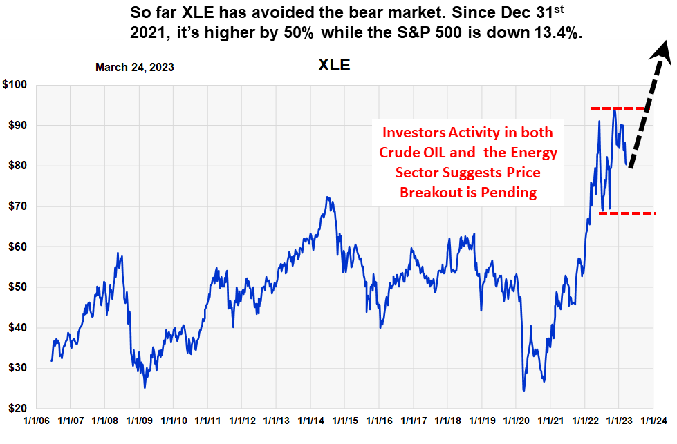
This is a follow-up to this earlier article on [[XLE]], which forecast a trading range market for the energy sector. We now think the trading range for oil stocks is ending.
The Basic Concept
While the stock market’s been in a bear market for over a year, stocks in the energy sector have been trending sideways. From a long term perspective, they appear to be consolidating their gains after their large move off the March 2020 low.
Key sentiment indicators are indicating this sideways price trend is coming to an end and that both crude oil and energy stocks are headed higher. This chart of the largest energy sector ETF ((XLE)), shows this pattern, along with our expectations (dotted black arrow) for a price breakout above the nine-month consolidation area (red lines).
We expect crude oil to move back to $100, or higher, and for XLE and [[XOP]] to both increase over 30%.
Our Visual Forecast for a XLE Breakout (Michael McDonald)
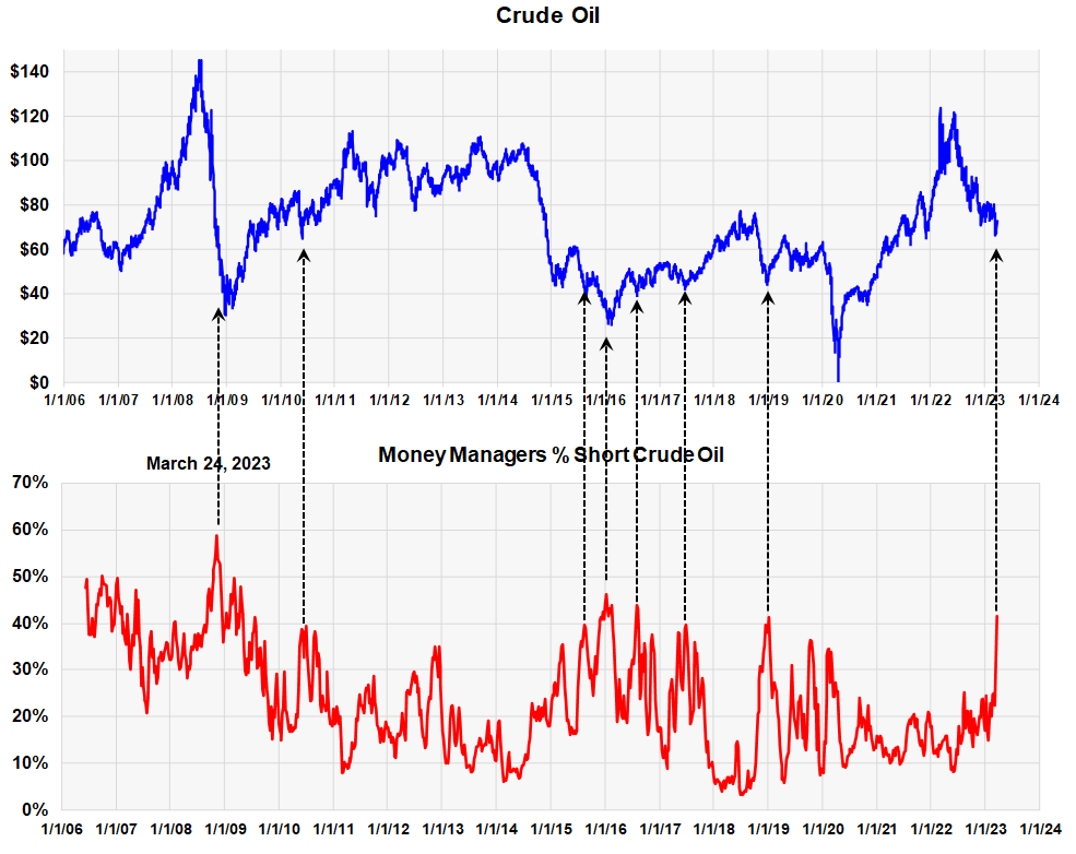
Crude Oil – Commitment of Traders
The idea that energy stocks will move higher is based on oil prices moving higher. While oil stocks could move higher without oil, it’s highly unlikely.
It's an old saying that choosing “what” to buy is best determined using economic data, but deciding “when” to buy is best determined by looking at investor activity. With crude oil prices, insight into investor activity is achieved by studying the commitment of trader’s data (COT).
The Futures Trading Commission monitors the long and short positions of different classes of investors. One of the largest, and most insightful class of investors, are the money managers. As an investment group they tend to be wrong the market at the extreme price points. In other words, at the bottom they tend to be heavily short the market and less short at the top, just opposite what you want. We wrote about this in this recent article on gold.
Commitment of Trader Data for OIL (Money Managers) (Michael McDonald)
This chart shows the percent that money managers are short oil futures. We've indicated with black arrows that high ratios normally are associated with price lows in Oil.
The current ratio, indicated by the arrow on the far right, is the highest ratio since 2019. Unfortunately, high ratios don't tell us how “large” a move will be, just that one should be expected. The rally could last three months, or it could last a year and a half. Because of data from the energy sector, which we'll show you, we think the indicated move will probably carry oil prices back above $100, possibly to $120.
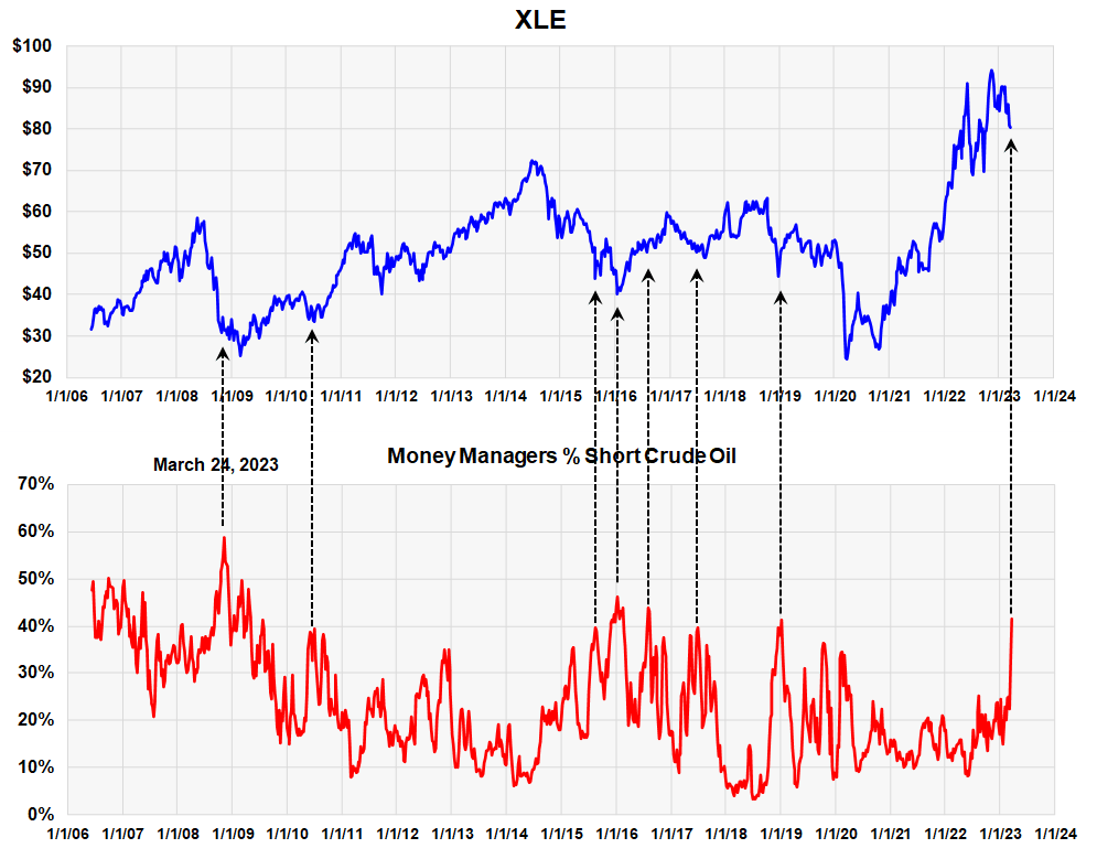
Energy Stocks Move with Oil Prices
This next graph shows prices of the energy sector, as represented by XLE, plotted against the same commitment of traders data. The black arrows again point to the high short positions of money managers. The correlation between the two is readily visible.
Money Manager Commitment of Trader Data plotted against XLE (Michael McDonald)
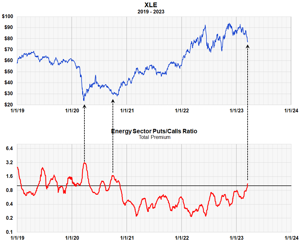
Energy Sector Option Data Also Points to a Price Breakout
We saw how energy sector stocks correlate with commitment of trader data of oil futures; let's see how sector prices correlate with energy sector put and call activity.
Energy Sector Puts to Calls Ratio (Michael McDonald)
This chart shows the puts and calls ratio of 160 energy stocks in the energy sector. It's statistically very broad based and therefore rather reliable.
That concept of the puts to calls ratio goes back to 1971 and is a well-established, well tested indicator of investor sentiment. A high ratio means a lot of put buying compared to call buying and represents option traders expecting lower prices. Market lows usually occur when traders are overly bearish.
You can see from the black arrows, that peaks in the ratio usually point to major price lows. We use the XLE in the graph not necessarily as a recommendation but as a proxy for the energy stock sector. While option traders can be short term in their outlook, by using long term moving averages of the data, we can achieve long term views of the market.
The ratio just recently went above one, meaning there's more money going into puts than calls for the first time since 2020. In our opinion, this helps confirm the bullish conclusions of the commitment of trader’s data for the energy sector.
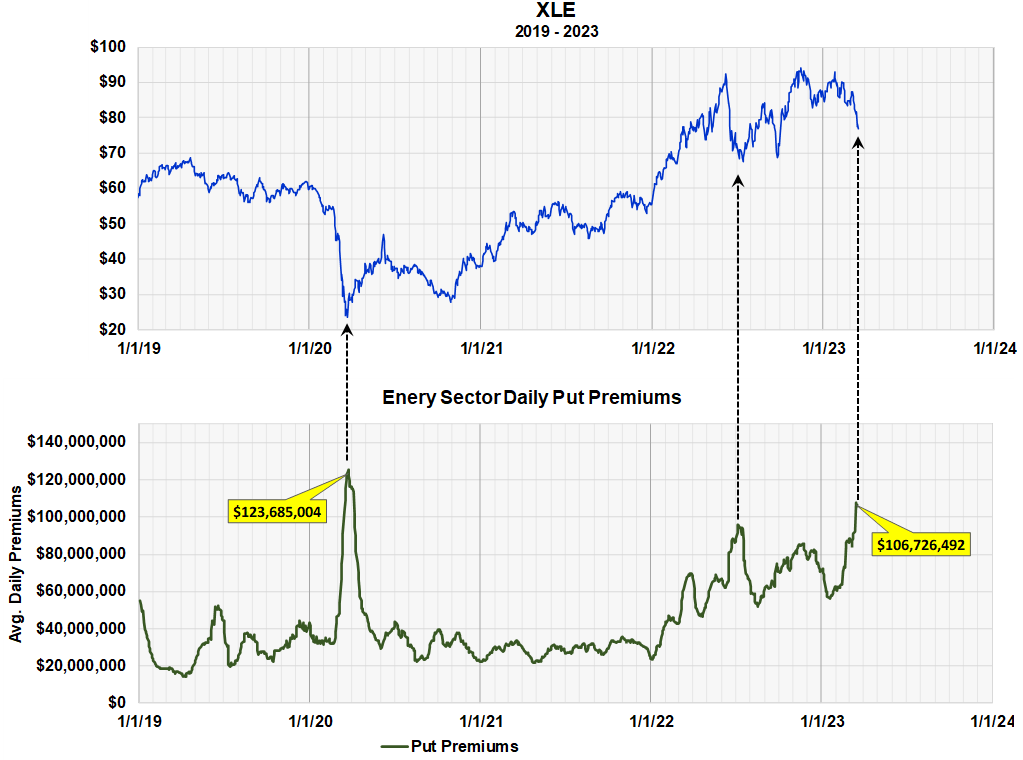
High levels of “Put Buying” in the Energy Sector
Sometimes using a ratio obscures absolute numbers and this chart shows the actual dollar amount of "puts" being purchased every day in all 160 energy stocks. It shows that $106 million dollars a day are going into "puts" in all energy stocks. This is the highest amount since the price low in March of 2020. In our opinion this better shows the significance of the current moment.
Again, this is data from 160 stocks, so the statistics are very broad based.
Average Daily Puy Buying in all 160 Energy Stocks (Michael McDonald)
Option Activity in XLE
We've shown how both COT data for oil and high levels of “put buying” in the energy sector are pointing to higher prices for each. It's somewhat reinforcing.
Now we look at what investors are doing in the option market for XLE itself. Remember, investors can buy puts and calls in the XLE ETF and the chart below shows the ratio of XLE back to 2019.
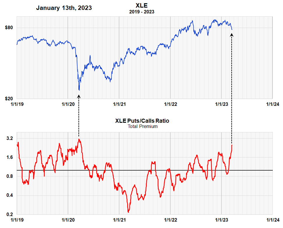
The Puts to Calls Ratio in XLE (Michael McDonald)
This graph shows that the ratio of puts to calls in XLE mirrors what happening to the ratio in all 160 stocks. This is important.
It should be noted that there are peaks in the puts to calls ratio that do not correspond to price lows. This simply means that nothing is perfect. But they're primarily anomalies and a reminder that one should be cautious and flexible in thought.
Overall, however, this chart gives added confirmation that energy stocks are poised to move higher along with oil.
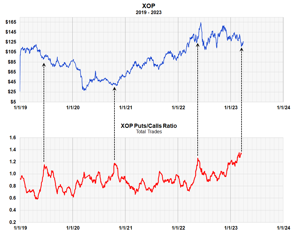
The Puts to Calls Ratio in XOP
The Puts to Calls Ratio in XOP (Michael McDonald)
As you can see the Puts to Calls ratio in XOP is at the highest levels in over for years. There are 1.3 put trades for every call trade. The message of option traders in XOP is in sync with that of XLE, the entire energy sector and of oil itself. Oil and the energy sector are both going higher.
Summary
While both ETFs should advance nicely with higher oil prices, we think XOP might perform a little better. For one, it's a little more volatile, so its potential return is better. For example, since the energy sector price low on April 16th, 2020, XLE is up 198% while XOP is up 242%.
But there is another reason. This expected price increase in the energy sector is based primarily on an expected increase in the price of oil. While XLE has a correlation factor of 41% with the price of oil, XOP has an extremely high correlation factor of 73%. This means that XOP is probably more certain to move with changes in the price of OIL than XLE. Because of this, we think XOP is probably the better choice.
For further details see:
XLE Or XOP? The Energy Sector Is Powering Up