ACTV - The White House Fed Inflation And Flow Of Funds For April 2023
2023-04-12 06:27:18 ET
Summary
- The private domestic sector balance increased by $264+ billion in March 2023 despite the external sector and bank credit creation headwinds.
- Bank credit retraction was -$53+ billion as more loans were repaid or written off than were created.
- The seasonal pattern is downwards now into summer 2023 and probably into Xmas 2023 as well. Crowned with a Fed-induced recession.
- The Fed's demand destruction policy has baked a recession into the economic pie for the end of this year or the beginning of next.
The purpose of this article is to examine the USA sectoral flows for March 2023 and assess the likely impact on markets as we advance into April 2023. This is pertinent, as a change in the fiscal flow rate has an approximately one-month-lagged effect on asset markets and is a useful investment forecasting tool. Other macro-fiscal flows can point to events months or years ahead.
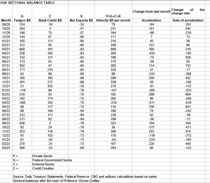
The table below shows the sectoral balances for the USA which are produced from the national accounts.
In March 2023, the domestic private sector recorded $264B of growth in financial balances overall and this is a strong and positive result.
From the table, one can see that the $264+ billion private sector injection of funds came from a huge $386+ billion injection of funds from the federal government [and this includes the new injection channel from the Fed of around $9.5B from interest on reserves that went directly into the banking sector, more on that below.], less -$53+ billion of credit retraction from commercial banks [IE more loans were repaid or written off than were created] and less the -$69B+ billion that flowed out of the private domestic sector and into foreign bank accounts at the Fed in return for imported goods and services.
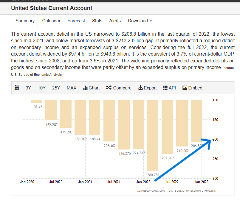
Fresh, quarterly reported, current account data is now available and shows the macro trend of a declining external sector drain persisting as shown in the chart below and the table above.
The blue arrow shows how a macro trend has now been in effect for a year. In terms of the sectoral flows, this trend means that less private sector money is flowing into the external sector [and becomes mostly treasuries held by foreigners at the Federal Reserve Bank]. The money is instead remaining in the private domestic sector and lifts financial balances dollar for dollar. This then allows for more money to be available for investment into domestic asset markets in such things as stocks, bonds, real estate, incomes, and savings and investment.
Why is the external sector falling? The Federal Reserve demand destruction monetary policies not only lead to less aggregate demand and unemployment internally but also less demand for imported goods and services as well. Through this process, unemployment and economic stagnation are exported from the USA to its trading partners as well. Mind you most of those are creating their internal economic hell with tight monetary policy as well.
One can expect this trend to change direction when the Federal Reserve reverses its monetary policy by again lowering interest rates and starting a fresh round of quantitative easing. Then, growth and market booms are back on.
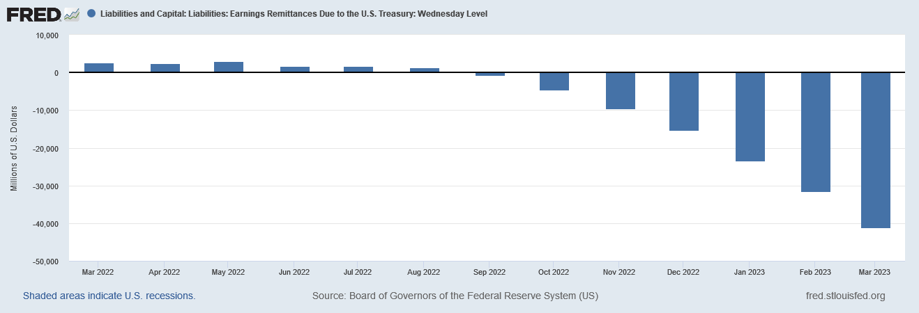
The contribution to the federal government sector from the Fed continues to grow and has reached a total of over $40B and a contribution of over $9B in the last month.
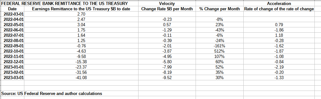
When one makes a table of the above information and applies some second and third derivative analysis one gets the result shown below.
US Treasury and author calculations
The table above shows that the while the nominal amount is larger each month the rate of change is narrowing and will rise and fall with the interest rate and the number of reserves the banks hold in their account at the Fed.
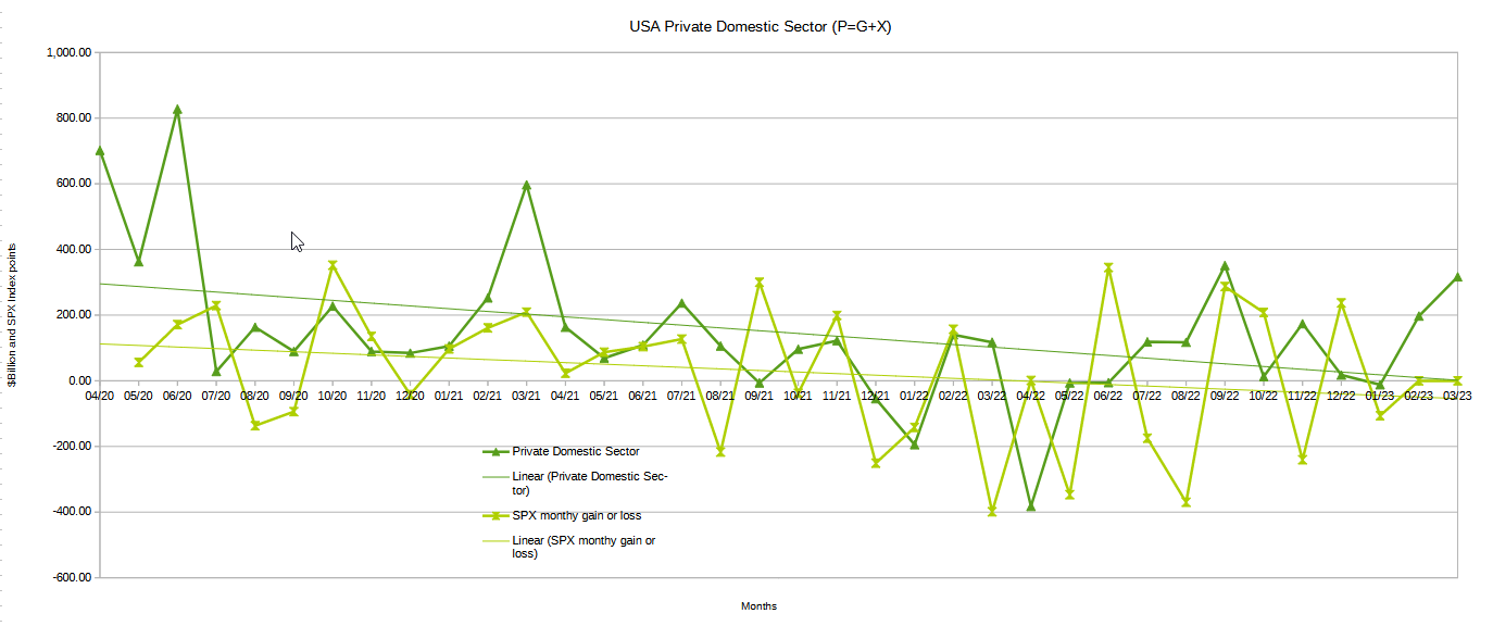
The chart below shows the sectoral balance data plotted in nominal terms. A trend line has been added to give an idea of the broad direction, which is downwards for both the private domestic sector (where asset markets are located) and the SPX. The calculation is Federal government spending or G plus the external sector (X and normally a negative factor) to leave that amount of money left to the private domestic sector or P by accounting identity true by definition.
The following chart emerges when one graphs the change rate of the information in the USA sectoral balances table above and adjusts for impact time lags. This is like a long-range market radar set.
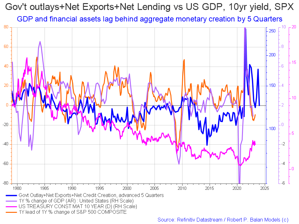
The blue line shows the fiscal impulse from federal government outlays plus bank credit creation and less the current account balance and leads by up to five quarters [a year and three months]. Short term, the orange SPX line appears to be trending back upwards to follow the leading blue line. Longer term the leading blue fiscal impulse line points to a major inflection downwards for markets in late 2024 or early 2025. The granularity of this chart does not allow for a more precise timing than this.
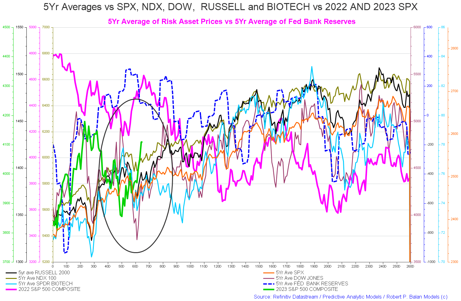
The chart below shows the five-year average of the seasonal stock market patterns for the SPX ( SPX ), NDX ( NDX ), Dow ( DIA ), Russell 2000 ( RTY ), and Biotech ( IBB ) market indexes. The black oval shows roughly where we are (trading day 72) at the time of writing and the end of the green line on the chart below.
The 5-year index averages call for a flat sideways movement falling into trading day 110 [Early June].
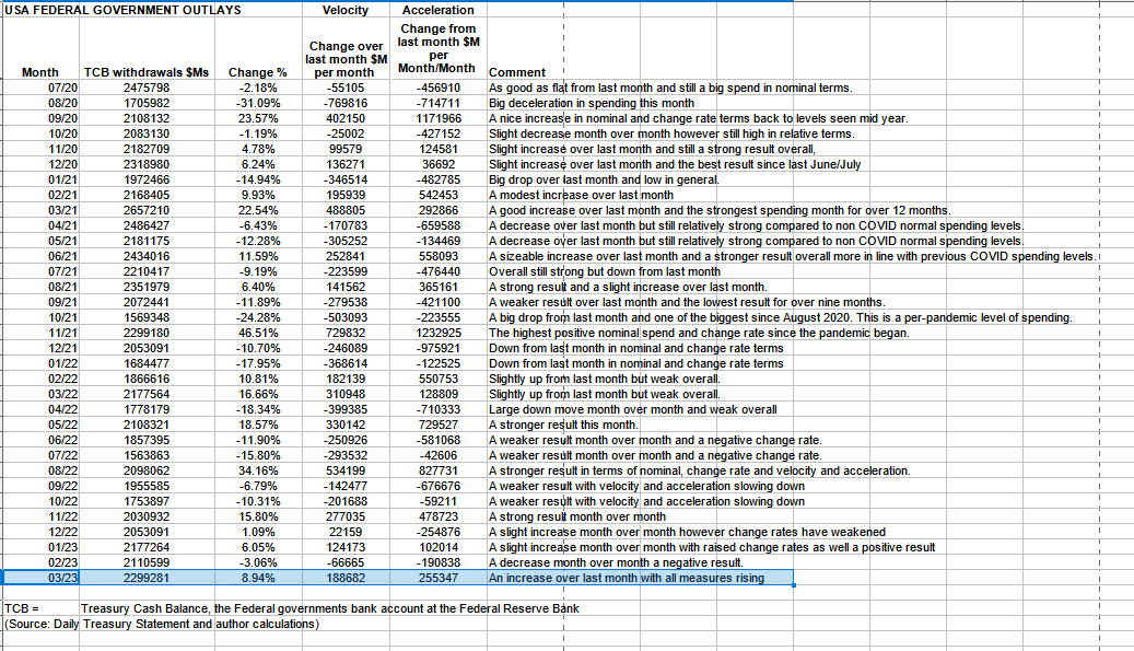
The table below shows the total federal government withdrawals from their account at the Federal Reserve Bank. A withdrawal by the federal government is a receipt/credit for the private sector and therefore a positive for asset markets.
US Treasury and author calculations
The table shows that total outlays were larger than last month and that the monetary velocity and acceleration are positive. The private sector surplus was so large as federal taxation was fairly light.
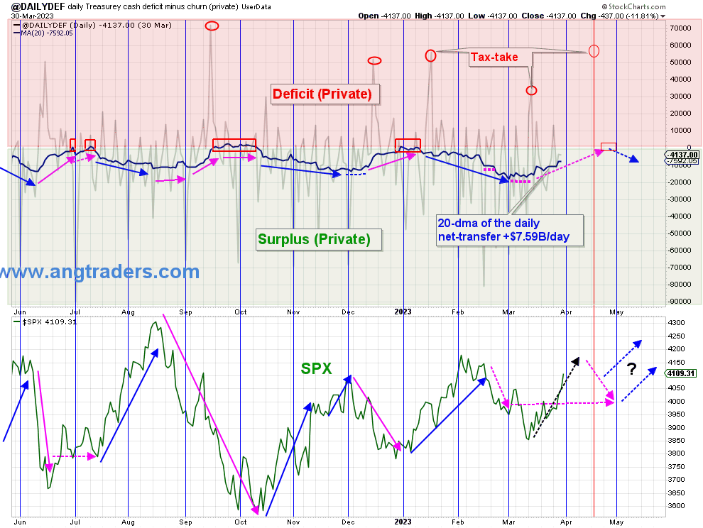
The chart below shows graphically the relationship between the federal government (currency creator) and the private sector (currency user) and is from ANG Traders of the Away from the Herd SA Marketplace service. The bottom panel highlights in red and green the financial relationship between the currency creator and currency users. One's loss is the other's gain and vice versa.
As expected, the 20-day average of the daily net-transfers is shrinking but remains positive at +$7.59B/day . It should continue to shrink as we approach the April 18 tax-take, but will increase again after that.
(Source: Mr. Nick Gomez, ANG Traders, Away from the Herd SA Market Service Weekly Report for Members).
The trend now is that the financial balance is moving in the direction of the red private sector deficit area and has been doing so since the end of February. That trend is about to exacerbate as a series of large federal tax collections are coming up over the next few months that give us the seasonal summer stock market low. Sell in May and go away. Last year in April over $300B was drained out of the private sector. This year will be similar and undo all the good work done in March.
ANG Traders
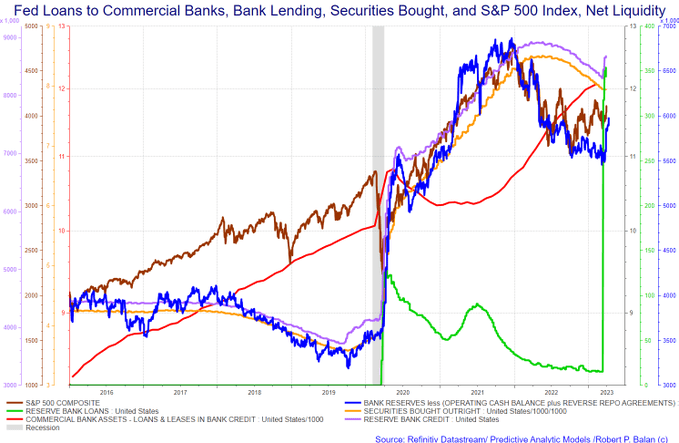
The above chart shows the stock of T securities whose growth has flatlined due to the debt limit crisis. Also shown in the lower panel is the SPX. The most striking line on the chart is the pink SOMA [Fed balance sheet] line. After months of destructive QT, about half of it was refunded to the banking sector as part of the recent bank-run rescue. The Fed effectively bought back about half of the bonds that it had sold to provide liquidity to the banks to forestall a bank run and a liquidity crisis created by its interest rate-raising policy.
The chart below highlights this emergency action from the point of view of the banks in the green reserve bank loans line. SOMA down, reserve bank loans up.
At the White House in the last month, the debt limit impasse continues causing the Treasury to move ever deeper into its range of limited extraordinary measures to find money with which to fund the government instead of being able to create currency by issuing treasury securities of one form or another.
This month the Congressional Budget Office reviewed an interesting proposal to change the law to allow a set of exempted payments to be made and T securities issued to cover them. The range was so broad that it would put an end to the bi-annual debt crisis cycle. One can only hope that this is passed into law.
A list of exemptions is shown in the text extract below.
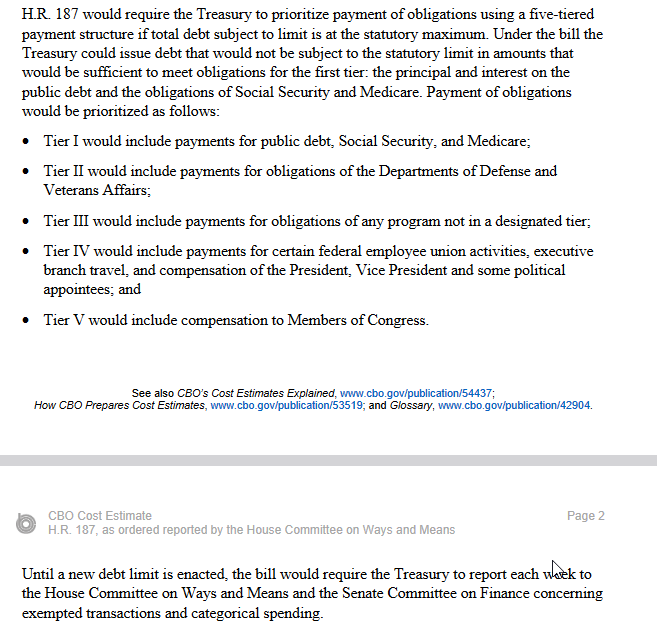
When and if this legislation is passed US bonds should never again rise above those of such countries as Australia, New Zealand, and Canada because the sovereign default risk is removed. This will make a material change to world bond markets.
What is also of concern now is the precariously low level of the treasury cash balance, the federal government operating account at the Fed. The level is shown in the table below.
US Treasury
The federal government has a relatively small bank balance of about $110B which from an operating point of view is on the brink of empty. There is a large federal tax collection in the middle of April and June and these are the only thing standing in the way of default. Not being able to issue treasury securities due to legal constraints, the cash balance cannot be recharged with a bond sale in the normal way.
The Fed and Treasury are just about out of extraordinary financial measures accounting tricks and a real federal government shutdown and default in the next months is now a real possibility and will be very damaging and add to the Fed's very damaging monetary policy impacts.
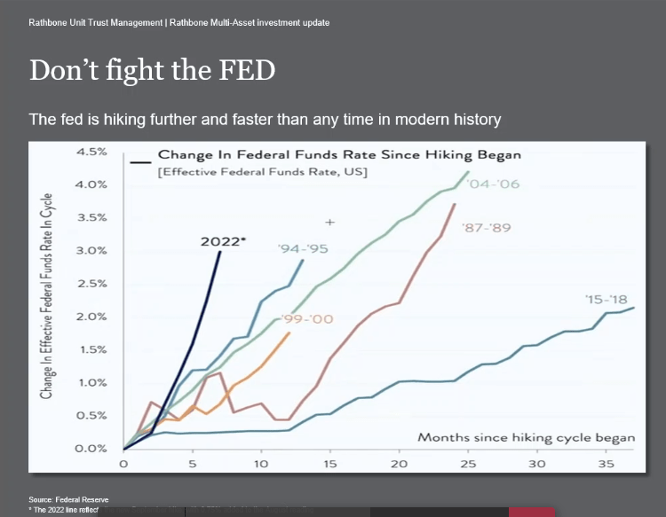
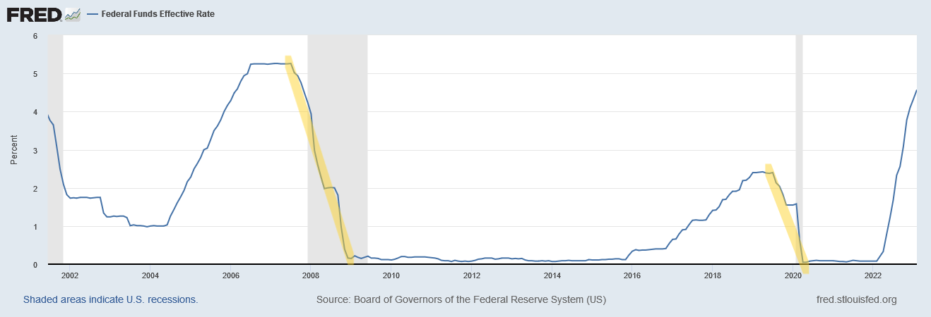
There is no Fed meeting this month but there is one early next month where there is no doubt there will be another rate rise. The chart below shows graphically how hard and fast the Fed has raised rates compared to other rate-raising campaigns in the past.
Never before have the rate rises been as large and as fast as they are now. It is no wonder that there have been a series of failed banks over the last few months as the value of their bond holdings falls so much that they have negative equity and are technically bankrupt. The larger banks then swoop in and buy up their assets at knockdown prices.
The next chart shows inflation compared to the 1970s and 80s inflation patterns. One sees that the current inflation pattern [orange line and right side axis] mirrors the same pattern as for the 1970s-80s [grey line and right side axis] in terms of shape, but is only half as high in terms of the actual rate of inflation.
One has here an interesting template for how this inflation episode will develop. Inflation is currently falling, disinflation, and will most likely bottom out in mid-2025, where most likely the high federal funds rate has already caused a recession, whereupon the Fed then lowers the rate and engenders a boom and then bust into the end of the decade.
Rathbones
The chart below highlights in yellow the point at which the Fed panicked and lowered the federal funds rate in the face of a recession that it had created by its preceding rate increase campaign.
First, it is clear that governments can always protect employment, incomes and business solvency with appropriate fiscal policy interventions. Second, it is less clear on what monetary policy does and that is the issue - eventually interest rate rises will cause certain sectors, such as construction, to encounter difficulties and start laying off workers and recording bankruptcies. But the problem is that monetary policy is such a crude instrument that the damage is done before we really can measure it.
Most likely we will see the same pattern occur in 2025, unemployment, recession, and then a meteoric dropping of the federal funds rate to undo the damage done by the rate rises. All done too late and way behind any sort of curve.
The policy stance is akin to suffocating your victim to the point where he is about to gag and die, then removing the pillow and resuscitating him again. By resuscitating the patient you look like a hero when in fact you were the villain.
This behavior is reminiscent of the German mass murderer Neils Högel who would medically attack patients in his care and then reanimate them.
The court described Högel's motive, to emerge as a hero after a potential reanimation, as "base" ( "niedriger Beweggrund" ), [36] which is a precondition for a murder conviction in Germany.
Source: Wikipedia
Raising interest rates combats inflation at the point where the economy stalls and falls into recession, up until that point the rate rises ADD to inflation in that they increase the price of credit, and credit is an element of everything we buy and produce.
Another function of rate rises is that they channel money away from real goods and services and into interest payments on debt. Interest is empty valueless production in that nothing is produced and the cost of production, making the rate rise, has no cost either.
What is happening is that as interest rates rise a larger share of GDP goes to bankers as empty unproductive profit and deflates the rest of the productive economy, GDP appears to rise because it treats bank earnings from higher rates as production and earnings when it is merely a dead weight cost on the rest of the economy. Professor Micheal Hudson puts its best
"Seemingly empirical National Income and Product Accounts (NIPA) follow this linguistic turnabout by reporting interest and rent as "earnings," as if bankers and landlords produce Gross Domestic Product ((GDP)) in the form of credit and ownership services. This practice is at odds with John Stuart Mill's definition of land rent as what property owners are able to make "in their sleep," by charging access fees for sites created by nature and given value by the community's overall prosperity. To depict this charge as "earnings" for providing an economic "product" is to pretend that rent extraction reflects real output, as if it is a useful service."
Hudson, Michael. J IS FOR JUNK ECONOMICS: A Guide To Reality In An Age Of Deception (Kindle Locations 364-368). ISLET/Verlag. Kindle Edition.
Following ten consecutive rate rises, the Reserve Bank of Australia decided at its last meeting on the 4th of April 2023 to hold the official cash rate at 3.60%. Australia is an important US satellite economy and it and New Zealand often ''lead'' the interest rate raising campaign as they attempt to pre-empt the US central banks' rate moves and so preserve their foreign exchange rate parity to the USD. If they hold then they believe the US will also hold or even reduce the interest rate at its next meeting.
On the larger world macroeconomic side, we have the G5 chart below. The chart below comes from Mr. Robert P. Balan of Predictive Analytic Models. The chart shows the level of money creation by the top five world governments (the G5) in a change rate format, along with a host of other indexes. This chart gives a sense of important inflection points and direction.
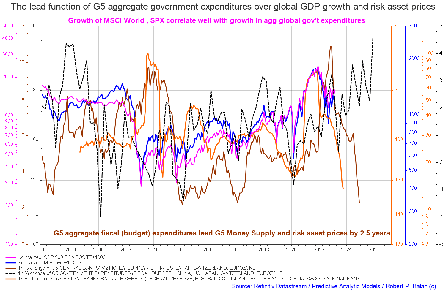
The chart above shows that central bank balance sheets and M2 [orange and brown lines] are still falling hard. At the same time, total G5 expenditure is generally rising even though at present it is at a low and looks to rise strongly into the rest of the year [black dotted line]. For best investment market outcomes one wants to see all the co-variables rising and falling together and not in divergence as is the case at present.
The major change over last month is the big pick up in the G5 fiscal expenditures [black dotted line] which has shot upwards but its lagged positive impact on markets is a long way off in time.
The macro direction is still downwards with local rallies that should be sold.
If you are looking to make a market entry, sometime in the last quarter of 2023, the first quarter of 2024 is likely to be a good time judging by the macro tidal forces that underpin the asset markets. Best to wait now until the recession has come and gone.
For further details see:
The White House, Fed, Inflation, And Flow Of Funds For April 2023