CARS - November Technology Dashboard And The Risks Of ROM
2023-11-16 09:58:24 ET
Summary
- Technology is the most overvalued sector, but the electronic equipment industry is undervalued relative to 11-year averages.
- 8 technology stocks were cheaper than their peers in November.
- ProShares Ultra Technology ETF: why the leveraged tech ROM ETF is risky.
This monthly article series monitors aggregate industry metrics in technology and communication services. It may also serve as a top-down analysis of sector exchange-traded funds, or ETFs, like Vanguard Information Technology Index ETF (VGT), Fidelity MSCI Information Technology Index ETF (FTEC), and Technology Select Sector SPDR ETF (XLK), whose largest holdings are used to calculate these metrics.
Shortcut
The next two paragraphs in italics describe the dashboard methodology. They are necessary for new readers to understand the metrics. If you are used to this series or if you are short of time, you can skip them and go to the charts.
Base Metrics
I calculate the median value of five fundamental ratios for each industry: Earnings Yield ("EY"), Sales Yield ("SY"), Free Cash Flow Yield ("FY"), Return on Equity ("ROE"), and Gross Margin ("GM"). The reference universe includes large companies in the U.S. stock market. The five base metrics are calculated on the trailing 12 months. For all of them, higher is better. EY, SY, and FY are medians of the inverse of Price/Earnings, Price/Sales, and Price/Free Cash Flow. They are better for statistical studies than price-to-something ratios, which are unusable or non-available when the "something" is close to zero or negative (for example, companies with negative earnings). I also look at two momentum metrics for each group: the median monthly return (RetM) and the median annual return (RetY).
I prefer medians to averages because a median splits a set in a good half and a bad half. A capital-weighted average is skewed by extreme values and the largest companies. My metrics are designed for stock-picking rather than index investing.
Value and Quality Scores
I calculate historical baselines for all metrics. They are noted respectively EYh, SYh, FYh, ROEh, GMh, and they are calculated as the averages on a look-back period of 11 years. For example, the value of EYh for hardware in the table below is the 11-year average of the median Earnings Yield in hardware companies.
The Value Score ("VS") is defined as the average difference in % between the three valuation ratios ((EY, SY, FY)) and their baselines (EYh, SYh, FYh). In the same way, the Quality Score ("QS") is the average difference between the two quality ratios ((ROE, GM)) and their baselines (ROEh, GMh).
The scores are in percentage points. VS may be interpreted as the percentage of undervaluation or overvaluation relative to the baseline (positive is good, negative is bad). This interpretation must be taken with caution: the baseline is an arbitrary reference, not a supposed fair value. The formula assumes that the three valuation metrics are of equal importance.
Current data
The next table shows the metrics and scores as of last week's closing. Columns stand for all the data named and defined above.
| VS |
| QS |
| EY |
| SY |
| FY |
| ROE |
| GM |
| EYh |
| SYh |
| FYh |
| ROEh |
| GMh |
| RetM |
| RetY |
| Hardware |
| -3.71 |
| -20.36 |
| 0.0351 |
| 0.7796 |
| 0.0404 |
| 5.37 |
| 31.36 |
| 0.0351 |
| 0.9642 |
| 0.0374 |
| 6.46 |
| 41.17 |
| 3.62% |
| 15.40% |
| Comm. Equip. |
| -5.42 |
| 9.50 |
| 0.0329 |
| 0.2841 |
| 0.0289 |
| 19.72 |
| 61.27 |
| 0.0313 |
| 0.2723 |
| 0.0389 |
| 16.19 |
| 63.05 |
| 2.29% |
| -16.46% |
| Electronic Equip. |
| 9.76 |
| -7.20 |
| 0.0487 |
| 0.8555 |
| 0.0385 |
| 17.03 |
| 20.05 |
| 0.0409 |
| 0.7708 |
| 0.0388 |
| 13.22 |
| 35.32 |
| 1.40% |
| 3.99% |
| Software |
| -18.49 |
| 5.17 |
| 0.0228 |
| 0.1286 |
| 0.0260 |
| 20.54 |
| 82.18 |
| 0.0255 |
| 0.1617 |
| 0.0344 |
| 17.94 |
| 85.75 |
| 5.16% |
| 6.34% |
| Semiconductors |
| -16.97 |
| 16.96 |
| 0.0427 |
| 0.1889 |
| 0.0241 |
| 33.87 |
| 58.92 |
| 0.0447 |
| 0.2327 |
| 0.0333 |
| 24.28 |
| 62.41 |
| 1.58% |
| 1.07% |
| IT Services |
| -28.10 |
| 12.43 |
| 0.0338 |
| 0.1937 |
| 0.0196 |
| 31.80 |
| 58.31 |
| 0.0371 |
| 0.3106 |
| 0.0315 |
| 26.72 |
| 55.10 |
| 3.70% |
| 2.06% |
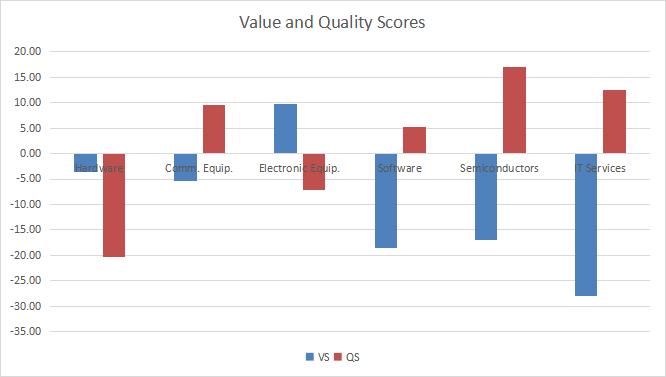
Value And Quality chart
The next chart plots the Value and Quality Scores by industry (higher is better).
Value and quality in technology (Chart: author; data: Portfolio123)
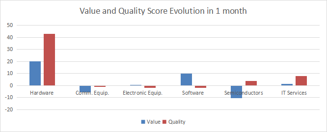
Evolution since last month
Hardware has significantly improved in valuation and quality.
Score variations (Chart: author; data: Portfolio123)
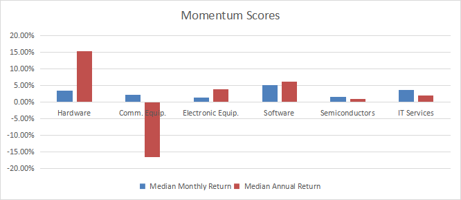
Momentum
The next chart plots momentum based on median returns by industry.
Momentum in technology (Chart: author; data: Portfolio123)
Interpretation
Technology is the most overvalued sector according to my monthly S&P 500 dashboard . Electronic equipment is the only tech industry showing a moderate undervaluation relative to 11-year averages. For communication equipment, a good quality score may offset a moderate overvaluation. Hardware is also close below the baseline in valuation, but it shows the worst quality score in the sector. Other industries are overvalued by 18% to 28% relative to the historical baseline, However, their quality scores are good, especially for semiconductors.
Dashboard List
I use the first table to calculate value and quality scores. It may also be used in a stock-picking process to check how companies stand among their peers. For example, the EY column tells us that a hardware company with an earnings yield above 0.0351 (or price/earnings below 28.49) is in the better half of the industry regarding this metric. A Dashboard List is sent every month to Quantitative Risk & Value subscribers with the most profitable companies standing in the better half among their peers regarding the three valuation metrics at the same time. The list below was sent to subscribers several weeks ago based on data available at this time.
| Belden, Inc. |
| Cargurus, Inc. |
| Cars.com, Inc. |
| Diodes, Inc. |
| Vishay Intertechnology, Inc. |
| NXP Semiconductors NV |
| Gen Digital Inc. |
| InterDigital, Inc. |
It is a rotating list with a statistical bias toward excess returns in the long term, not the result of an analysis of each stock.
Is it safe to bet on tech with ROM?
ProShares Ultra Technology ETF (ROM) is a leveraged ETF tracking 2x the daily return of the S&P Technology Select Sector Index, which is the underlying index of XLK. It was launched on 1/30/2007 and has a net expense ratio of 0.95%. To reach its objective, it holds the stocks of the underlying index along with swap contracts on this index issued by 7 different banks. The largest holding in the portfolio is the Technology Select Sector Index Swap of JP Morgan Securities.
Leveraged ETFs often underperform their underlying index leveraged by the same factor. Beta-slippage is the main reason for the decay of equity-leveraged ETFs. To understand it, imagine a very volatile asset going up 25% one day and down 20% the day after. A perfect double-leveraged ETF goes up 50% on the first day and down 40% on the second day. On the close of the second day, the underlying asset is back to its initial price:
(1 + 0.25) x (1 - 0.2) = 1
…whereas the perfect leveraged has lost 10%:
(1 + 0.5) x (1 - 0.4) = 0.9
In a trending market, beta slippage can be positive. If the underlying index goes up 10% two days in a row, on the second day, it is up 21%:
(1 + 0.1) x (1 + 0.1) = 1.21
…whereas the perfect 2x leveraged ETF is up 44%:
(1 + 0.2) x (1 + 0.2) = 1.44
Since its inception in 2007, ROM has outperformed XLK, as reported in the next table. It also shows a much higher risk in drawdown (-83.79%) and volatility (measured below as the standard deviation of monthly returns). As a result, it has a lower risk-adjusted performance (Sharpe ratio) than the non-leveraged index.
| Total Return |
| Annual. Return |
| Drawdown |
| Sharpe |
| Volatility |
| ROM |
| 2097.82% |
| 20.23% |
| -83.79% |
| 0.62 |
| 40.66% |
| XLK |
| 868.70% |
| 14.50% |
| -53.04% |
| 0.74 |
| 18.76% |
In fact, ROM has underperformed XLK from inception to 2013.
I define the normalized drift of a leveraged ETF as follows:
Drift = (Return - (IndexReturn x Ñ))/ Abs(Ñ)
Where:
- "Return" is the return of the leveraged ETF in a given time interval, including dividends.
- "IndexReturn" is the return of a non-leveraged ETF on the same underlying asset in the same time interval, including dividends.
- "Abs" is the absolute value operator.
- " Ñ" is the leverage factor.
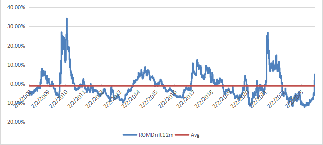
The next chart plots the 12-month drift since one year after inception (February 2008). The historical average is negative (meaning a decay): -1.01%.
ROM drift history (chart: author, data Portfolio123)
Positive drift follows a steady trend in the underlying asset, whatever the trend direction. It means positive drift may come with a gain or a loss for the ETF. Negative drift comes with daily return volatility ("whipsaw"). ROM is an efficient swing trading instrument in a bull market. However, it suffers a significant decay when the underlying index oscillates between positive and negative daily returns. It has been designed for seasoned traders with a good understanding of the behavior behind the advertised leveraging factor. If you have a doubt, stay away from it.
For further details see:
November Technology Dashboard, And The Risks Of ROM