CA - Risk-Off Through Trimming Core S&P 500 ETF
2023-06-21 09:21:08 ET
Summary
- With the S&P 500 at frothy valuations and bonds, savings accounts, and GICs offering appealing interest rates, it might be time to take some risk off your portfolio.
- The S&P 500 looks expensive on a number of metrics including the Shiller P/E and Tobin Q ratio in addition to the usual historical P/E.
- Looking globally across Vanguard's broad market ETFs, the S&P 500 is most expensive on a number of metrics with emerging markets looking appealing from a valuation standpoint.
- With volatility cheap and premiums low, protecting put options look like a good potential strategy for taking some risk off the table.
The S&P 500 and Vanguard's flagship S&P 500 ETF ( VOO ) are looking expensive after the recent run up partially helped by the tech sector's investor enthusiasm around artificial intelligence. Not only is the S&P 500 looking expensive on an absolute basis as this article will discuss though analyzing the current PEG ratio for the S&P 500 as well as the Shiller P/E ratio; but, the S&P 500 is also looking expensive on a relative basis as we look globally and compare asset prices across European, Asian, and Emerging markets which are all offered through Vanguard's low-cost ETF product line.
With interest rates still generally on the rise globally for over the past year, markets are expecting GDP growth and inflation to slow (the latter being the goal of central bankers across). A soft landing of economic growth is ideal, but slowing is definitely to be expected and this will show up in company earnings. The effect of higher interest expenses in everyone's budget has a delayed effect on consumer/business spending. Stress is only starting to be felt in certain parts of the world and the frothy valuation of the S&P 500 is looking out of place.
With interest rates at highs not seen since 2006 when prime reached 8.25% from the big banks before the meltdown, bonds, and even the interest rate on savings accounts and GICs are starting to look attractive. Whether allocating more to fixed income, looking globally to diversify in other markets, selling to raise some liquidity, or hedging your portfolio, now looks like an opportune time in my opinion to take some risk off the portfolio.
Personally, I have some funds sitting in a savings account earning 5% and began my dollar-cost averaging of cross hedging my portfolio using puts on the S&P 500 which is a protective put option strategy I have wrote about back in 2019. Using a protective put allows an investor to continue participating in the upside of the market while limiting the downside. Staying invested in the market and collecting dividends offsets part of the options cost.
With volatility currently near 52-week lows and opportunity cost/risk-free interest rates so high, I have never seen at-the-money put options so cheap in my investing life yet. The below three year graph of the VIX shows that volatility is currently priced at 3 years lows. Earlier this week, I purchased an at-the-money put on the CBOE's Mini S&P 500 Index (XSP) with a one year out maturity for a premium of only 4.7%. When I last wrote on this strategy in 2019 (and it was cheap then too!) the cost of a one year out at-the-money put option was 5.5%. With market valuations expensive and volatility cheap, the opportunity for low cost insurance looks to be presenting itself again.
Price Comparing Globally
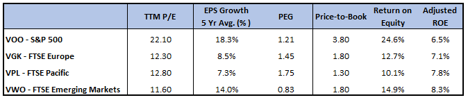
Now let's compare the S&P 500 to other markets globally to see how the current valuation stacks up. We will look at Vanguard's products for Europe, Asia, and Emerging markets and compare them across price levels, book value, profitability, as well as growth.
While the S&P 500 looks the most expensive on a TTM P/E basis at 22.1x, the highest 5-year average annual growth rate of 18.3% helps [[VGK]] and the S&P 500 achieve the second lowest PEG ratio of the group at 1.2x. Only the [[VWO]] ETF based on the FTSE Emerging market index is lower with a PEG of 0.8x helped by its higher growth rate but also low beginning valuation.
Price Comparison for Vanguard ETF Lineup (compiled by author from market data and Vanguard 's ETF product page)
As we look across to P/B ratios, the S&P 500 is once again the most expensive at 3.8x. But, this ratio in itself is not too meaningful as what that equity is able to return, ROE, determines, how much it is worth. On that point, the S&P's high P/B is looks to be partially justified by the 24.6% ROE that leads the pack of ETFs we are looking at.
I also always like to examine the relationship between ROE and price-to-book value in what I call the Investors' Adjusted ROE. It adjusts the ROE for the price investors are currently paying for the company's book value or equity per share. When we divide the ROE for each ETF by the P/B that investors are paying, we get that price-adjusted ROE for investors which is also an earnings yield. Unfortunately, the S&P does not hold up well here with the lowest investors' adjusted ROE of 6.5%. The emerging market index and ETF once again carry the highest calculated yield at 8.3%.
Just How Expensive is the S&P 500?
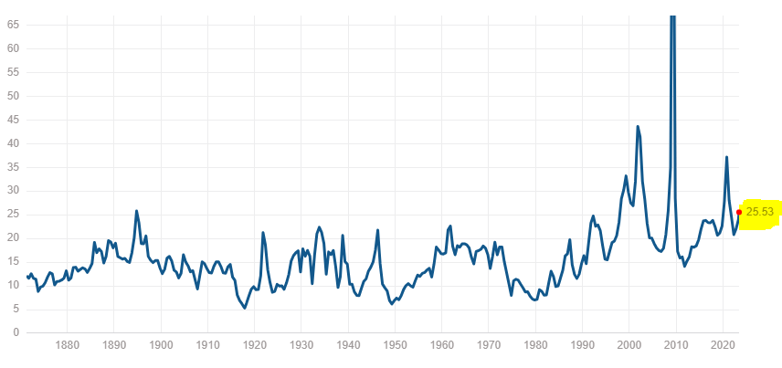
It is important to also put things into a cyclical and historical perspective. Looking back at past valuation levels, the S&P 500 is looking expensive on a relative historical basis. The P/E ratio is trading up at 25.6x which is far above its historical median of 14.9x. Considering interest rates are the highest we have seen in decades, this frothy valuation looks to be out of place. Next, let's look at some other good ratios as potential indicators such as the Shiller P/E and Tobin Q ratios.
PE History since 1800's (sourced from multpl.com)
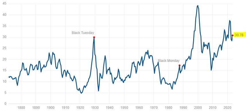
The Shiller CAPE ratio is also currently flashing potential warning signs at 30.8x P/E which is well above its historic median of 15.9x. This metric attempts to average out earnings over the business cycle by looking at the inflation-adjusted earnings from the previous 10 years. CAPE stands for Cyclically Adjusted Price-to-Earnings.
Shiller PE History since 1800's (sourced from multpl.com)
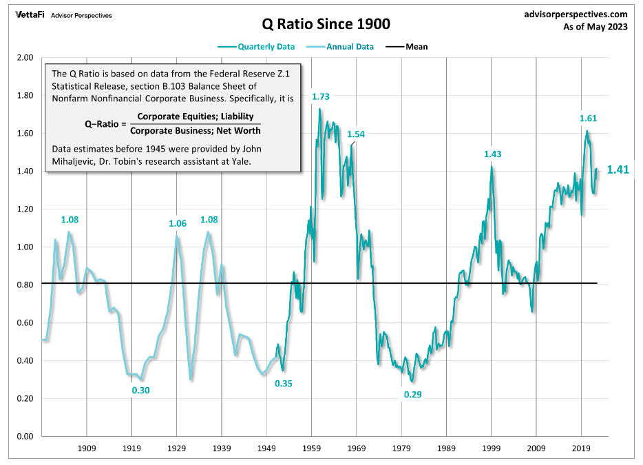
Additionally, the Tobin Q ratio is currently near all recent highs of 1.41x which is much higher than its average of just around 0.8x. Theoretically, if greater than 1, or the long-term average, the market is over-valued and will revert to the mean or the replacement cost of assets. The Tobin Q ratio measures the enterprise value (debt + equity) of the market divided by the replacement cost of the assets in the economy. It be calculated from data published in the Flow of Funds Accounts of the United States-Z.1 The Fed - Financial Accounts of the United States - Z.1 - Release Dates .
Tobin Q Ratio since 1900 (sourced from advisorperspectve.com)
Investor Takeaway
With the S&P 500 at frothy valuations along interest rates offering compelling returns, it looks like it may be time to take some risk off the table. VOO is one of my favorite ETFs with its low expense rock-bottom 0.03% MER, but it is also one of the easiest parts of my personal portfolio to sell or hedge with protective puts. Investors should also take the time to look globally and leave behind any home bias as valuations abroad look compelling, especially emerging markets.
For further details see:
Risk-Off Through Trimming Core S&P 500 ETF