RTX - Why The Index Of Leading Indicators Failed
2023-11-22 09:49:02 ET
Summary
- The Index of Leading Indicators forecast a deep recession in the past year, which did not come close to materializing, for two major reasons.
- First, manufacturing, which used to have a significant impact on the economy, now has less influence.
- Second, the decline in commodity prices and the relaxation of supply restrictions have supported the economy and countered negative indicators.
Introduction
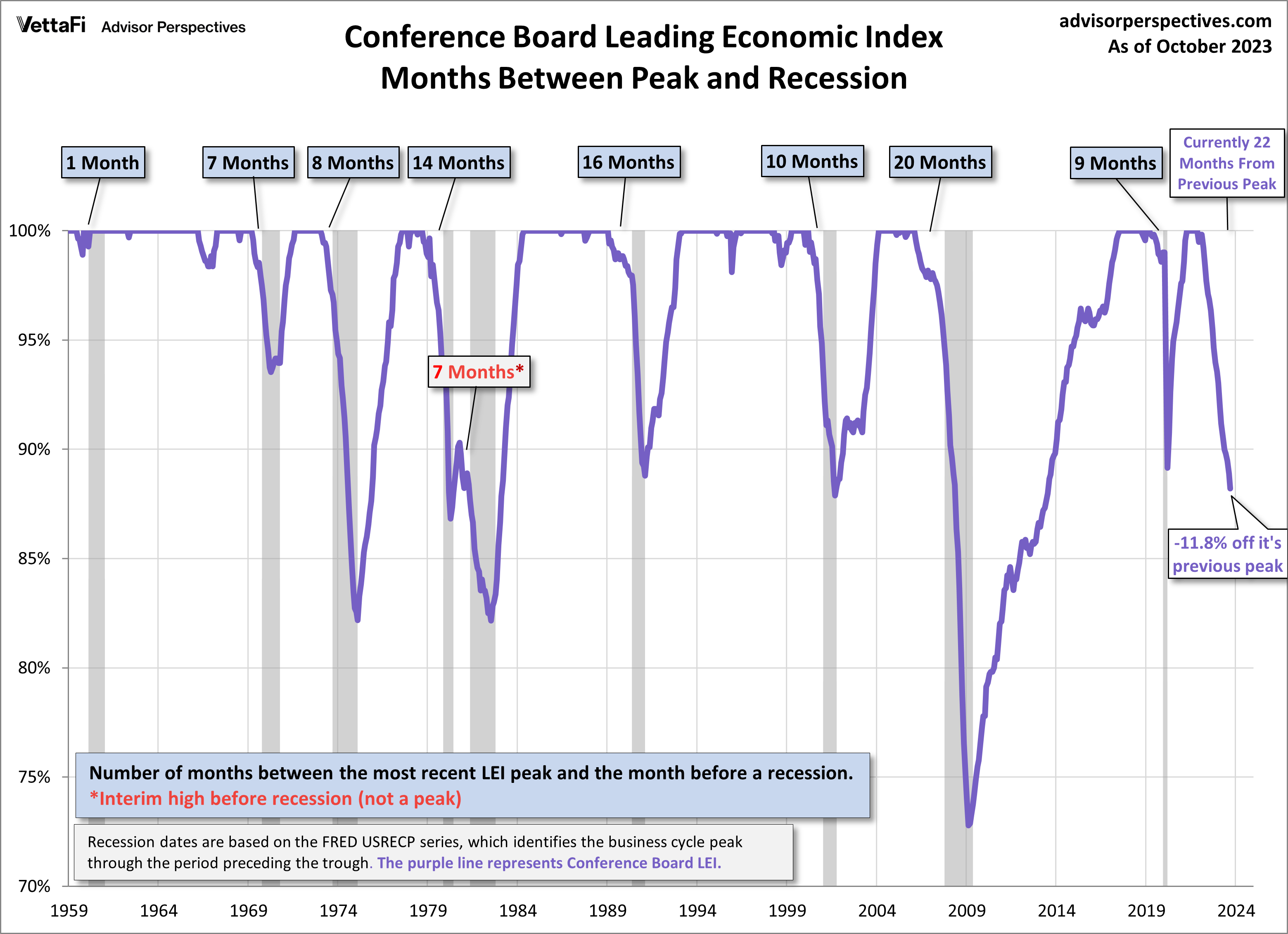
Historically, the Index of Leading Indicators ("LEI" and "the Index") has had the inconvenient habit of being more accurate than Wall Street forecasters. But, of course, no forecasting tool is perfect, and in the past year the Index, if accurate, would have had us in a very deep recession by this point, as shown in this graph of its current status and historical record:
Declines in Index of Leading Indicators (Conference Board via Advisor Perspectives)
Needless to say, that hasn't happened. This post and a follow-up post will examine the most salient reasons why, of which there are two. Here I examine the first of the two overarching reasons why the LEI failed in the past year.
A brief recapitulation of the Index and its utility
The LEI consist of 10 indicators. While it is designed to look 6 to 8 months ahead, it actually contains at least 3 components that are more properly long leading indicators; that is, they historically have turned more than 1 year before the economy as a whole does. They are: the yield curve, as measured by the 10 year Treasury (US10Y) vs. Fed funds spread, housing permits, and a credit tightness index.
Unsurprisingly, all of the above are negative and have been for over a year, and have been much discussed here and elsewhere in the financial press.
The other 7 components are more properly short leading indicators, typically turning down less than 1 year before a recession begins. They are: initial jobless claims, the S&P 500 Index (SP500), the average manufacturing workweek, the new orders subindex of the ISM manufacturing index, core capital goods orders, non-durable consumer goods orders, and consumer expectations.
These generally lead the coincident recession indicators as indicated by the NBER, which include jobs, income, industrial production, and real consumer spending measures, along with the quarterly real GDP.
But this time around, despite declining relentlessly for over a year, to levels that in the past were only plumbed late in very deep recessions, there has been no recession at all - at least so far.
Reason #1: Manufacturing is overemphasized, and one component's Achilles heel was attacked
Notice that of the 7 short leading indicators in the Index, 4 are measures of manufacturing: the average manufacturing workweek, the new orders subindex of the ISM manufacturing index, core capital goods orders, and non-durable consumer goods orders.
Between the end of World War 2, and lasting generally until the turn of the Millennium, it made sense to highly weight manufacturing. After all, the U.S. was the world's biggest producer by far, and manufacturing was and is far more cyclical than services (which frequently power right through recessions without ever turning down).
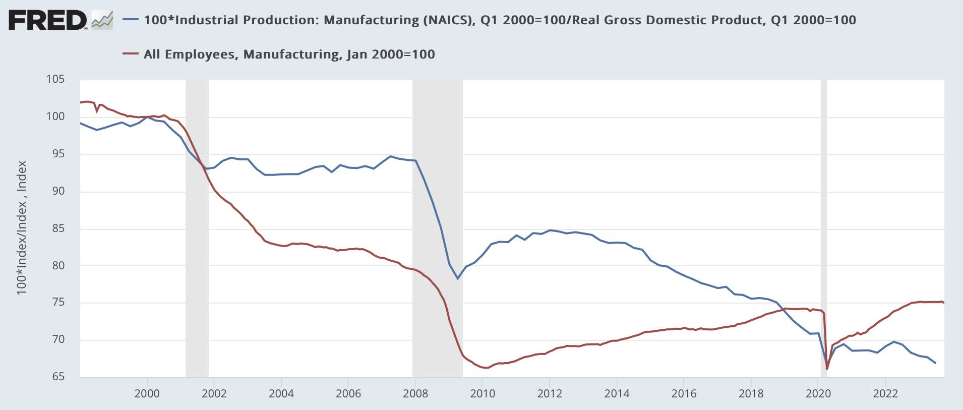
But since China was accorded regular trading status at the end of the 1990s, that situation has been greatly attenuated. Below is a graph of the manufacturing component of industrial production divided by real GDP (red), showing how it has shrunk as a share of the economy; and also manufacturing employment (blue), both normed to 100 as of January 2000:
Manufacturing as share of GDP (FRED)
As you can see, manufacturing production has declined by about 33% as a share of real GDP; and manufacturing employment, which actually peaked way back in 1979, has fallen another 25% since 2000. Manufacturing simply doesn't carry nearly the same weight it did 25 years ago in terms of how it affects the economy as a whole.
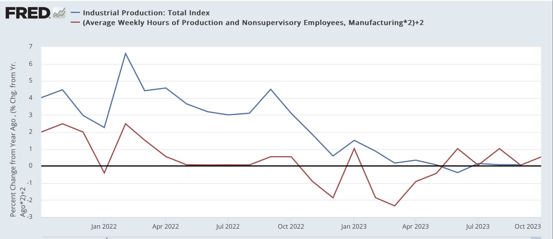
The effect of this shows up in one of the short leading indicators in particular: the average manufacturing work week; and can also be seen in how industrial production has behaved since then.
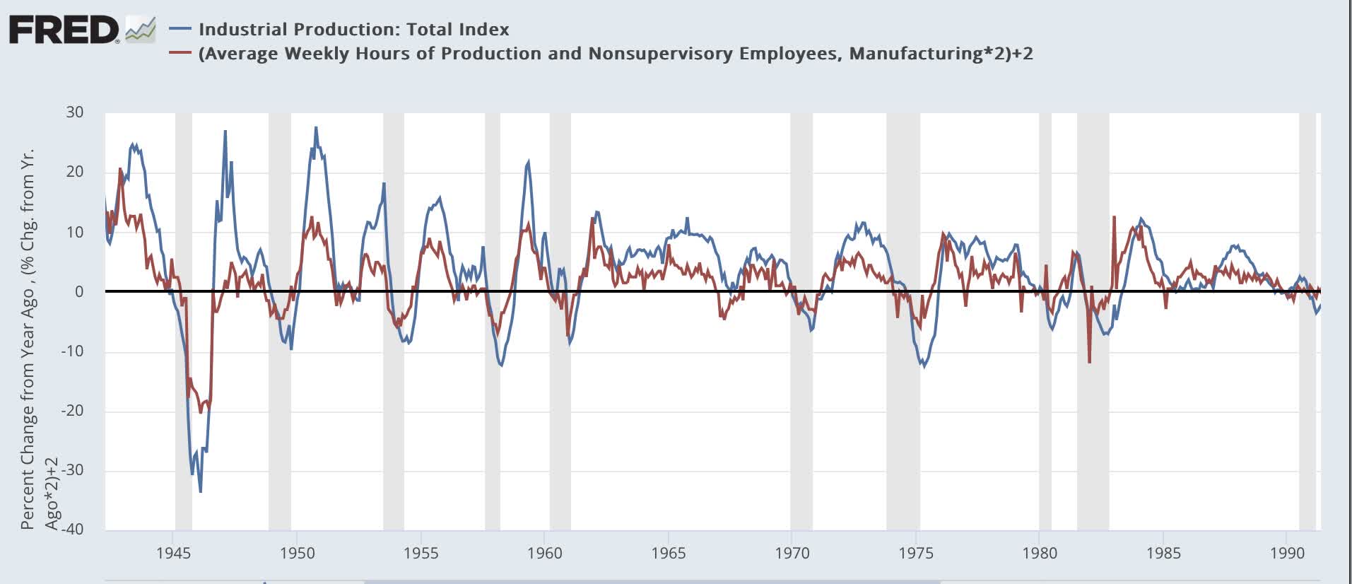
Below, I show a long-term look at the YoY% change in each of these two metrics (the manufacturing workweek *2 for scale):
YoY% change manufacturing indexes (FRED)
Before the year 2000, if the average hours of manufacturing workers declined by 1 hour YoY, it mean a recession was coming. Similarly, when industrial production declined YoY, it meant a recession was here.
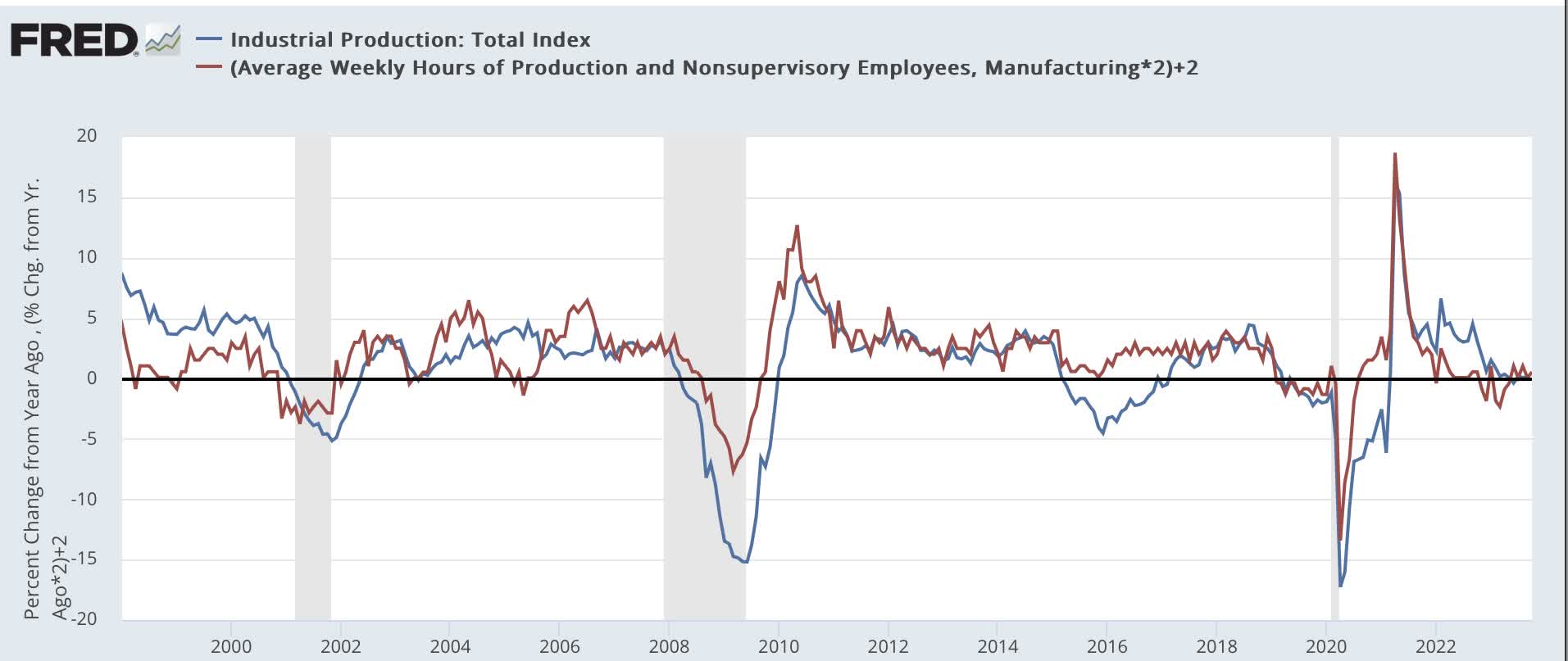
But between 2000 and 2020, hours declined in 2003, 2005, and 2019, and touched 0 in 2016; while industrial production declined in 2003, sharply in 2015-16, and again in 2019; all without heralding a recession (2020 was caused by the pandemic lockdowns; there was no broader weakness before then):
YoY% change manufacturing 2000-20 (FRED)
Here's what the past 2 years look like:
Post-pandemic manufacturing indexes (FRED)
Both turned negative at points between late last year and earlier this year; all the while, the economy kept moving forward.
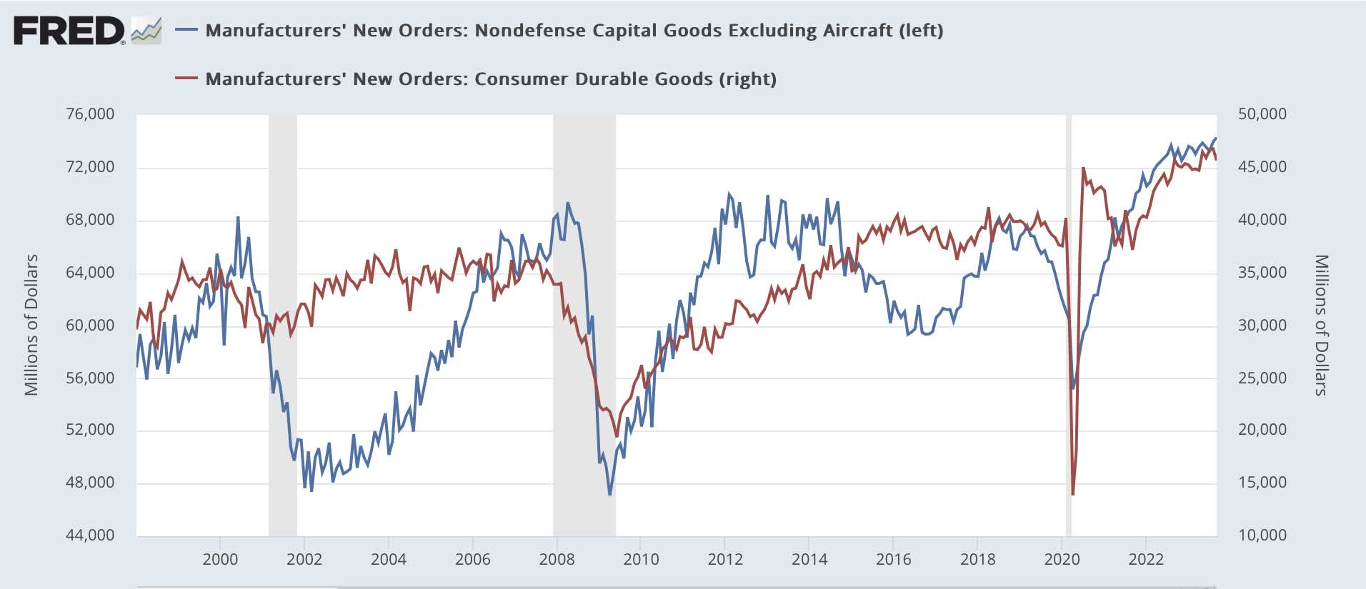
Additionally, the two other manufacturing indicators - core capital goods new orders, and consumer goods new orders - also both declined in 2016, the former sharply; and there was no recession:
Durable and Capital goods new orders (FRED)
Simply put, manufacturing does not have the clout in the U.S. economy it once did. While these metrics deserve inclusion in a leading index, we need to see bigger declines in all except those for consumer goods (since consumers still make up over 2/3rd's of the economy) than previously to sound the alarm.
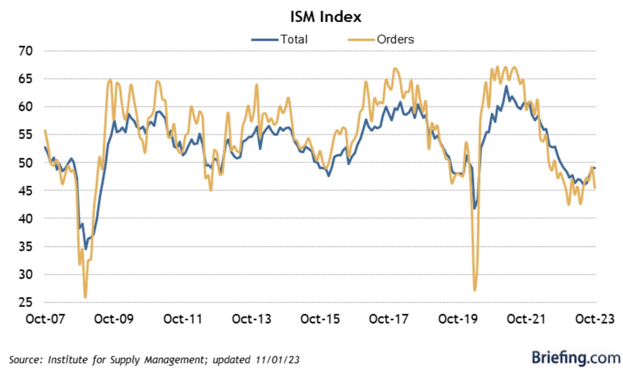
Further, the ISM new orders subindex, which has generally been reliable going all the way back to 1948, had its Achilles heel exposed in the past year, as it forecast a substantial manufacturing recession:
That Achilles heel is that it is a diffusion index. You simply count up the sectors improving vs. the sectors declining, and if there are more in decline than advancing, the Index comes in at a reading below 50. Since you don't have to do any complex weighting, it is much easier to calculate. And as I wrote above, it is generally a very good forecasting tool.
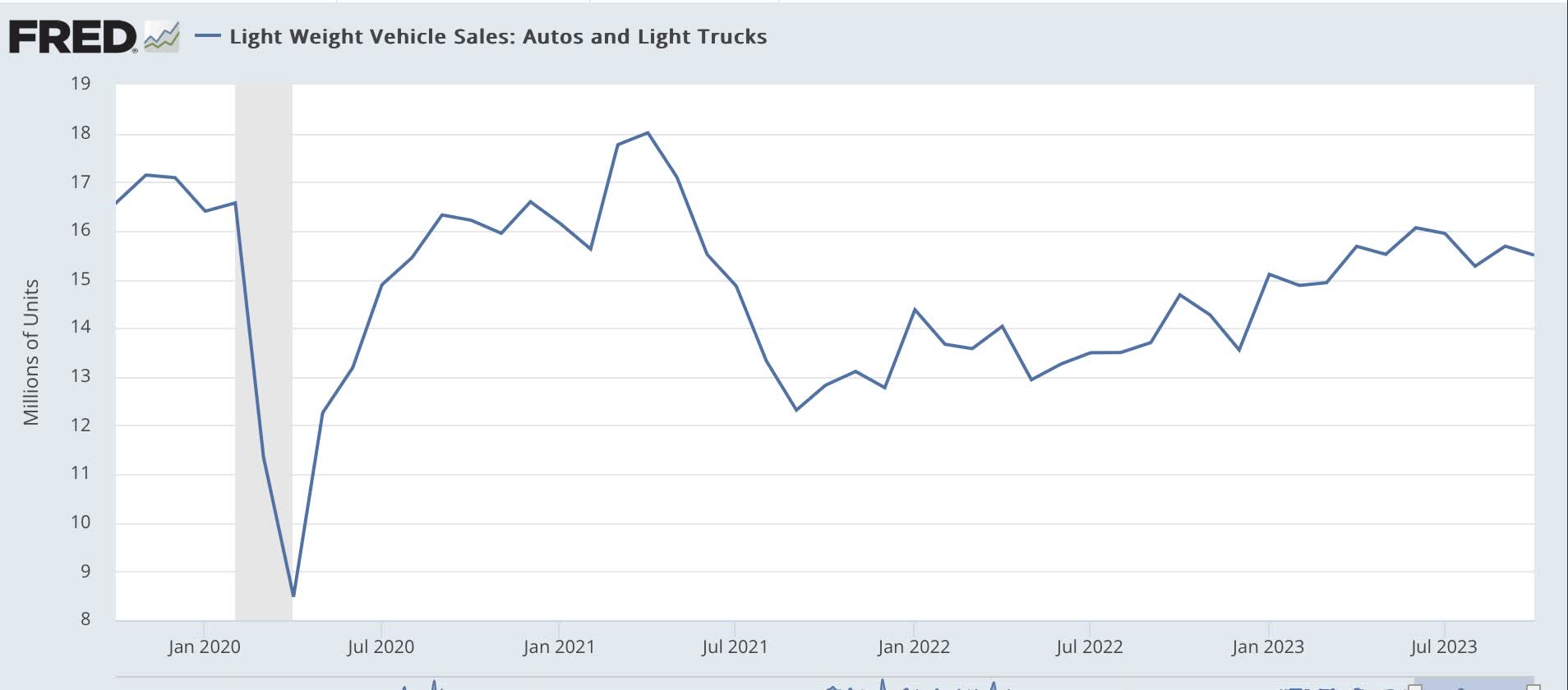
But while most manufacturing sectors contracted, vehicle production increased sharply from 2022 into 2023. We can see this two ways.
First, here are motor vehicle sales since the pandemic:
Motor vehicle production (FRED)
Second, here is motor vehicle production compared with manufacturing production as a whole:
Motor vehicle vs. manufacturing production (FRED)
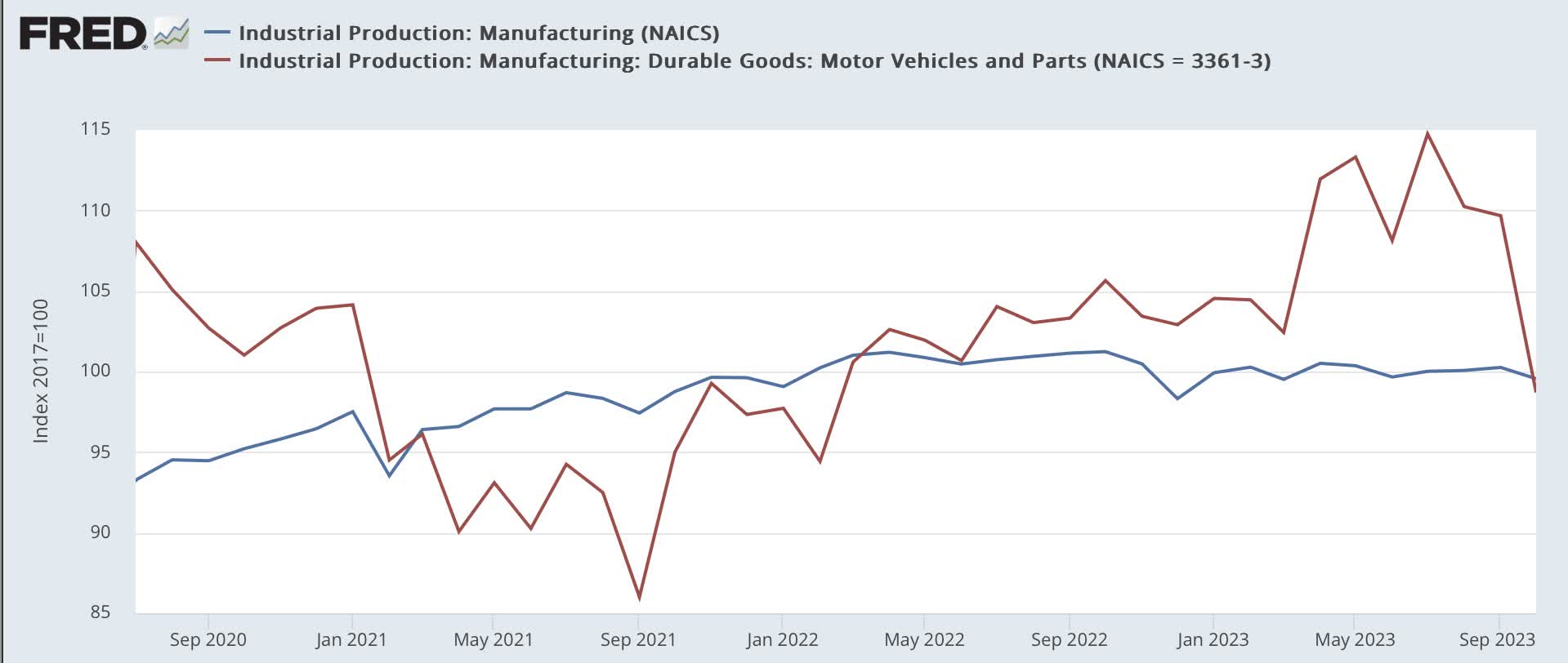
Motor vehicle production fell more steeply, and has had a sharp rebound, even as other sectors softened. If the ISM index were weighted (which would make it *much* more complex), it would pick that up, but as a diffusion index, it gave a more negative reading than it otherwise would.
Reason #2: A 40% drop in gas prices, and a generalized 10% drop in commodity prices, can do wonders for both producers and consumers.
Here's a graph of the YoY% change in all commodities going back 100 years:
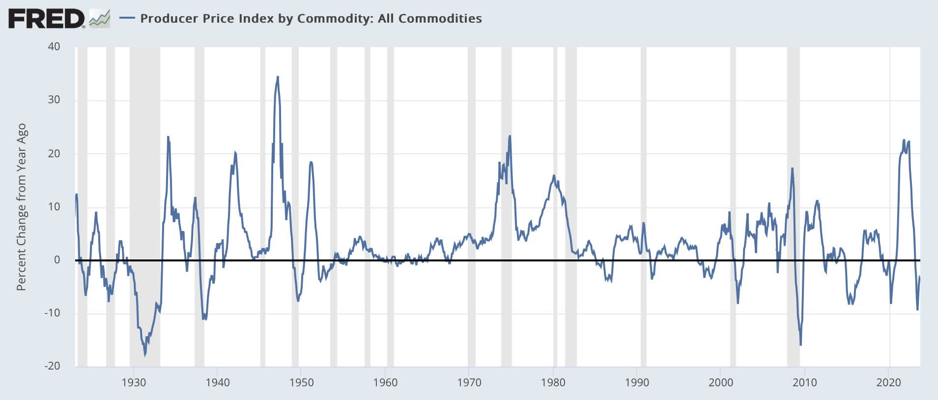
The decline in commodity prices that began after June 2022 was only exceeded in the past 100 years by that during the Great Depression, the Depression of 1938, and the Great Recession.
So long as you don't have wage deflation (as in the Great Depression), declining commodity prices are a powerful stimulant to downstream producers and consumers, who have more money freed up to spend on other things (which is one reason why recessions end!).
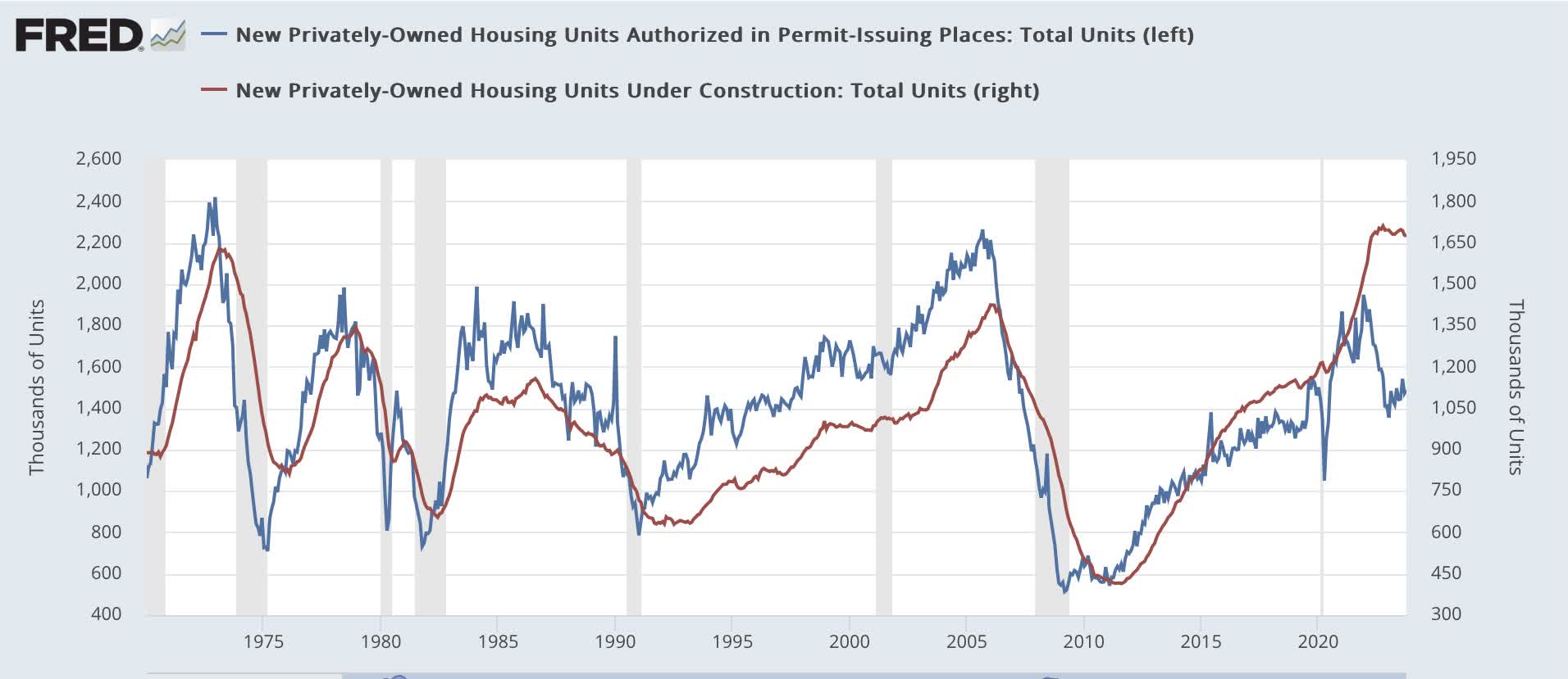
I briefly discussed the impact of the un-kinking of supply chains in motor vehicle production. Similarly, pandemic-related bottlenecks in lumber and other production for the construction industry are one reason why housing units under construction - the *real* economic measure of that important leading industry - has lagged far more than usual behind the "official" leading indicator of housing permits
Housing permits vs. construction (FRED)
Instead of turning down 3 or 6 months after permits, units under construction did not peak until a full year later, and even now are only down 2% from that peak.
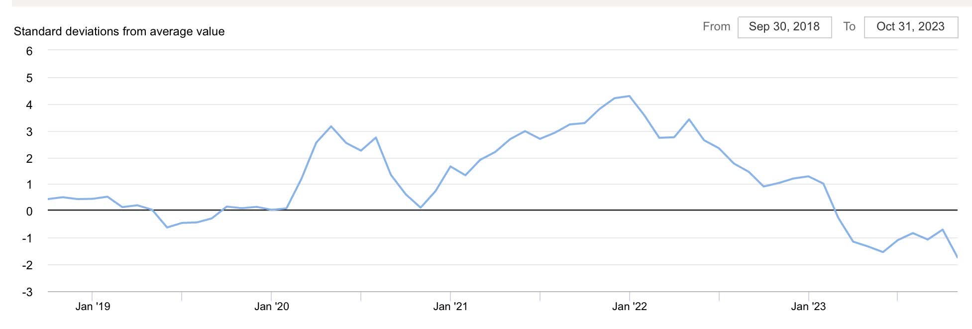
Indeed, beyond vehicle production and residential building, the Global Supply Chain Tightness Index hit all-time highs from 2020 through 2022:
Global supply chain pressures (NY Fed)
The relaxing of those from late 2022 through 2023 has had the effect of creating a tailwind supporting the economy. Below I use a relatively simple Econ 101-style graph to show how, compared with the situation just before the pandemic (lines S1, D1), stimulus pushed demand to the right (i.e., higher demand) even as supply tightness constricted (also acting to move prices higher) (lines S2, D2), and then the relaxation of supply constrictions has acted to push prices down to a point of equilibrium where demand is greater (Point S3, D3):
Demand vs. supply post-pandemic (Author generated illustration)
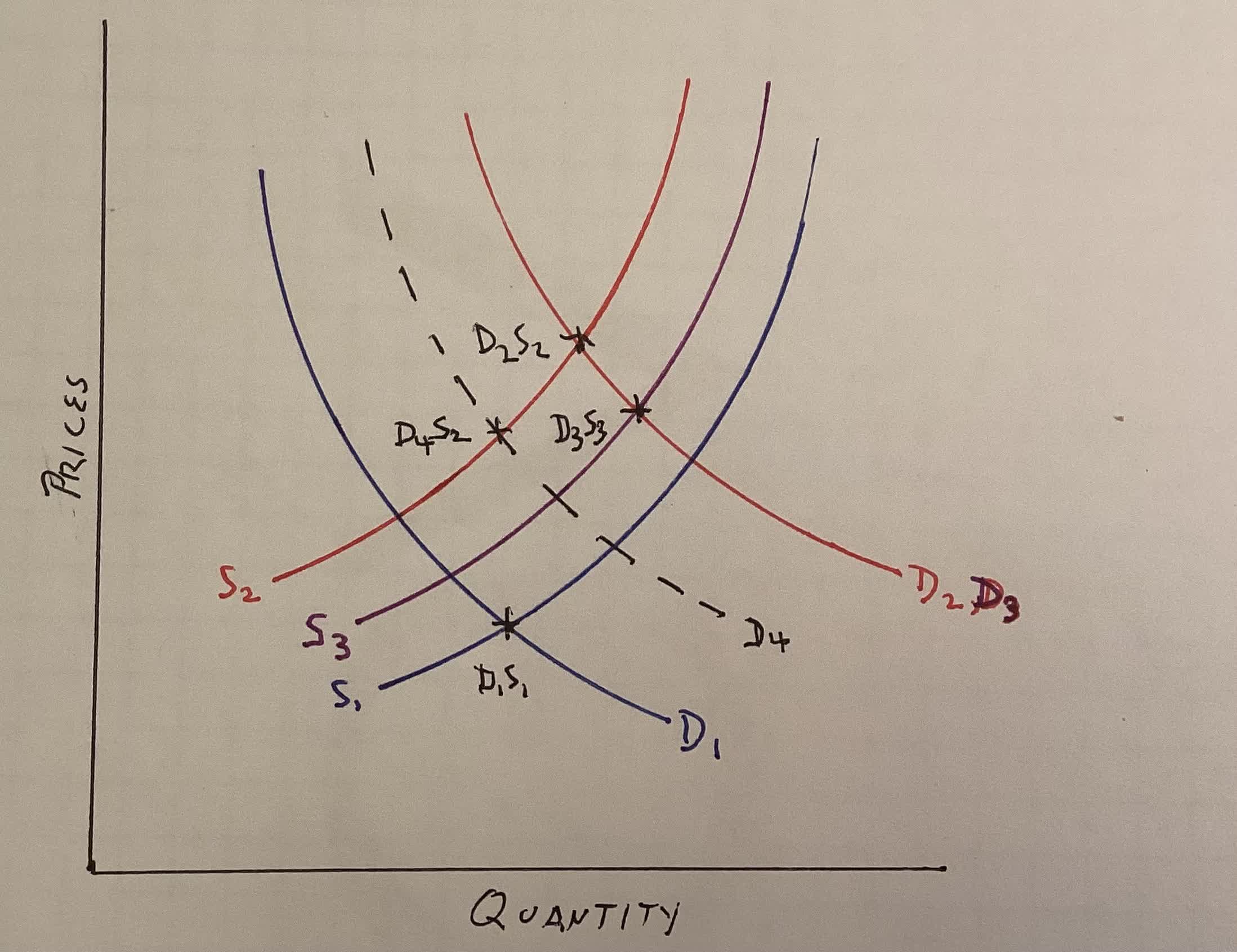
This is in contrast to the normal expectation of the models behind the LEI that commodity prices decline due to demand destruction (S2, dotted line D4).
Conclusion
The first overarching reason why the index of Leading Indicators was much more negative than would warrant for the economy as a whole is that it continues to emphasize manufacturing, even though that sector has a smaller impact on consumer behavior than it did before the turn of the Millennium. And one of the components, being a diffusion index, failed to capture the impact of a sharp increase in one important sector of manufacturing as a whole.
The second reason is that the relaxation of supply restrictions counteracted increased costs that were otherwise caused by interest rate increases. Stalls or downturns in both manufacturing and construction related components of the LEI were thus blunted.
The bottom line is that both the producer and consumer sides of the U.S. economy benefitted since June 2022 from a gale-force tailwind, part of which was a (hopefully) once in a lifetime aftermath of a pandemic. That tailwind, by chance, also attacked the weak points in several important leading indicators. For those reasons, the Index failed to properly forecast the short-term direction of the economy
For further details see:
Why The Index Of Leading Indicators Failed